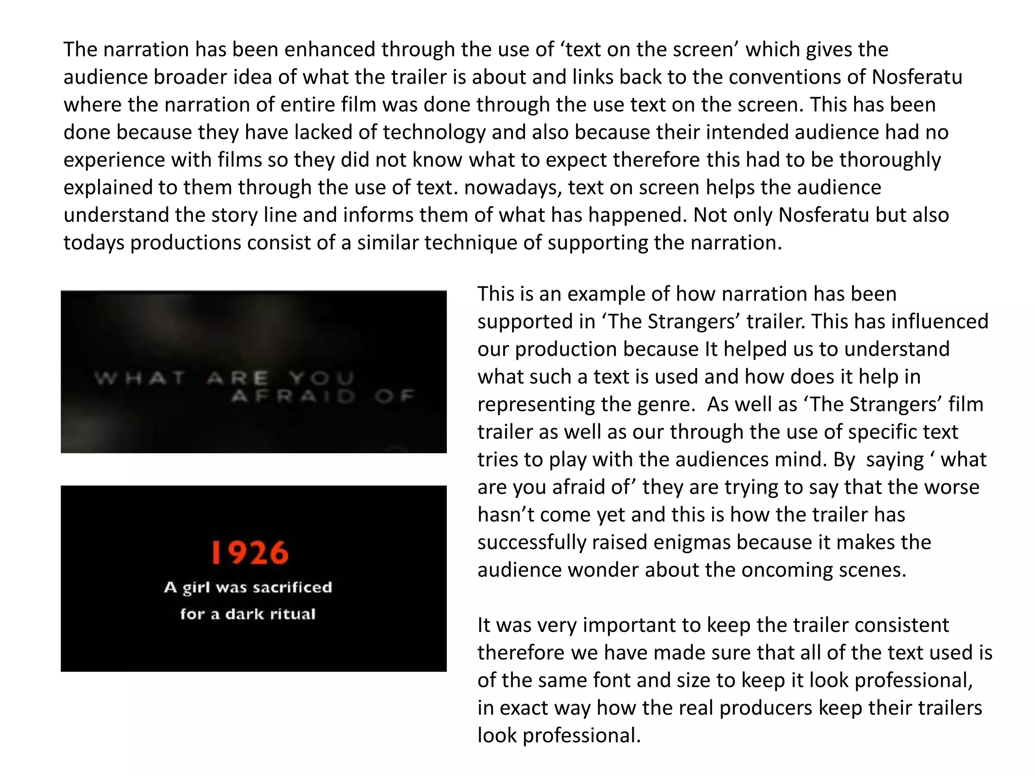
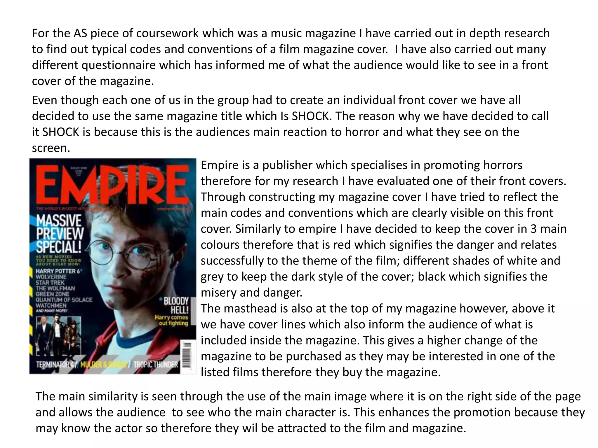
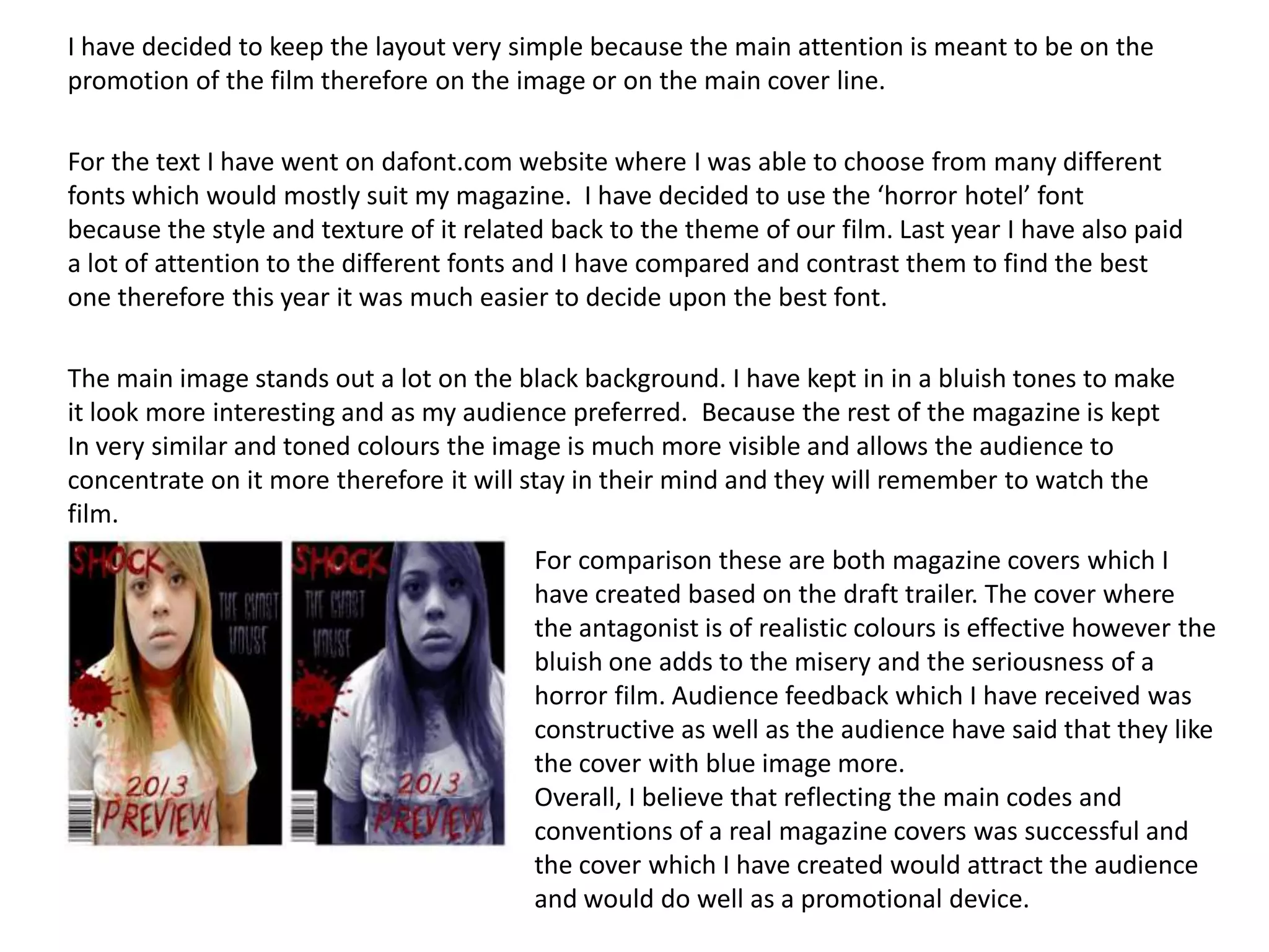
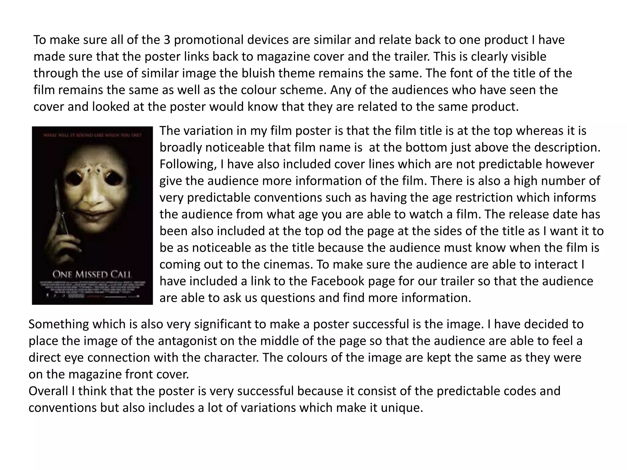
The document discusses how the media product (a film trailer, magazine cover, and poster) uses conventions of real media.
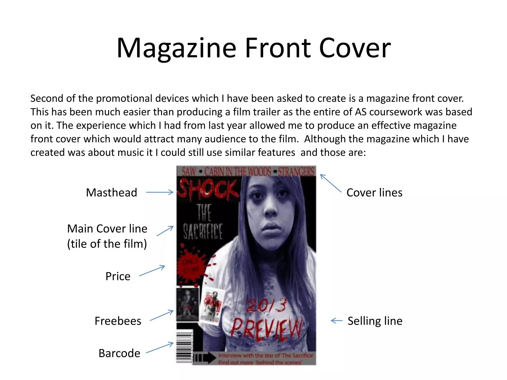
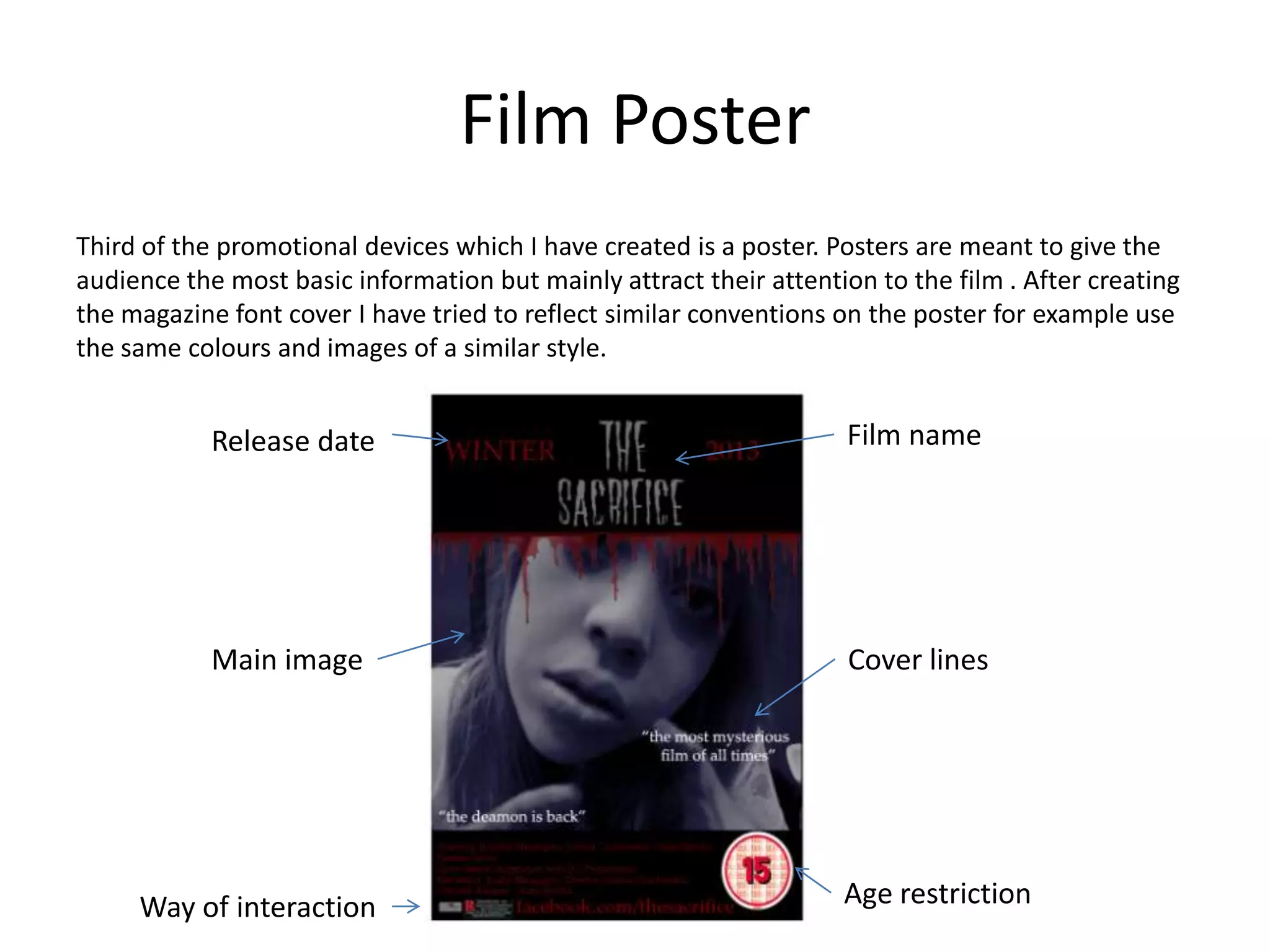
It analyzes the typical codes and conventions used in each type of media, such as using a positive opening scene in the trailer, masthead and cover lines on the magazine, and including the film title and release date on the poster.
The document also discusses how audience feedback was invaluable during the production process, as it helped shape decisions around the genre, trailer synopsis, magazine cover design, and ensured the promotional materials would appeal to and attract audiences.