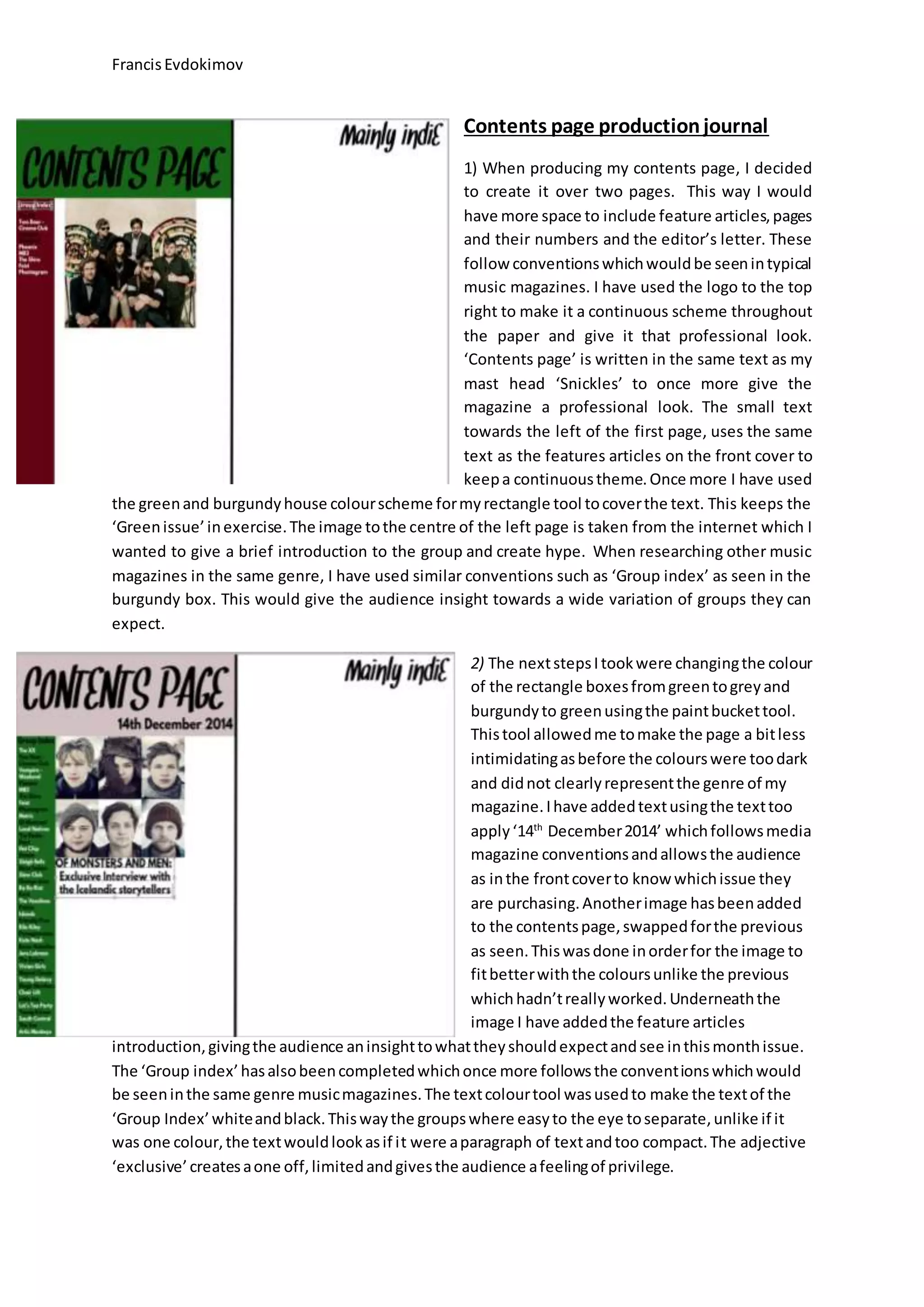
FrancisEvdokimov
Contents page productionjournal
1) When producing my contents page, I decided
to create it over two pages. This way I would
have more space to include feature articles,pages
and their numbers and the editor’s letter. These
follow conventionswhichwouldbe seenintypical
music magazines. I have used the logo to the top
right to make it a continuous scheme throughout
the paper and give it that professional look.
‘Contents page’ is written in the same text as my
mast head ‘Snickles’ to once more give the
magazine a professional look. The small text
towards the left of the first page, uses the same
text as the features articles on the front cover to
keepa continuoustheme.Once more I have used
the greenand burgundyhouse colourscheme formyrectangle tool tocoverthe text. This keeps the
‘Greenissue’inexercise.The image tothe centre of the left page is taken from the internet which I
wanted to give a brief introduction to the group and create hype. When researching other music
magazines in the same genre, I have used similar conventions such as ‘Group index’ as seen in the
burgundy box. This would give the audience insight towards a wide variation of groups they can
expect.
2) The nextstepsItookwere changingthe colour
of the rectangle boxesfromgreentogreyand
burgundyto greenusingthe paintbuckettool.
Thistool allowedme tomake the page a bitless
intimidatingasbefore the colourswere toodark
and didnot clearlyrepresentthe genre of my
magazine.Ihave addedtextusingthe texttoo
apply‘14th
December2014’ whichfollowsmedia
magazine conventionsandallowsthe audience
as inthe frontcoverto know whichissue they
are purchasing.Anotherimage hasbeenadded
to the contentspage,swappedforthe previous
as seen.Thiswasdone inorderfor the image to
fitbetterwiththe coloursunlike the previous
whichhadn’treallyworked.Underneaththe
image I have addedthe feature articles
introduction,givingthe audience aninsighttowhattheyshouldexpectandsee inthismonthissue.
The ‘Group index’hasalsobeencompletedwhichonce more followsthe conventionswhichwould
be seeninthe same genre musicmagazines.The textcolourtool wasusedto make the textof the
‘Group Index’whiteandblack.Thiswaythe groupswhere easyto the eye toseparate,unlike if it
was one colour,the textwouldlookasif it were aparagraph of textandtoo compact.The adjective
‘exclusive’createsaone off,limitedandgivesthe audience afeelingof privilege.

contents page production journal 1

  • 1.
    FrancisEvdokimov Contents page productionjournal 1)When producing my contents page, I decided to create it over two pages. This way I would have more space to include feature articles,pages and their numbers and the editor’s letter. These follow conventionswhichwouldbe seenintypical music magazines. I have used the logo to the top right to make it a continuous scheme throughout the paper and give it that professional look. ‘Contents page’ is written in the same text as my mast head ‘Snickles’ to once more give the magazine a professional look. The small text towards the left of the first page, uses the same text as the features articles on the front cover to keepa continuoustheme.Once more I have used the greenand burgundyhouse colourscheme formyrectangle tool tocoverthe text. This keeps the ‘Greenissue’inexercise.The image tothe centre of the left page is taken from the internet which I wanted to give a brief introduction to the group and create hype. When researching other music magazines in the same genre, I have used similar conventions such as ‘Group index’ as seen in the burgundy box. This would give the audience insight towards a wide variation of groups they can expect. 2) The nextstepsItookwere changingthe colour of the rectangle boxesfromgreentogreyand burgundyto greenusingthe paintbuckettool. Thistool allowedme tomake the page a bitless intimidatingasbefore the colourswere toodark and didnot clearlyrepresentthe genre of my magazine.Ihave addedtextusingthe texttoo apply‘14th December2014’ whichfollowsmedia magazine conventionsandallowsthe audience as inthe frontcoverto know whichissue they are purchasing.Anotherimage hasbeenadded to the contentspage,swappedforthe previous as seen.Thiswasdone inorderfor the image to fitbetterwiththe coloursunlike the previous whichhadn’treallyworked.Underneaththe image I have addedthe feature articles introduction,givingthe audience aninsighttowhattheyshouldexpectandsee inthismonthissue. The ‘Group index’hasalsobeencompletedwhichonce more followsthe conventionswhichwould be seeninthe same genre musicmagazines.The textcolourtool wasusedto make the textof the ‘Group Index’whiteandblack.Thiswaythe groupswhere easyto the eye toseparate,unlike if it was one colour,the textwouldlookasif it were aparagraph of textandtoo compact.The adjective ‘exclusive’createsaone off,limitedandgivesthe audience afeelingof privilege.