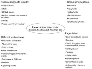
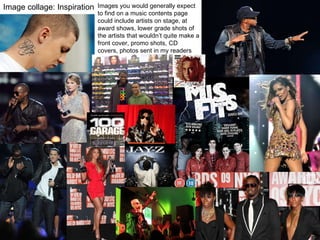
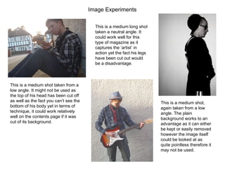
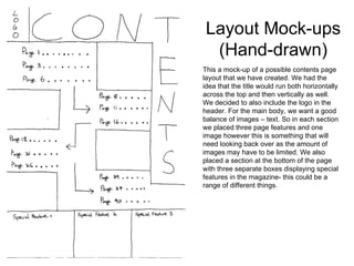
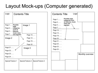
Contents Page Planning
Ideas:   Articles (titles), fonts,  Colours, headings/sub-headings etc. Colour scheme ideas: Red/black Navy/white Yellow/white Red/black/white Purple/white Sky blue/navy/white Possible images to include:  Image of editor Artists CD/DVD covers Random pictures from events of the month Adverts Photos sent in from ‘readers’ Different section ideas:  The months contributors  Album of the week  Editors corner Issue number/date Random images of the months events Best buys e.g. DVDs etc. Reviews Upcoming events Pages listed: Cover story (double spread) Regulars Top 50 Songs you must download before you die Monthly review Fan page Official charts Upcoming artists Concert/festival guide An hour with… (random celebrity)
Image collage: Inspiration Images you would generally expect to find on a music contents page could include artists on stage, at award shows, lower grade shots of the artists that wouldn’t quite make a front cover, promo shots, CD covers, photos sent in my readers etc.
Image Experiments  This is a medium shot taken from a low angle. It might not be used as the top of his head has been cut off as well as the fact you can’t see the bottom of his body yet in terms of technique, it could work relatively well on the contents page if it was cut of its background. This is a medium shot, again taken from a low angle. The plain background works to an advantage as it can either be kept or easily removed however the image itself could be looked at as quite pointless therefore it may not be used. This is a medium long shot taken a neutral angle. It could work well for this type of magazine as it captures the ‘artist’ in action yet the fact his legs have been cut out would be a disadvantage.
Layout Mock-ups (Hand-drawn) This a mock-up of a possible contents page layout that we have created. We had the idea that the title would run both horizontally across the top and then vertically as well. We decided to also include the logo in the header. For the main body, we want a good balance of images – text. So in each section we placed three page features and one image however this is something that will need looking back over as the amount of images may have to be limited. We also placed a section at the bottom of the page with three separate boxes displaying special features in the magazine- this could be a range of different things.
Layout Mock-ups (Computer generated) Logo Contents Title Page 1…… Page 2…… Page 3…… Page 10…… Page 12…… Page 16…… Page 21…… Page 22…… Page 23…… Special Feature 1 Special Feature 3 Special Feature 2 Contents Title Logo Page 1…… Page 2…… Page 3…… Page 7…… Page 10…… Page 12…… Page 16…… Page 20…… Page 21…… Page 22…… Page 23…… Page 24…… Page 7…… Page 20…… Page 24…… Monthly overview Image 1 Image 2 Image 3 Possible page categories such as features, music news and regulars. Possible page categories such as features, music news and regulars.

Contents Page Planning

  • 1.
  • 2.
    Ideas: Articles (titles), fonts, Colours, headings/sub-headings etc. Colour scheme ideas: Red/black Navy/white Yellow/white Red/black/white Purple/white Sky blue/navy/white Possible images to include: Image of editor Artists CD/DVD covers Random pictures from events of the month Adverts Photos sent in from ‘readers’ Different section ideas: The months contributors Album of the week Editors corner Issue number/date Random images of the months events Best buys e.g. DVDs etc. Reviews Upcoming events Pages listed: Cover story (double spread) Regulars Top 50 Songs you must download before you die Monthly review Fan page Official charts Upcoming artists Concert/festival guide An hour with… (random celebrity)
  • 3.
    Image collage: InspirationImages you would generally expect to find on a music contents page could include artists on stage, at award shows, lower grade shots of the artists that wouldn’t quite make a front cover, promo shots, CD covers, photos sent in my readers etc.
  • 4.
    Image Experiments This is a medium shot taken from a low angle. It might not be used as the top of his head has been cut off as well as the fact you can’t see the bottom of his body yet in terms of technique, it could work relatively well on the contents page if it was cut of its background. This is a medium shot, again taken from a low angle. The plain background works to an advantage as it can either be kept or easily removed however the image itself could be looked at as quite pointless therefore it may not be used. This is a medium long shot taken a neutral angle. It could work well for this type of magazine as it captures the ‘artist’ in action yet the fact his legs have been cut out would be a disadvantage.
  • 5.
    Layout Mock-ups (Hand-drawn)This a mock-up of a possible contents page layout that we have created. We had the idea that the title would run both horizontally across the top and then vertically as well. We decided to also include the logo in the header. For the main body, we want a good balance of images – text. So in each section we placed three page features and one image however this is something that will need looking back over as the amount of images may have to be limited. We also placed a section at the bottom of the page with three separate boxes displaying special features in the magazine- this could be a range of different things.
  • 6.
    Layout Mock-ups (Computergenerated) Logo Contents Title Page 1…… Page 2…… Page 3…… Page 10…… Page 12…… Page 16…… Page 21…… Page 22…… Page 23…… Special Feature 1 Special Feature 3 Special Feature 2 Contents Title Logo Page 1…… Page 2…… Page 3…… Page 7…… Page 10…… Page 12…… Page 16…… Page 20…… Page 21…… Page 22…… Page 23…… Page 24…… Page 7…… Page 20…… Page 24…… Monthly overview Image 1 Image 2 Image 3 Possible page categories such as features, music news and regulars. Possible page categories such as features, music news and regulars.