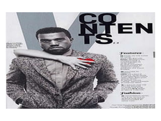
Contents Page Analysis 2
By Nishat Aziz.
This is the contents page of ā€˜Vibe’ magazine. Featured on this
contents page is American rapper Kanye West.
The main image is a mid-shot of Kanye which allows us to see
his body and his head. He is posed with his hands in his
pockets and his head slightly slanted down. One of the main
features that stand out in this main image is the hand across
him with the red heart. This is significant as it can relate to the
reader as it is trying to win over the reader to get them to buy
it. Also the colours contrast with each other. The white, blue
and grey which are very dull colours suggest unhappiness,
depression and misery whereas the red suggests passion, love
and blood. Finally, the red heart could be a reference to his
album cover for his album ā€˜808s & Heartbreak’.
The contents listing is written in a very fancy text which
makes it almost look like its been done with a calligraphy
pen because of the extended ends to letters. Also the
contents is actually quite vague from how they have only
written about 4 or 5 of the magazines featured content.
Vibe have not only thought about the music aspect, but
they have included a section about fashion. This is clever
as not only have they got Kanye to dress fashionably but
fashion is an issue that would interest the target
audience.
The master head that reads ā€˜Contents’ is
different to other content pages as the title is
broken down. It makes it look unique. Also, even
though it is black with the dull colours on the
page it makes it have a large impact as the black
stands out against the grey.
The colour pallet used on this contents page is
very vague. They have used white, grey and blue
which are very dull colours but the black text
makes it stand out as well as the red heart which
is being held by another hand across Kanyes
chest. This could emphasise that someone has
his heart.

Contents page analysis 2

  • 1.
    Contents Page Analysis2 By Nishat Aziz.
  • 3.
    This is thecontents page of ā€˜Vibe’ magazine. Featured on this contents page is American rapper Kanye West. The main image is a mid-shot of Kanye which allows us to see his body and his head. He is posed with his hands in his pockets and his head slightly slanted down. One of the main features that stand out in this main image is the hand across him with the red heart. This is significant as it can relate to the reader as it is trying to win over the reader to get them to buy it. Also the colours contrast with each other. The white, blue and grey which are very dull colours suggest unhappiness, depression and misery whereas the red suggests passion, love and blood. Finally, the red heart could be a reference to his album cover for his album ā€˜808s & Heartbreak’.
  • 4.
    The contents listingis written in a very fancy text which makes it almost look like its been done with a calligraphy pen because of the extended ends to letters. Also the contents is actually quite vague from how they have only written about 4 or 5 of the magazines featured content. Vibe have not only thought about the music aspect, but they have included a section about fashion. This is clever as not only have they got Kanye to dress fashionably but fashion is an issue that would interest the target audience.
  • 5.
    The master headthat reads ā€˜Contents’ is different to other content pages as the title is broken down. It makes it look unique. Also, even though it is black with the dull colours on the page it makes it have a large impact as the black stands out against the grey.
  • 6.
    The colour palletused on this contents page is very vague. They have used white, grey and blue which are very dull colours but the black text makes it stand out as well as the red heart which is being held by another hand across Kanyes chest. This could emphasise that someone has his heart.