
Recommended
More Related Content
What's hot
What's hot (18)
Similar to Codes and conventions contents page
Similar to Codes and conventions contents page (20)
More from PaigeRebecca
Recently uploaded
Recently uploaded (20)
Codes and conventions contents page
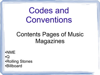
- 1. Codes and Conventions Contents Pages of Music Magazines ●NME ●Q ●Rolling Stones ●Billboard
- 2. Title – includes magazine logo, familiarises reader, bold font stands out, keeps to traditional house style, date informs readers of how old issue is Sub-Categorises – ease of navigation, page numbering in red (stands out), smaller lettering but same font (easily recognisable as NME) Arrow – encourages reader to turn the page over, keeps with house style, white on red stands out Subscription – conventionally on left hand side, yellow stands against black, bold font, different typography, image of next issue, entices the reader to subscribe, 'just £5.57' makes reader feel like they're getting a deal Column – band index, wide range of artists to attract wider audience, keeps to house style, opposite of text on right, red text, black numbering Main Image – Conventionally the same artist that's on the front cover Text – provides insight into the main article, makes you want to read on
- 3. Title – familiar logo, sets house style, conventional placement, 'contents' clearly tells you what you're reading Sub-categories - ease of navigation, page numbering in red (stands out), smaller lettering (text), 3 distinct sections, 'features' and 'every month' follow the conventional house style, shows they're conventionally on contents pages, 'Oasis special' is written in gold instead of red, showing rarity and uniqueness (a one of special) Main Image – conventionally the same artist that's on the front cover, takes up a large proportion of the page Date/Issue Number – tells you how up to date you are, includes magazine website, increase circulation Pull Quote - entices & intrigues reader, creates hermeneutic question (want to know what he's done), gives personal feel to readers (uses and grats)
- 4. Masthead – RS tells reader it's by Rolling Stones, 1167 is the issue number, tells you how up to date you are Title/Slogan – familiar, tells readers at a glance what's on the page Main Image – medium close-up, artist on image unconventionally isn't the featured front cover artist, Amy Heidemann (artist) is looking into the distance, looks like we're watching her through a window, mise en scene – wearing a lot of make-up & nice clothes, unnatural pose, subtly suggestive, attractive to male gaze (Mulvey) Sub-categories - ease of navigation, page numbering in grey (keeps to house style), smaller lettering (text), 4 distinct sections, follow the house style, this shows that they're conventionally on the contents page Question – creates hermeneutic code (Barthes), makes reader want to read on Sub-category – additional section, promotes 2 female artists – Adele (front cover) & Karmin (contents image), larger typography show uniqueness House Style – black, grey & red
- 5. Masthead – Billboard reminds reader of magazine, issue number, tells you how up to date you are, contents tells you what's on the pageSidebar – current music in charts, represents type of artists they want in magazine, numerous colours, doesn't follow house style, conventional placement & a constant feature Sub-section – follows house style, advertising other aspects of the magazine, date tells you how current the issue is Main Image – mid shot, direct mode of address, creates personal relationship with reader & connects with text (uses & grats), grey, black and white colour scheme = professionalism, unconventionally not the front cover artist as main image, 'Benny Blanco anchors image, 22 shows what page he's on 3 Smaller Images – frame the top of page, show 3 different genres, artists' name anchors images & page numbers inform you where to go Sub-categories - ease of navigation, keeps house style, small lettering, title's bold, 4 distinct sections, shows they're conventionally on contents page
- 6. Summary of Contents Pages ● Conventionally has a masthead which includes magazine logo, the word 'contents' and issue number ● Typically 1 'large' image in the right hand corner – doesn't take up a lot of space but tends to relate to main article ● Other smaller images often frame the larger image which makes the page more interesting ● Conventionally the text is placed into sub-categories surrounding the image(s), creating a more clean & professional feel ● Usually follows the house style created in the front cover ● Page numbers are conventionally in a larger, bold font to make it easier to navigate
- 7. Summary of Contents Pages ● Conventionally has a masthead which includes magazine logo, the word 'contents' and issue number ● Typically 1 'large' image in the right hand corner – doesn't take up a lot of space but tends to relate to main article ● Other smaller images often frame the larger image which makes the page more interesting ● Conventionally the text is placed into sub-categories surrounding the image(s), creating a more clean & professional feel ● Usually follows the house style created in the front cover ● Page numbers are conventionally in a larger, bold font to make it easier to navigate