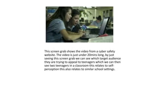
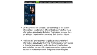
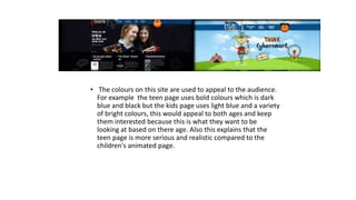
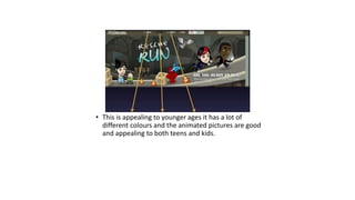
Competitor analysis
This screen grab shows the video from a cyber safety 
website. The video is just under 20mins long, by just 
seeing this screen grab we can see which target audience 
they are trying to appeal to teenagers which we can then 
see two teenagers in a classroom this relates to self-perception 
this also relates to similar school settings.
• This website shows where the girls upload there cyber bullying 
messages and images, the website is blogger.com. This site is 
used quite a lot by many high schools, the girls who use this 
know that this site is used by a lot of schools so they know a lot 
of people will see it, consequently this makes the video 
campaign more understandable for the audience. 
• The story in this video can also help the target audience as it 
involves the relationship between boys and girls which is very 
common at that age for a teenager, it also shows the how the 
teenagers are effected in a physical and mental state from just 
posting pictures online teaches them a lesson.
• On this website we can see a bar at the top of the screen 
which allows you to select different category's to find more 
information about cyber bullying. This is good because they 
got a bigger target audience making their product bigger. 
• The websites provides their target audience with more 
information about cyber-bullying. The language which is used 
in this site is very easy to understand and it is also been 
written in first person, this targets the audience personally 
because it makes them think and gather their thoughts.
• The colours on this site are used to appeal to the audience. 
For example the teen page uses bold colours which is dark 
blue and black but the kids page uses light blue and a variety 
of bright colours, this would appeal to both ages and keep 
them interested because this is what they want to be 
looking at based on there age. Also this explains that the 
teen page is more serious and realistic compared to the 
children's animated page.
• This website is not appealing. The website has no colour, no 
images and looks boring and vague which is not appealing to 
there target audience. The way they are promoting internet 
safety to kids is not good as it even looks boring to read. Having 
no videos or anything like in the other campaigns. This is very 
unappealing to kids and teens.
• This is appealing to younger ages it has a lot of 
different colours and the animated pictures are good 
and appealing to both teens and kids.

Competitor analysis

  • 1.
  • 2.
    This screen grabshows the video from a cyber safety website. The video is just under 20mins long, by just seeing this screen grab we can see which target audience they are trying to appeal to teenagers which we can then see two teenagers in a classroom this relates to self-perception this also relates to similar school settings.
  • 3.
    • This websiteshows where the girls upload there cyber bullying messages and images, the website is blogger.com. This site is used quite a lot by many high schools, the girls who use this know that this site is used by a lot of schools so they know a lot of people will see it, consequently this makes the video campaign more understandable for the audience. • The story in this video can also help the target audience as it involves the relationship between boys and girls which is very common at that age for a teenager, it also shows the how the teenagers are effected in a physical and mental state from just posting pictures online teaches them a lesson.
  • 4.
    • On thiswebsite we can see a bar at the top of the screen which allows you to select different category's to find more information about cyber bullying. This is good because they got a bigger target audience making their product bigger. • The websites provides their target audience with more information about cyber-bullying. The language which is used in this site is very easy to understand and it is also been written in first person, this targets the audience personally because it makes them think and gather their thoughts.
  • 5.
    • The colourson this site are used to appeal to the audience. For example the teen page uses bold colours which is dark blue and black but the kids page uses light blue and a variety of bright colours, this would appeal to both ages and keep them interested because this is what they want to be looking at based on there age. Also this explains that the teen page is more serious and realistic compared to the children's animated page.
  • 6.
    • This websiteis not appealing. The website has no colour, no images and looks boring and vague which is not appealing to there target audience. The way they are promoting internet safety to kids is not good as it even looks boring to read. Having no videos or anything like in the other campaigns. This is very unappealing to kids and teens.
  • 7.
    • This isappealing to younger ages it has a lot of different colours and the animated pictures are good and appealing to both teens and kids.