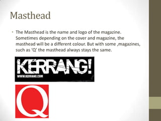
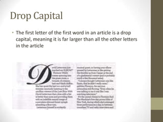
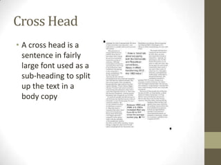
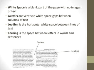
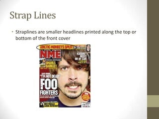
Magazine Key Terms
Masthead
• The Masthead is the name and logo of the magazine.
Sometimes depending on the cover and magazine, the
masthead will be a different colour. But with some ,magazines,
such as ‘Q’ the masthead always stays the same.
Fonts
• Serif Fonts have
little bars on the
ends of their
letters and are
used for small
text, like the body
copy

• Sans Serif
Fonts don’t
have little bars
and are used
for larger texts
like Mastheads
Body Copy
• The Body Copy is the main body of text in written
articles. It is usually printed in a small, serif font and
divided into columns
Drop Capital
• The first letter of the first word in an article is a drop
capital, meaning it is far larger than all the other letters
in the article
Cross Head
• A cross head is a
sentence in fairly
large font used as a
sub-heading to split
up the text in a
body copy
• White Space is a blank part of the page with no images
or text
• Gutters are ventricle white space gaps between
columns of text
• Leading is the horizontal white space between lines of
text
• Kerning is the space between letters in words and
sentences
Gutters

Leading
Strap Lines
• Straplines are smaller headlines printed along the top or
bottom of the front cover
• House Style is a magazines distinctive style that
helps it stand out against its competitors
• Banners are text that stands out against it
background due to the text and the background
contrasting colours
• Mode Of Address is how the magazines directly
speaks to it audience, usually with a rhetorical
question
• Anchorage is text that gives context or
significance to an image and visa versa
• By-Lines are the name of the articles writer
• Picture Credits are the source of the photo’s or
who took them

Magazine key terms

  • 1.
  • 2.
    Masthead • The Mastheadis the name and logo of the magazine. Sometimes depending on the cover and magazine, the masthead will be a different colour. But with some ,magazines, such as ‘Q’ the masthead always stays the same.
  • 3.
    Fonts • Serif Fontshave little bars on the ends of their letters and are used for small text, like the body copy • Sans Serif Fonts don’t have little bars and are used for larger texts like Mastheads
  • 4.
    Body Copy • TheBody Copy is the main body of text in written articles. It is usually printed in a small, serif font and divided into columns
  • 5.
    Drop Capital • Thefirst letter of the first word in an article is a drop capital, meaning it is far larger than all the other letters in the article
  • 6.
    Cross Head • Across head is a sentence in fairly large font used as a sub-heading to split up the text in a body copy
  • 7.
    • White Spaceis a blank part of the page with no images or text • Gutters are ventricle white space gaps between columns of text • Leading is the horizontal white space between lines of text • Kerning is the space between letters in words and sentences Gutters Leading
  • 8.
    Strap Lines • Straplinesare smaller headlines printed along the top or bottom of the front cover
  • 9.
    • House Styleis a magazines distinctive style that helps it stand out against its competitors • Banners are text that stands out against it background due to the text and the background contrasting colours • Mode Of Address is how the magazines directly speaks to it audience, usually with a rhetorical question • Anchorage is text that gives context or significance to an image and visa versa • By-Lines are the name of the articles writer • Picture Credits are the source of the photo’s or who took them