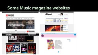
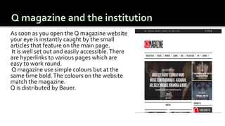
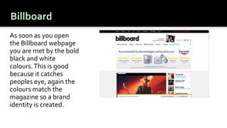
This document discusses conventions used in music magazines to indicate their genre to readers. It provides examples of conventions for different genres, such as dark colors and leather for rock magazines and ball gowns for classical. Codes and conventions allow the audience to identify the magazine's genre just from the cover. Specific magazines are also analyzed, such as Kerrang using a rock star pose on the cover to indicate their genre. Throughout, the document emphasizes how conventions like images, colors and layouts help classify a magazine's musical focus for readers.

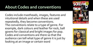
![MAGAZINE 1
In billboard [ an American
magazine] the artist is stood side
on whilst looking at the camera:
this is a front cover convention.
This shows others that her music
is mainly ballads and soft pop.The
background is good because it is
plain and it is a good background
for a pop artist.
MAGAZINE 2
In Kerrang the artist is stood like
he is playing and not looking at
the camera.This shows that he is
more of the “Rebel” character. He
is rock star and the way he is
dressed, his posture and his
expression reflects his music.](https://image.slidesharecdn.com/codesandconventions-media-160923090946/85/Codes-and-Conventions-4-320.jpg)