Download to read offline


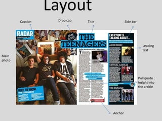


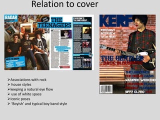
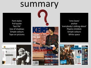


This document provides an analysis of the layout, design, tone, and intended audience of a magazine spread about musical genres like punk rock from the 1970s. It examines elements like the use of grunge fonts, black and white photographs, pull quotes, captions, and a simple color scheme to create a style evoking the gritty aesthetic of punk rock music. The summary describes how the spread aims to appeal both to younger, newer audiences as well as older, existing fans through its mix of biographical artist profiles and popular music reviews.


