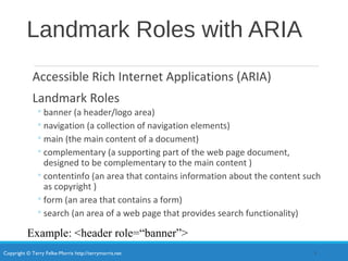
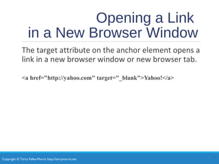
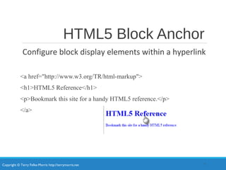
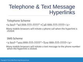
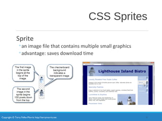
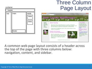
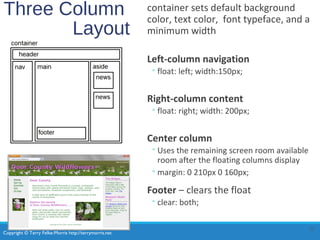
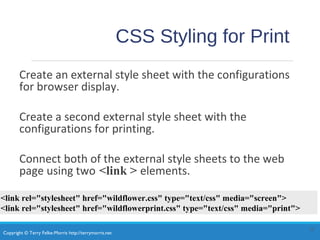
Copyright © Terry Felke-Morris http://terrymorris.net
Web Development & Design
Foundations with HTML5
8th
Edition
CHAPTER 7
KEY CONCEPTS
1
Copyright © Terry Felke-Morris
Copyright © Terry Felke-Morris http://terrymorris.net
Learning
Outcomes
In this chapter, you will learn how to ...
•Code relative hyperlinks to web pages in folders within a website
•Configure a hyperlink to a named fragment internal to a web page
•Provide for accessibility by configuring ARIA landmark roles for structural HTML
elements
•Configure images with CSS sprites
•Configure a three-column page layout using CSS
•Configure CSS for printing
•Describe mobile design best practices
•Configure web pages for mobile display using the viewport meta tag
•Apply responsive web design techniques with CSS3 media queries and flexible images
2
Copyright © Terry Felke-Morris http://terrymorris.net
More on
Relative Linking
<a href="contact.html">Contact</a>
<a href="rooms/canyon.html">Canyon</a>
<a href="../index.html">Home</a>
<a href="../events/weekend.html">Weekend</a>
3
Relative links from the Home page:
index.html
Relative links from the Canyon page:
rooms/canyon.html
Copyright © Terry Felke-Morris http://terrymorris.net
HTML Linking to Fragment
Identifiers
ď‚—A link to a part of a web page
ď‚—Also called named fragments, fragment ids
ď‚—Two components:
1. The element that identifies the named fragment of a
web page. This requires the id attribute.
<div id=“top”> ….. </div>
2. The anchor tag that links to the named fragment of a
web page. This uses the href attribute.
<a href=“#top”>Back to Top</a>
4
Note the use of the # in the anchor tag!
Copyright © Terry Felke-Morris http://terrymorris.net
Landmark Roles with ARIA
Accessible Rich Internet Applications (ARIA)
Landmark Roles
â—¦banner (a header/logo area)
â—¦navigation (a collection of navigation elements)
â—¦main (the main content of a document)
â—¦complementary (a supporting part of the web page document,
designed to be complementary to the main content )
â—¦contentinfo (an area that contains information about the content such
as copyright )
â—¦form (an area that contains a form)
â—¦search (an area of a web page that provides search functionality)
5
Example: <header role=“banner”>
Copyright © Terry Felke-Morris http://terrymorris.net
Opening a Link
in a New Browser Window
The target attribute on the anchor element opens a
link in a new browser window or new browser tab.
<a href="http://yahoo.com" target="_blank">Yahoo!</a>
6
Copyright © Terry Felke-Morris http://terrymorris.net
HTML5 Block Anchor
Configure block display elements within a hyperlink
<a href="http://www.w3.org/TR/html-markup">
<h1>HTML5 Reference</h1>
<p>Bookmark this site for a handy HTML5 reference.</p>
</a>
7
Copyright © Terry Felke-Morris http://terrymorris.net
Telephone & Text Message
Hyperlinks
Telephone Scheme
<a href="tel:888-555-5555">Call 888-555-5555</a>
Many mobile browsers will initiate a phone call when the hyperlink is
clicked.
SMS Scheme
<a href="sms:888-555-5555">Text 888-555-5555</a>
Many mobile browsers will initiate a text message to the phone number
when the hyperlink is clicked.
8
Copyright © Terry Felke-Morris http://terrymorris.net
CSS Sprites
Sprite
â—¦an image file that contains multiple small graphics
â—¦advantage: saves download time
9
Copyright © Terry Felke-Morris http://terrymorris.net
Checkpoint
1. Describe a reason to organize the files in a website using
folders and subfolders.
2. Which attribute configures a hyperlink to open the file
in a new browser window or tab?
3. State an advantage of using CSS sprites in a website.
Copyright © Terry Felke-Morris http://terrymorris.net
Three Column
Page Layout
A common web page layout consists of a header across
the top of the page with three columns below:
navigation, content, and sidebar.
11
Copyright © Terry Felke-Morris http://terrymorris.net
Three Column
Layout
container sets default background
color, text color, font typeface, and a
minimum width
Left-column navigation
â—¦float: left; width:150px;
Right-column content
â—¦float: right; width: 200px;
Center column
â—¦Uses the remaining screen room available
room after the floating columns display
â—¦margin: 0 210px 0 160px;
Footer – clears the float
â—¦clear: both;
12
Copyright © Terry Felke-Morris http://terrymorris.net
CSS Styling for Print
Create an external style sheet with the configurations
for browser display.
Create a second external style sheet with the
configurations for printing.
Connect both of the external style sheets to the web
page using two <link > elements.
13
<link rel="stylesheet" href="wildflower.css" type="text/css" media="screen">
<link rel="stylesheet" href="wildflowerprint.css" type="text/css" media="print">
Copyright © Terry Felke-Morris http://terrymorris.net
Print Styling Best Practices
Hide non-essential content
Example:
#nav { display: none; }
Configure font size and color for printing
â—¦Use pt font sizes, use dark text color
Control page breaks
Example:
.newpage { page-break-before: always; }
Print URLs for hyperlinks
Example:
#sidebar a:after { content: " (" attr(href) ") "; }
14
Copyright © Terry Felke-Morris http://terrymorris.net
Mobile Web Limitations
Small Screen Size
Low bandwidth
Limited fonts
Limited color
Awkward controls
Lack of Flash support
Limited processor and memory
Cost per kilobyte
Copyright © Terry Felke-Morris http://terrymorris.net
Mobile Web Design Best
Practices
ď‚—Recommended by the W3C
ď‚—http://www.w3.org/TR/mobile-bp
ď‚—http://www.w3.org/2007/02/mwbp_flip_cards.html
ď‚—Optimize Layout, Navigation, Graphics,
and Text for Mobile Use
ď‚—Design for One Web
Copyright © Terry Felke-Morris http://terrymorris.net
Optimize Layout for Mobile
Use
ď‚—Single column design
ď‚—Limit scrolling to one direction
ď‚—Use heading elements
ď‚—Use lists
ď‚—Avoid using tables
ď‚—Provide labels for form controls
ď‚—Avoid using pixel units in style sheets
ď‚—Avoid absolute positioning in style sheets
ď‚—Hide content that is not essential for mobile use.
Copyright © Terry Felke-Morris http://terrymorris.net
Optimize Navigation for Mobile
Use
ď‚—Provide minimal navigation
near the top of the page
ď‚—Provide consistent navigation
ď‚—Avoid hyperlinks that open files
in new windows or pop-up
windows
ď‚—Try to balance both the number
of hyperlinks on a page and the
number of levels needed to
access information
Copyright © Terry Felke-Morris http://terrymorris.net
Optimize Graphics for Mobile
Use
ď‚—Avoid displaying images that are
wider than the screen width
ď‚—Configure alternate, small
optimized background images
ď‚—Some mobile browsers will
downsize all images, so avoid using
images that contain text
ď‚—Avoid the use of large graphic
images
ď‚—Specify the size of images
ď‚—Provide alternate text for graphics
and other non-text elements.
Copyright © Terry Felke-Morris http://terrymorris.net
Optimize Text for Mobile
Use
ď‚—Configure good contrast
between text and background
colors
ď‚—Use common font typefaces
ď‚—Configure font size with em
units or percentages
ď‚—Use a short, descriptive page
title
Copyright © Terry Felke-Morris http://terrymorris.net
Viewport Meta Tag
Default action for most mobile devices
is to zoom out and scale the web page
Viewport Meta Tag
Created as an Apple extension to configure
display on mobile devices
Configures width and initial scale of browser viewport
<meta name="viewport" content="width=device-width, initial-scale=1.0">
21
Copyright © Terry Felke-Morris http://terrymorris.net
CSS3 Media Queries
Media Query
â—¦Determines the capability of the mobile device,
such as screen resolution
â—¦Directs the browser to styles configured
specifically for those capabilities
Example with link tag
<link href="lighthousemobile.css" rel="stylesheet"
media="only all and (max-device-width: 480px)">
Example within CSS
@media only all and (max-width: 768px) {
}
22
Copyright © Terry Felke-Morris http://terrymorris.net
Flexible Images
Edit HTML:
remove height and width attributes
CSS:
img { max-width: 100%;
height: auto; }
23
Copyright © Terry Felke-Morris http://terrymorris.net
Responsive Images
HTML 5.1 Picture Element
<picture>
<source media="(min-width: 1200px)" srcset="large.jpg">
<source media="(min-width: 800px)" srcset="medium.jpg">
<source media="(min-width: 320px)" srcset="small.jpg">
<img src="fallback.jpg" alt="waterwheel">
</picture>
24
Copyright © Terry Felke-Morris http://terrymorris.net
Responsive Images
HTML 5.1 sizes & srcset
Attributes
<img src="fallback.jpg"
sizes="100vw"
srcset="large.jpg 1200w, medium.jpg 800w, small.jpg 320w"
alt="waterwheel">
25
Copyright © Terry Felke-Morris http://terrymorris.net
Testing Mobile Display
Options
•Test with a mobile device
•Emulators
• Opera Mobile Emulator
• Mobilizer
• iPhone Emulator
•Test with a Desktop Browser
•Install an iOS or Android SDK
26
Copyright © Terry Felke-Morris http://terrymorris.net
CSS Flexible Box Layout
Module
•Referred to as “flexbox”
•GREAT way to easily configure multi-column page layout
•elements contained within a flex container can be configured either
horizontally or vertically in a flexible manner with flexible sizing
•Flexbox is not yet well-supported by browsers.
•Check http://caniuse.com/flexbox for the current level of browser
support.
•Common Properties used with flexbox:
display flex
flex-direction order
flex-wrap justify-content
27
Copyright © Terry Felke-Morris http://terrymorris.net
Using Flexbox
Configure a flexible container “flex container”
Configure the direction of the flex
Example:
#demo { display: -webkit-flex;
display: flex;
-webkit-flex-direction: row;
flex-direction: row; }
Adjust the proportion of the “flex item” elements in the container
Example:
nav { -webkit-flex: 1; flex: 1; }
main { -webkit-flex: 7; flex:7; }
aside { -webkit-flex:2; flex: 2 }
28
Copyright © Terry Felke-Morris http://terrymorris.net
CSS Debugging
Tips
•Manually check syntax errors
•Use W3C CSS Validator to check syntax errors
• http://jigsaw.w3.org/css-validator/
•Configure temporary background colors
•Configure temporary borders
•Use CSS comments to find the unexpected
/* the browser ignores this code */
•Don’t expect your pages to look exactly the same in all
browsers!
•Be patient!
29
Copyright © Terry Felke-Morris http://terrymorris.net
Checkpoint
1. State an advantage of using CSS to style for print.
2. Describe a design consideration when configuring a web
page for mobile display.
3. Describe coding techniques that will configure an image
with a flexible display.
30
Copyright © Terry Felke-Morris http://terrymorris.net
Summary
This chapter introduced you to a variety of
topics related to hyperlinks, page layout,
and configuring responsive web pages that
display well on desktop browsers and
mobile devices.
31

Chapter7

  • 1.
    Copyright © TerryFelke-Morris http://terrymorris.net Web Development & Design Foundations with HTML5 8th Edition CHAPTER 7 KEY CONCEPTS 1 Copyright © Terry Felke-Morris
  • 2.
    Copyright © TerryFelke-Morris http://terrymorris.net Learning Outcomes In this chapter, you will learn how to ... •Code relative hyperlinks to web pages in folders within a website •Configure a hyperlink to a named fragment internal to a web page •Provide for accessibility by configuring ARIA landmark roles for structural HTML elements •Configure images with CSS sprites •Configure a three-column page layout using CSS •Configure CSS for printing •Describe mobile design best practices •Configure web pages for mobile display using the viewport meta tag •Apply responsive web design techniques with CSS3 media queries and flexible images 2
  • 3.
    Copyright © TerryFelke-Morris http://terrymorris.net More on Relative Linking <a href="contact.html">Contact</a> <a href="rooms/canyon.html">Canyon</a> <a href="../index.html">Home</a> <a href="../events/weekend.html">Weekend</a> 3 Relative links from the Home page: index.html Relative links from the Canyon page: rooms/canyon.html
  • 4.
    Copyright © TerryFelke-Morris http://terrymorris.net HTML Linking to Fragment Identifiers A link to a part of a web page Also called named fragments, fragment ids Two components: 1. The element that identifies the named fragment of a web page. This requires the id attribute. <div id=“top”> ….. </div> 2. The anchor tag that links to the named fragment of a web page. This uses the href attribute. <a href=“#top”>Back to Top</a> 4 Note the use of the # in the anchor tag!
  • 5.
    Copyright © TerryFelke-Morris http://terrymorris.net Landmark Roles with ARIA Accessible Rich Internet Applications (ARIA) Landmark Roles ◦banner (a header/logo area) ◦navigation (a collection of navigation elements) ◦main (the main content of a document) ◦complementary (a supporting part of the web page document, designed to be complementary to the main content ) ◦contentinfo (an area that contains information about the content such as copyright ) ◦form (an area that contains a form) ◦search (an area of a web page that provides search functionality) 5 Example: <header role=“banner”>
  • 6.
    Copyright © TerryFelke-Morris http://terrymorris.net Opening a Link in a New Browser Window The target attribute on the anchor element opens a link in a new browser window or new browser tab. <a href="http://yahoo.com" target="_blank">Yahoo!</a> 6
  • 7.
    Copyright © TerryFelke-Morris http://terrymorris.net HTML5 Block Anchor Configure block display elements within a hyperlink <a href="http://www.w3.org/TR/html-markup"> <h1>HTML5 Reference</h1> <p>Bookmark this site for a handy HTML5 reference.</p> </a> 7
  • 8.
    Copyright © TerryFelke-Morris http://terrymorris.net Telephone & Text Message Hyperlinks Telephone Scheme <a href="tel:888-555-5555">Call 888-555-5555</a> Many mobile browsers will initiate a phone call when the hyperlink is clicked. SMS Scheme <a href="sms:888-555-5555">Text 888-555-5555</a> Many mobile browsers will initiate a text message to the phone number when the hyperlink is clicked. 8
  • 9.
    Copyright © TerryFelke-Morris http://terrymorris.net CSS Sprites Sprite ◦an image file that contains multiple small graphics ◦advantage: saves download time 9
  • 10.
    Copyright © TerryFelke-Morris http://terrymorris.net Checkpoint 1. Describe a reason to organize the files in a website using folders and subfolders. 2. Which attribute configures a hyperlink to open the file in a new browser window or tab? 3. State an advantage of using CSS sprites in a website.
  • 11.
    Copyright © TerryFelke-Morris http://terrymorris.net Three Column Page Layout A common web page layout consists of a header across the top of the page with three columns below: navigation, content, and sidebar. 11
  • 12.
    Copyright © TerryFelke-Morris http://terrymorris.net Three Column Layout container sets default background color, text color, font typeface, and a minimum width Left-column navigation ◦float: left; width:150px; Right-column content ◦float: right; width: 200px; Center column ◦Uses the remaining screen room available room after the floating columns display ◦margin: 0 210px 0 160px; Footer – clears the float ◦clear: both; 12
  • 13.
    Copyright © TerryFelke-Morris http://terrymorris.net CSS Styling for Print Create an external style sheet with the configurations for browser display. Create a second external style sheet with the configurations for printing. Connect both of the external style sheets to the web page using two <link > elements. 13 <link rel="stylesheet" href="wildflower.css" type="text/css" media="screen"> <link rel="stylesheet" href="wildflowerprint.css" type="text/css" media="print">
  • 14.
    Copyright © TerryFelke-Morris http://terrymorris.net Print Styling Best Practices Hide non-essential content Example: #nav { display: none; } Configure font size and color for printing ◦Use pt font sizes, use dark text color Control page breaks Example: .newpage { page-break-before: always; } Print URLs for hyperlinks Example: #sidebar a:after { content: " (" attr(href) ") "; } 14
  • 15.
    Copyright © TerryFelke-Morris http://terrymorris.net Mobile Web Limitations Small Screen Size Low bandwidth Limited fonts Limited color Awkward controls Lack of Flash support Limited processor and memory Cost per kilobyte
  • 16.
    Copyright © TerryFelke-Morris http://terrymorris.net Mobile Web Design Best Practices Recommended by the W3C http://www.w3.org/TR/mobile-bp http://www.w3.org/2007/02/mwbp_flip_cards.html Optimize Layout, Navigation, Graphics, and Text for Mobile Use Design for One Web
  • 17.
    Copyright © TerryFelke-Morris http://terrymorris.net Optimize Layout for Mobile Use Single column design Limit scrolling to one direction Use heading elements Use lists Avoid using tables Provide labels for form controls Avoid using pixel units in style sheets Avoid absolute positioning in style sheets Hide content that is not essential for mobile use.
  • 18.
    Copyright © TerryFelke-Morris http://terrymorris.net Optimize Navigation for Mobile Use Provide minimal navigation near the top of the page Provide consistent navigation Avoid hyperlinks that open files in new windows or pop-up windows Try to balance both the number of hyperlinks on a page and the number of levels needed to access information
  • 19.
    Copyright © TerryFelke-Morris http://terrymorris.net Optimize Graphics for Mobile Use Avoid displaying images that are wider than the screen width Configure alternate, small optimized background images Some mobile browsers will downsize all images, so avoid using images that contain text Avoid the use of large graphic images Specify the size of images Provide alternate text for graphics and other non-text elements.
  • 20.
    Copyright © TerryFelke-Morris http://terrymorris.net Optimize Text for Mobile Use Configure good contrast between text and background colors Use common font typefaces Configure font size with em units or percentages Use a short, descriptive page title
  • 21.
    Copyright © TerryFelke-Morris http://terrymorris.net Viewport Meta Tag Default action for most mobile devices is to zoom out and scale the web page Viewport Meta Tag Created as an Apple extension to configure display on mobile devices Configures width and initial scale of browser viewport <meta name="viewport" content="width=device-width, initial-scale=1.0"> 21
  • 22.
    Copyright © TerryFelke-Morris http://terrymorris.net CSS3 Media Queries Media Query ◦Determines the capability of the mobile device, such as screen resolution ◦Directs the browser to styles configured specifically for those capabilities Example with link tag <link href="lighthousemobile.css" rel="stylesheet" media="only all and (max-device-width: 480px)"> Example within CSS @media only all and (max-width: 768px) { } 22
  • 23.
    Copyright © TerryFelke-Morris http://terrymorris.net Flexible Images Edit HTML: remove height and width attributes CSS: img { max-width: 100%; height: auto; } 23
  • 24.
    Copyright © TerryFelke-Morris http://terrymorris.net Responsive Images HTML 5.1 Picture Element <picture> <source media="(min-width: 1200px)" srcset="large.jpg"> <source media="(min-width: 800px)" srcset="medium.jpg"> <source media="(min-width: 320px)" srcset="small.jpg"> <img src="fallback.jpg" alt="waterwheel"> </picture> 24
  • 25.
    Copyright © TerryFelke-Morris http://terrymorris.net Responsive Images HTML 5.1 sizes & srcset Attributes <img src="fallback.jpg" sizes="100vw" srcset="large.jpg 1200w, medium.jpg 800w, small.jpg 320w" alt="waterwheel"> 25
  • 26.
    Copyright © TerryFelke-Morris http://terrymorris.net Testing Mobile Display Options •Test with a mobile device •Emulators • Opera Mobile Emulator • Mobilizer • iPhone Emulator •Test with a Desktop Browser •Install an iOS or Android SDK 26
  • 27.
    Copyright © TerryFelke-Morris http://terrymorris.net CSS Flexible Box Layout Module •Referred to as “flexbox” •GREAT way to easily configure multi-column page layout •elements contained within a flex container can be configured either horizontally or vertically in a flexible manner with flexible sizing •Flexbox is not yet well-supported by browsers. •Check http://caniuse.com/flexbox for the current level of browser support. •Common Properties used with flexbox: display flex flex-direction order flex-wrap justify-content 27
  • 28.
    Copyright © TerryFelke-Morris http://terrymorris.net Using Flexbox Configure a flexible container “flex container” Configure the direction of the flex Example: #demo { display: -webkit-flex; display: flex; -webkit-flex-direction: row; flex-direction: row; } Adjust the proportion of the “flex item” elements in the container Example: nav { -webkit-flex: 1; flex: 1; } main { -webkit-flex: 7; flex:7; } aside { -webkit-flex:2; flex: 2 } 28
  • 29.
    Copyright © TerryFelke-Morris http://terrymorris.net CSS Debugging Tips •Manually check syntax errors •Use W3C CSS Validator to check syntax errors • http://jigsaw.w3.org/css-validator/ •Configure temporary background colors •Configure temporary borders •Use CSS comments to find the unexpected /* the browser ignores this code */ •Don’t expect your pages to look exactly the same in all browsers! •Be patient! 29
  • 30.
    Copyright © TerryFelke-Morris http://terrymorris.net Checkpoint 1. State an advantage of using CSS to style for print. 2. Describe a design consideration when configuring a web page for mobile display. 3. Describe coding techniques that will configure an image with a flexible display. 30
  • 31.
    Copyright © TerryFelke-Morris http://terrymorris.net Summary This chapter introduced you to a variety of topics related to hyperlinks, page layout, and configuring responsive web pages that display well on desktop browsers and mobile devices. 31