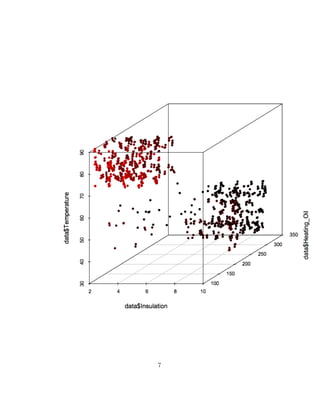
Using R in Data mining for the masses,
Chapter 4
Ulrik Hørlyk Hjort
April 5, 2014
1 Modeling
In the following text “the book” will refer to the the book: “Data Mining for
the masses”
1.1 Correlation Matrix
The only execise in chapter 4 is how to create an correlation matrix on a
data set with with Rapidminer. This is easily done in R. Fiest we import
the data set for chapter 4:
data = read.csv(‘‘Chapter04DataSet.csv’’, sep=’’,’’,header = TRUE)
The we use the buildin cor() function in R to get the correlation matrix on
our data frame:
> cor(data)
Insulation Temperature Heating_Oil Num_Occupants Avg_Age
Insulation 1.00000000 -0.79369606 0.73609688 -0.01256684 0.64298171
Temperature -0.79369606 1.00000000 -0.77365974 0.01251864 -0.67257949
Heating_Oil 0.73609688 -0.77365974 1.00000000 -0.04163508 0.84789052
Num_Occupants -0.01256684 0.01251864 -0.04163508 1.00000000 -0.04803415
Avg_Age 0.64298171 -0.67257949 0.84789052 -0.04803415 1.00000000
Home_Size 0.20071164 -0.21393926 0.38119082 -0.02253438 0.30655725
Home_Size
Insulation 0.20071164
Temperature -0.21393926
Heating_Oil 0.38119082
Num_Occupants -0.02253438
Avg_Age 0.30655725
Home_Size 1.00000000
1
which is equal to the correlation matrix shown in Figure 4-4 in the book
2
1.2 Correlation plot
Execise 9 in chapter 4 shows an example of a scatter plot between the Insu-
lation and Heating Oil attributes. A equivalent scatter plot can be done in
R in the following way:
plot(data$Insulation,data$Heating_Oil,col="blue",type="p", pch=20, cex=.5)
Which generate the following plot:1
1
Use the R help function help(plot) to get an complete list and explanation of the
different arguments it takes
3
4
To prevent the overplotting we can add jitter to the x-axis:
plot(jitter(data$Insulation),data$Heating_Oil,col=’’blue’’,type=’’p’’, pch=20, cex=.5)
5
The plotting can be made more structured by first create a subset data frame
with the attributes we wish to plot:
dd <- data.frame(jitter(data$Insulation),data$Heating_Oil)
And then:
plot(dd)
1.3 3D Scatter plot
It is possible to make 3D scatter plots in R with the library “scatterplot3D”.
If the library is not installed on the system install it with the following
command in the R environment and follow the instrctions given.
install.packages(‘‘scatterplot3d’’)
When the library is installed import it with:
library(scatterplot3d)
And create a 3D scatter plot like the one at Figure 4-9 in the book:
scatterplot3d(data$Insulation,data$Heating_Oil,data$Temperature,pch=20,highlight.3d=T)
Which gives the following plot:
6
7

Data mining for the masses, Chapter 4, Using R instead of Rapidminer

  • 1.
    Using R inData mining for the masses, Chapter 4 Ulrik Hørlyk Hjort April 5, 2014 1 Modeling In the following text “the book” will refer to the the book: “Data Mining for the masses” 1.1 Correlation Matrix The only execise in chapter 4 is how to create an correlation matrix on a data set with with Rapidminer. This is easily done in R. Fiest we import the data set for chapter 4: data = read.csv(‘‘Chapter04DataSet.csv’’, sep=’’,’’,header = TRUE) The we use the buildin cor() function in R to get the correlation matrix on our data frame: > cor(data) Insulation Temperature Heating_Oil Num_Occupants Avg_Age Insulation 1.00000000 -0.79369606 0.73609688 -0.01256684 0.64298171 Temperature -0.79369606 1.00000000 -0.77365974 0.01251864 -0.67257949 Heating_Oil 0.73609688 -0.77365974 1.00000000 -0.04163508 0.84789052 Num_Occupants -0.01256684 0.01251864 -0.04163508 1.00000000 -0.04803415 Avg_Age 0.64298171 -0.67257949 0.84789052 -0.04803415 1.00000000 Home_Size 0.20071164 -0.21393926 0.38119082 -0.02253438 0.30655725 Home_Size Insulation 0.20071164 Temperature -0.21393926 Heating_Oil 0.38119082 Num_Occupants -0.02253438 Avg_Age 0.30655725 Home_Size 1.00000000 1
  • 2.
    which is equalto the correlation matrix shown in Figure 4-4 in the book 2
  • 3.
    1.2 Correlation plot Execise9 in chapter 4 shows an example of a scatter plot between the Insu- lation and Heating Oil attributes. A equivalent scatter plot can be done in R in the following way: plot(data$Insulation,data$Heating_Oil,col="blue",type="p", pch=20, cex=.5) Which generate the following plot:1 1 Use the R help function help(plot) to get an complete list and explanation of the different arguments it takes 3
  • 4.
  • 5.
    To prevent theoverplotting we can add jitter to the x-axis: plot(jitter(data$Insulation),data$Heating_Oil,col=’’blue’’,type=’’p’’, pch=20, cex=.5) 5
  • 6.
    The plotting canbe made more structured by first create a subset data frame with the attributes we wish to plot: dd <- data.frame(jitter(data$Insulation),data$Heating_Oil) And then: plot(dd) 1.3 3D Scatter plot It is possible to make 3D scatter plots in R with the library “scatterplot3D”. If the library is not installed on the system install it with the following command in the R environment and follow the instrctions given. install.packages(‘‘scatterplot3d’’) When the library is installed import it with: library(scatterplot3d) And create a 3D scatter plot like the one at Figure 4-9 in the book: scatterplot3d(data$Insulation,data$Heating_Oil,data$Temperature,pch=20,highlight.3d=T) Which gives the following plot: 6
  • 7.