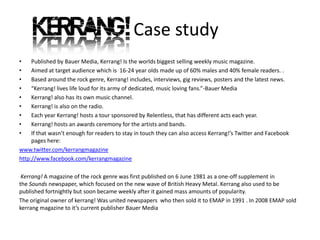
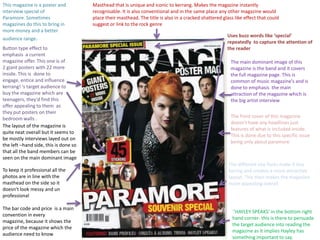
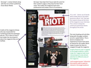
Kerrang! is a weekly British rock music magazine published by Bauer Media that targets 16-24 year olds. It includes interviews, reviews, news and posters related to rock music. This particular issue focuses exclusively on the band Paramore and features a two page spread interview with the lead singer Hayley Williams. The magazine maintains a consistent style across articles with use of fonts, colors and graphics to appeal to its target audience.
The document summarizes key elements of a music magazine cover design. It discusses design elements like the masthead placement, use of color, images of bands, and promotional offers to attract readers. Specific techniques are examined, such as using exclamation points to emphasize free offers, quotes to spark curiosity, and listing additional artists to provide value. Maintaining consistent branding elements like layout and font helps readers recognize the magazine. The cover aims to entice the target audience through visuals and promises of exclusive content related to the profiled genre of music.
The contents page of NME magazine uses a consistent color scheme of red, black, and white throughout. Band names and page numbers are listed in the left column in red and black. The masthead matches the front cover. The main image shows a woman near a tour bus to advertise a piece on touring. An introductory letter from the editor makes readers feel included. Information in the bottom right encourages subscribing for future issues.
The document provides an analysis of magazine front covers from NME, Billboard, and Top of the Pops magazines. Key details analyzed include mastheads, images, colors, fonts, and essential information placement. Across the magazines, common techniques are used to attract audiences, such as prominent placement of celebrity images and catchy headlines. Fonts, colors and graphic designs are tailored towards each magazine's target demographic. Essential details like date and price are consistently included but their location varies between top and bottom placement.
The document provides an analysis of various design elements of the weekly music magazine 'NME'. It examines features of the front cover such as the masthead, images of artists, and use of color. It also analyzes the contents page, looking at section headings, images, and navigational elements like the band index. A double page spread is discussed in terms of layout, fonts, and relationship of images to articles. In conclusion, the author notes several 'NME' design aspects they intend to imitate in their own magazine, such as the band index, page flip puffs, and subscription advertisement.
The NME magazine cover from September 2009 features rapper Dizzee Rascal. The bold masthead, colorful design, and image of Dizzee Rascal attract the magazine's target audience of music fans interested in up-and-coming urban artists. Additional elements like the pull quote from Dizzee Rascal and listings of other artists provide incentives for readers to purchase the issue. The graffiti background and angled photo help maintain a consistent tone reflective of the magazine's musical roots.
The magazine cover features a large image of the band Paramore, drawing attention to the main article about the band. Large text displays the band's name and the magazine's name prominently. Additional text and images advertise other content like interviews and articles about other bands. The use of bold colors, fonts, and images throughout aims to attract readers, particularly fans of the featured band and artists, and ultimately encourage people to buy the magazine.
The magazine cover features a large image of the band Paramore, drawing attention to the main article about the band. In bold text above the image, the band's name is prominently displayed to further emphasize the focus of this issue. Additional text and images around the cover promote other aspects of the magazine, such as a competition to win posters, details of articles on other bands, and an attractive female singer to appeal to various audiences. The cover design utilizes prominent images and text in different fonts, sizes, and colors to attract readers and fans of the featured band as well as other musical content within the issue.
The NME magazine cover from September 2009 features rapper Dizzee Rascal. The bold masthead at the top and eye-catching colors make the cover stand out on store shelves. Dizzee Rascal's happy expression represents the magazine's lighthearted tone. Graffiti in the background ties into the urban roots of rap music. The cover uses visual elements and a celebrity endorsement to attract its target audience of music fans interested in both established and up-and-coming artists.
Music magazines cover music artists and culture through interviews, photos, and charts. Billboard magazine, founded in 1894, became well known for its music charts starting in 1936. In the 1950s, it faced competition from newer magazines like Melody Maker and New Musical Express, which appealed to younger audiences. Today, Q Magazine is the top-selling monthly music magazine in the UK.
The NME targets young adult males interested in rock and hip-hop music. It has been published since 1952 and shifted its focus from music journalism to associated with genres like punk rock and hip-hop. The magazine aims to keep its audience informed of new music through ads and articles on up-and-coming artists. The typical reader is male around 23 years old, making up two-thirds of subscribers.
The magazine uses consistent branding elements like a red, white, and black color scheme throughout to maintain its house style and make the NME easily recognizable. Photos are used prominently on the cover and in articles to appeal to the target audience of younger music fans. Captions, pull quotes, and informal language help hook readers and provide a quick sense of the content in a way that matches the magazine's casual tone.
The NME targets young adult males interested in rock and hip-hop music. It has been published since 1952 and shifted its focus from music journalism to associated more with punk rock in the 1970s. Currently, the magazine aims to keep readers informed of new music through ads and articles, with a typical reader being a 23-year old male. Circulation is approximately 23,924 issues.
Front cover analysis 3 – top of the popsasmediac12
The document provides information about the front cover of the magazine "Top Of The Pops". The summary is as follows:
[1] The main image on the cover is of singer Tulisa which will attract readers interested in her interview.
[2] The masthead spans the top of the cover in purple bubbly writing.
[3] The main cover line promotes Tulisa's "cheekiest interview ever" in large yellow text to grab attention.
The layout and design of the magazine cover aims to attract readers through bold headlines and images. Notable features include a shattered masterhead suggesting a rock magazine, prominent placement of the lead singer to generate interest, and use of gold and white to convey luxury. Taglines about music celebrities aim to intrigue readers into learning more. Overall, the cover is designed to quickly inform readers of the main stories and attract potential buyers through visual elements and provocative text.
The magazine cover uses bold colors and design to attract a young, urban audience interested in rap and indie music. A large image of rapper Dizzee Rascal dominates the cover, with his happy expression conveying the magazine's lighthearted tone. Additional details like graffiti in the background and a pull quote from Rascal reinforce the magazine's focus on street culture and new artist interviews. The prominent masthead, cover lines, and barcode make key information immediately visible to potential buyers browsing in stores.
The document analyzes magazine cover designs. It notes that effective covers have the main image dominate and make eye contact. They use mise-en-scene and color schemes to portray the genre and draw attention. The layouts are organized without appearing cluttered, and feature film titles are large and eye-catching to inform consumers. Key lessons are that eye contact, dominant images, genre portrayal, and clear presentation are important for attractive magazine covers.
Research into music magazines front cover analysis05bealeros
The document summarizes and analyzes the front cover of the NME music magazine featuring Rihanna. Key points include:
- The large pink masthead and font make the title eye-catching and tie into the pink and black color scheme.
- The headline in the center of the page above Rihanna's full-page image draws the viewer's eyes to identify her.
- The target audience is identified as females aged 16-25 based on Rihanna's age and the bright pink color.
- Elements like the puffs, barcode, and price placement follow magazine conventions while the full-page image stands out.
This magazine cover features a close-up shot of actor Johnny Depp to attract audiences. It uses a minimal color palette and simple font for the title to maintain a clean, uncluttered design. While it only includes one celebrity image and does not advertise specific magazine contents, the cover highlights its familiar brand and style to draw in readers without needing additional images or details.
The 1993 NME magazine cover uses red, black, and white colors prominently throughout. The large, bold masthead draws attention. The central image features famous singers from Oasis and Blur to entice readers. Below it, the anchorage "Blur vs. Oasis" provides context about the featured article. Barcode, price, and edition details are placed unobtrusively while maintaining the color scheme.
Presentation on Music magazine analysing.lauren8908
This magazine targets teenage girls with its focus on cheesy pop music and artists. It uses bright colors, bubbly fonts, and photos of attractive male celebrities to appeal to this audience. The main story focuses on the movie High School Musical, reflecting the target age group. Additional short descriptions of other pop artists aim to intrigue readers and show the variety of content inside.
The masthead is placed at the top left to easily identify the magazine. Colors like red are used to draw attention to important elements. The main image is of a well-known artist to attract readers interested in that artist. Additional images and stories would further engage readers by informing them of related content.
1) The Rolling Stones magazine cover uses a revealing photo of Britney Spears as the main image to catch viewers' attention, particularly male audiences.
2) While the masthead is less prominent than other magazines, the cover lines on both sides of the image provide stories without obscuring the photo.
3) The magazine maintains a consistent style across issues with formal fonts, bold colors, and structured layouts that bombard readers with story headlines.
This document analyzes the design elements of the Kerrang! rock magazine front cover and contents page. The front cover uses black, white, red, and yellow colors that create a rock atmosphere. It features a full-page image of a Foo Fighters band member in a red shirt. Variations in font size are used to emphasize different elements. The contents page includes artist images and issue details, maintaining the color scheme and fonts for consistency. Images on the double-page article spread are captioned and arranged at angles to make the page visually interesting while following conventions of magazine design.
The document discusses the design elements of the Kerrang magazine, a rock music publication. It analyzes the typography, imagery, and color palette used throughout the magazine. The sans serif font in capitals and smashed title contribute to the "loud and in your face" tone representative of rock music. Dark red symbolizes anger and blood, fitting for the genre rather than a pop magazine. Images of bands performing live and album covers feature artists appropriate for the target audience. The informal language and exclamation points aim to connect with readers.
The document describes the process of selecting images and designing the layout for an indie music magazine. It discusses deliberating over which photos to use for the cover and features to establish the right aesthetic. Considerable effort was put into editing the cover image and ensuring variety among the small feature photos. Descriptions of the magazine masthead, selling points, interviews, festivals content, and features aim to appeal to an indie demographic.
The front cover uses various techniques to attract audiences to the magazine. It features a central image of Madonna with a sad expression to draw readers in and make them want to learn more. Additional headlines and text use bold fonts and "buzzwords" to promote exclusive special features and free gifts inside the issue. Plugs featuring snippets of other articles provide further incentives for audiences to purchase the magazine. Overall, the cover aims to create curiosity and intrigue around Madonna's story through its use of imagery and promotional text.
The magazine cover uses a simple yet professional design that appeals to its target audience of young adults. High key lighting is used on the main image to make the artist easily recognizable. The bold masthead stretches across the top to clearly display the magazine name. Cover lines down the left side briefly summarize additional articles to entice readers. The overall house style with plain colors and formal typefaces creates a serious yet appealing tone.
My magazine follows conventions of real music magazines in its layout, design elements, and photography. The masthead is prominently displayed in the center of the cover page as is typical. The contents listing includes page numbers, titles, and descriptions. Images are grouped together on the left side to draw readers in. While unable to fully replicate professional photography resources, efforts were made to achieve a clean, minimal aesthetic and feature models dressed appropriately for the indie music genre. Some conventions were challenged, such as the color scheme, to help the magazine stand out. Overall, the magazine draws heavily from real magazine conventions but puts its own spin to be unique.
This music video for the song "Here with Me" by The Killers tells the story of a past relationship that went wrong. The main character regrets trusting their partner due to their infidelity. Images in the video connect to lyrics about seeing their ex in public and being reminded of them everywhere. At the end, the main character's dummy candle symbolizes the relationship burning out. The video was directed by Tim Burton and stars Winona Ryder. It uses dark colors and lighting to portray the sadness and mystery of the broken relationship through a conceptual storyline.
This document summarizes how a media product represents particular social groups. It shows males and females aged 16-20 as having an "indie" persona through relaxed outfits and poses. The main character, Ryan, wears double denim and a checked shirt and poses in a relaxed, "cool" way to appeal to the target indie audience. Pictures of Ryan up close show a shy side to match the indie stereotype, while another picture shows a cheeky smile to make him seem more relatable. The font and layout are meant to seem minimalistic, simple and easy to connect with, like the indie lifestyle, while also showing a "tainted" reflective side.
End-to-End Semantics: Sensors, Semitones and Social MachinesDavid De Roure
Keynote talk by David De Roure at SSN workshop at ISWC 2012, Boston, 12 November 2012
In many respects the music industry has gone digital "end-to-end", with success stories in Semantic Web adoption. Science too is dealing with a "digital turn" and the R&D community is active with Semantic Web. Meanwhile the Semantic Sensor Network workshop series has demonstrated the applicability of Semantic Web approaches in the sensor network domain. Looking to the future, what can we learn from music and science – and what can they learn from us? In this talk I will draw examples from music and science and introduce a discussion on future work in Semantic Sensor Networks.
This document discusses new forms of data and scientific research. It notes that more data and computation allows more people and machines to work together (Quadrant 4). This shifts research to a more data-driven paradigm, posing statistical challenges. It questions how objects in a sensemaking network are shared. New data requires new methods, objects, intermediaries, and social machines to facilitate research. In conclusion, the integration of more data, people, and machines enables new forms of collaborative and data-driven scientific research.
"Data Science" panel intro slides at Digital Research 2013, St Anne's, Oxford, September 2013 hosted by e-Research South and Oxford e-Research Centre - see http://digital-research.oerc.ox.ac.uk/
PDHPE (Personal Development, Health and Physical Education) in primary schools is important because it promotes a healthy lifestyle in students. One quarter of children are overweight or obese and do less physical activity than in the past. PDHPE gets students moving and helps them make good choices about diet, health, self-care, relationships, and treating others well. When implemented effectively in primary schools, PDHPE can help address rising obesity rates in children and establish healthy habits to carry into adulthood.
Observing Social Machines Part 1: What to Observe?David De Roure
This document discusses observing social machines. It defines social machines as systems composed of people and technologies interacting with each other. The document examines what aspects of social machines could be observed, such as logs, analytics, and qualitative studies of user motivation. It discusses different observation techniques and scales. The document also provides examples of social machines like myExperiment and how they could be analyzed. It suggests identifying ecosystems where social machines interact and evolve to better understand their design processes and emergent behaviors. The document concludes by encouraging the audience to engage with and help design social machines while sharing methodologies, with the goal of continuing to study these systems.
myExperiment and the Rise of Social MachinesDavid De Roure
Talk at hubbub 2012, Indianapolis, 25 September 2012. The talk introduces myExperiment and Wf4Ever, discusses the future of research communication including FORCE11, and introduces the SOCIAM project (Theory and Practice of Social Machines) which launches in October 2012.
The document summarizes four main publishing houses in the UK magazine industry: IPC Media, Bauer Media, Future Media, and Condé Nast. IPC Media publishes magazines such as NME, TEEN NOW, and LOOK. Bauer Media publishes magazines including KERRANG, GRAZIA, and HEAT. Future Media publishes magazines like Classic Rock, PlayStation: The Official Magazine, and Games Master. Finally, Condé Nast publishes well-known magazines like Vogue, GQ Style, and Glamour.
This document proposes a documentary film titled "Fashion Through the Lens" that would follow the lives of influential fashion designers such as Karl Lagerfeld and Vivienne Westwood, and models who promote their brands, examining the hard work of fitting into high fashion and if it is worth it. It provides potential casting choices for models like Cara Delevingne and designers like Chanel. The proposed director is Tom Ford, known for the successful film "A Single Man". A funding letter compares it to the profitable film "Coco Before Chanel" and argues Tom Ford's direction could similarly lead to box office success.
The document discusses the layout and design elements of magazine covers. Key elements include the logo, masthead, skyline, cover lines, barcode, price, and main image. The logo and masthead identify the magazine brand for readers. Cover lines are used to promote stories inside and attract audiences. Imagery and text are tailored to the target genre and audience. Pricing and barcode information is placed strategically to not interfere with the overall design.
This magazine cover features a main image promoting the film "Anuvahood" with the three main actors looking at the camera. Additional images and text promote other celebrities and topics featured in the magazine such as Chipmunk and Ashley Walter. The cover uses bold fonts, banners, and slogans to advertise the magazine's exclusive content and website address. The dominant colors of blue, black, and white create a masculine style and theme throughout the magazine.
The document summarizes the key design elements of a magazine cover and contents page. The masthead is prominently displayed on both pages to identify the publication. On the cover, the lead story is highlighted in a brighter color to attract readers. Other articles and advertisements are placed strategically throughout the left third to entice readers. Important information like the date and barcode are placed unobtrusively. The contents page neatly organizes articles by page number and uses colors, images, and text formatting consistently to guide readers through the issue.
The NME magazine challenges stereotypes with its pink and white color scheme, though it aims for a more masculine punk audience. The latest issue features the band Macabees and offers Noel Gallagher tickets, appealing to its punk readers. While the colors are minimalist, the font maintains an entertaining feel for younger audiences.
Spin magazine uses a classic black, red and white color scheme for its covers. The masthead is placed in the top left corner as usual. Lady Gaga's brightly colored hair contrasts with the grey backdrop on her issue's cover. NME magazine features a vintage-style black and white image of Arctic Monkeys filling half the page, with text on the other half. Q magazine's contents page shows images and quotes from live gigs on the left side in a rock and roll color scheme of black, red and white.
The document provides an analysis of various design elements commonly found on magazine covers. These include the masthead, main image, buzzwords, barcodes, additional stories, cover lines, and layout. Each of these elements serves an important purpose in attracting readers and marketing the content of the magazine issue. The masthead, cover lines, and main image help identify the magazine and draw attention to key stories. Buzzwords and additional stories promote and advertise further content. While less prominent, barcodes also serve important functions for producers and consumers. Together, these various cover design choices aim to effectively promote and sell each new issue.
The document provides an analysis of various design elements that are commonly found on magazine covers, including:
1) The masthead, which identifies the magazine brand, is typically in a prominent font that stands out against the background.
2) The main image is central to attracting readers, as celebrities or familiar characters create recognition.
3) Additional stories and features are advertised to entice readers to purchase the issue.
4) Standard elements like the barcode and publishing details help readers identify pricing and other details, while complementing the overall layout and design.
This document discusses how the student's media product magazine called "Note" uses typical magazine conventions. It analyzes the front cover, contents page, and double page spread based on research of real music magazines. On the front cover, conventions like the masthead, main image, cover lines, price and date are used. The contents page includes a masthead, page numbers, images, editor's message, and headings. The double page spread features a masthead, main image, layout of smaller images, and question and answer article format.
The document summarizes and compares the front covers and contents pages of two music magazines, NME and Vibe. Some key conventions highlighted include bold mastheads, featured artist banners, and prominent page numbers to help readers navigate. Color schemes and images are used to attract different audiences. Contents pages list article headlines clearly and draw attention through formatting like bold text. Overall the document analyzes design elements and their purpose in engaging readers.
The document discusses the design choices made for a music magazine cover. It challenges some conventions by not including a strap line but keeps others like the barcode, price and release date at the bottom. The masthead is at the top in a simple blue and white font. The main image reflects the cover story and is meant to attract readers. Taglines are used to link a secondary story and alert readers to a new album. Previews of exclusive interviews inside help audiences know what to expect.
The magazine cover features a black and white photo of Ian Curtis, the lead singer of Joy Division, which would appeal to fans of the band. The masthead is prominently displayed in bold red letters to identify the magazine. The design uses a limited color palette of white, black and red, with the white background making Curtis stand out. While there is no explicit model credit, readers would know the photo is of the late Ian Curtis. The main headline indicates the cover story is about the 30th anniversary of Joy Division.
The document summarizes the typical layout and design elements of magazine covers and articles. It notes that magazines usually have consistent house styles that feature a limited color palette, font styles, and positioning of elements like the masthead and barcodes. The main goals are to attract readers with large prominent images while also including additional article teasers and categorizations to entice readers to learn more.
The document provides an analysis of the cover of a music magazine. It discusses several design elements of the cover and their intended purposes:
1) The central image of the lead singer is placed above the masthead to indicate its greater importance and that the magazine focuses on that band.
2) Competition ads, free posters, and article snippets are meant to encourage readers to purchase the magazine.
3) The color scheme, text styles, and images are coordinated to emphasize particular articles and keep the reader's attention.
This magazine cover features analysis discusses key elements of magazine design. In 3 sentences:
The cover summarizes that magazine covers typically include prominent mastheads, cover lines advertising main features, colorful schemes and images to attract readers, and additional text and graphics highlighting articles, artists, and advertisements. Common elements like barcodes and issue details are kept small and out of the way. Overall magazine covers aim to entice readers through eye-catching designs that preview exciting content and artists.
The document summarizes the key design conventions used in the contents pages of two music magazines - NME and Vibe. Some of the conventions highlighted include: using bold colors and fonts to make headings stand out; including article page numbers and titles; separating sections with lines or spacing; and featuring images of artists to match article topics and attract readers. Both magazines aim to catch the eye, clearly present content information, and appeal to target audiences through their contents page designs.
The document analyzes the design elements of music magazine covers and contents pages. Key elements included mastheads, slogans, cover lines, pull quotes, and graphic images to attract readers. Color schemes were used that appealed to the target audiences. Contents pages included headers, page numbers, and margins to organize information and guide readers to features. Competitions and free offers were included to encourage readers to buy issues.
The front cover of the magazine shows an aggressive facial expression of the artist to express the target audience. Common conventions like having the main image fill the frame and placing the masthead in the same location in every issue to maintain brand identity. The use of words like "exclusive" and promises of gifts are intended to entice readers to buy the magazine. While some conventions are not followed, like direct address, the lack of conventions reflects the target audience that does not strictly follow conventions.
The document provides an evaluation of a media product called "SAMPLE" magazine created by the author. It summarizes the key elements of the magazine including the masthead on the front cover, main image focusing on the lead artist, use of cover lines, contents page layout, and double page article spread. Feedback was gathered from an audience survey that indicated the target age group was being reached and elements like the cover design and article style were engaging. The purpose of the evaluation was to analyze how the magazine challenged or developed conventions of real media.
The document summarizes the key conventions and codes used in music magazines that the author incorporated into their own music magazine project. Some of the main conventions included mastheads, cover lines, quotes from artists, large cover images, contents pages with headings and listings of articles, double page interviews with photos and introductory comments, and consistent color schemes and fonts throughout. The author analyzed real music magazines to incorporate standard elements like mastheads, barcodes, and subscription boxes to make their magazine seem professional and realistic.
The document discusses the author's skills in various areas related to media studies, including terminology, theories, and software programs. The author felt proficient in using terminology in exams but wanted to learn less common terms. They also wanted to learn theories in more depth. While skilled in programs like Photoshop and PowerPoint, the author expressed interest in gaining higher proficiency in Photoshop and learning Adobe design software. Areas like blogging, file organization and photography the author believed could be improved further.
The student learned about the media industry and magazine publishing process through constructing their own magazine. They developed skills in image manipulation using Photoshop and PicMonkey, and learned about camera settings and angles. The software used helped advance the student's Photoshop skills beyond a basic level, including how to remove backgrounds and highlight figures.
The author attracted their audience for their magazine through using a relaxed tone and imagery throughout the publication. They chose the title "Totally Awesome" after asking their target audience through a quiz which title they preferred. The relaxed text and imagery of models with relaxed bodily expressions was aimed to make the magazine easy to read like chatting with a friend. The author also attracted readers through the use of color, fonts, giveaways, content and images. Quotes and coverage of up-and-coming artists on the front cover and within were meant to entice readers to learn more about their favorite musicians.
The target audience for the media product is 16-22 year old male and female students who have an interest in indie and grunge music. They have an indie fashion sense and look to stand out from the crowd rather than blend in. This audience would be attracted to the magazine due to its simplistic grunge style house design with appealing colors, fonts, and covers for both men and women. The magazine gives off a cool, relaxed vibe focused on music that the target audience can relate to.
The document discusses which media institution would be best suited to distribute the author's magazine product. The author previously researched several publishing houses, including Conde Nast, IPC Media, and Bauer. After extensive research, the author concluded that IPC Media would be the best fit to distribute their magazine, as IPC Media already distributes magazines like NME that are similar in subject matter to the author's magazine, and thus would have experience targeting the right audiences.
Alicia Taylor proposes creating a magazine focused on music from the 1980s era. She believes this theme would appeal to the target demographic of 16-25 year olds who are interested in 1980s music revival. The magazine would have colorful graphic designs inspired by 1980s magazines but with higher print quality. Articles would have a personal and enthusiastic tone about bands, with less commercial focus, to appeal to readers' enjoyment of music over profit.
This questionnaire asks about magazine preferences including average price willingness to pay, appeals of magazine covers, suitable music artists for the magazine's style, target age demographic, appealing sayings, interesting article types, and factors that attract readers to articles such as featured artists, length, words, images, and color. Responses are requested to multiple choice and open-ended questions to understand reader tastes.
1. Case study
• Published by Bauer Media, Kerrang! Is the worlds biggest selling weekly music magazine.
• Aimed at target audience which is 16-24 year olds made up of 60% males and 40% female readers. .
• Based around the rock genre, Kerrang! includes, interviews, gig reviews, posters and the latest news.
• “Kerrang! lives life loud for its army of dedicated, music loving fans.”-Bauer Media
• Kerrang! also has its own music channel.
• Kerrang! is also on the radio.
• Each year Kerrang! hosts a tour sponsored by Relentless, that has different acts each year.
• Kerrang! hosts an awards ceremony for the artists and bands.
• If that wasn’t enough for readers to stay in touch they can also access Kerrang!’s Twitter and Facebook
pages here:
www.twitter.com/kerrangmagazine
http://www.facebook.com/kerrangmagazine
Kerrang! A magazine of the rock genre was first published on 6 June 1981 as a one-off supplement in
the Sounds newspaper, which focused on the new wave of British Heavy Metal. Kerrang also used to be
published fortnightly but soon became weekly after it gained mass amounts of popularity.
The original owner of kerrang! Was united newspapers who then sold it to EMAP in 1991 . In 2008 EMAP sold
kerrang magazine to it’s current publisher Bauer Media
2. This magazine is a poster and Masthead that is unique and iconic to kerrang. Makes the magazine instantly
interview special of recognisable. It is also conventional and in the same place any other magazine would
Paramore. Sometimes place their masthead. The title is also in a cracked shattered glass like effect that could
magazines do this to bring in suggest or link to the rock genre
more money and a better
Uses buzz words like ‘special’
audience range.
repeatedly to capture the attention of
Button type effect to the reader
emphasis a current
magazine offer. This one is of The main dominant image of this
2 giant posters with 22 more magazine is the band and it covers
inside. This is done to the full magazine page. This is
engage, entice and influence common of music magazine’s and is
kerrang! ‘s target audience to done to emphasis the main
buy the magazine which are attraction of the magazine which is
teenagers, they'd find this the big artist interview
offer appealing to them as
they put posters on their
bedroom walls . The front cover of this magazine
doesn't have any headlines just
The layout of the magazine is
features of what is included inside.
quite neat overall but it seems to
This is done due to this specific issue
be mostly interviews layed out on
being only about paramore
the left –hand side, this is done so
that all the band members can be
seen on the main dominant image
The different size fonts make it less
To keep it professional all the boring and creates a more attractive
photos are in line with the layout. This then makes the magazine
masthead on the side so it more appealing overall
doesn't look messy and un
professional
The bar code and price is a main
‘’HAYLEY SPEAKS’ in the bottom right
convention in every
hand corner- this is there to persuade
magazine, because it shows the
the target audience into reading the
price of the magazine which the
magazine as it implies Hayley has
audience need to know
something important to say.
3. Kerrang! ‘s contact details along Kerrang! Have kept their house style the same for
with the icon of their publishing their content’s page as they have for their front
house Bauer Media cover. This makes the magazine look more
professional and creates a form of consistency
‘it’s a riot’- Clever use of words
which relate back to the latest
paramore album ‘riot’ that was
the newest release at the time
of the magazine issue interview.
This is done to keep the
continuous paramore theme
throughout the article
Credits of the magazine-Shows
who was responsible for
marketing,production,photogra The main heading and sub titles
phy etc. This is done so that if along with the page numbers
any reader has any enquiry’s are all in capital letters. This is
about the magazine they can be done to emphasis the
fulfilled. importance of each main point
of interest for the reader which
makes it easier for them to
navigate through the magazine
Graphic features used to appeal
to the target audience and to
make the magazine look more
interesting but to also attract
attention to different areas of
the magazine
‘pull-out giant poster’ influential
buzz words used to spark an
interest in the target audience
4. Kerrang!’s house style on this
double spread is consistent
Grab line used as the main title to grab the with three main colours of
readers attention. The title is in red and white red, white and black. T
which contrasts the black background
The central image is
of the lead singer of
the band. This is
done for people that
aren't familiar with
the band to be able
to recognise the key
member
There are also multiple images in
the bottom right hand corner and
this shows