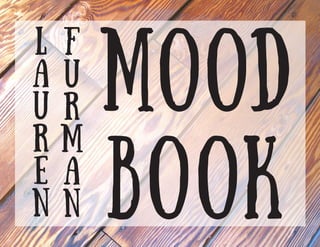
Furman lauren mood-book
•
0 likes•305 views

This is a mood book created while developing my brand in my Production Management class at Full Sail University.

Recommended
More Related Content
Similar to Furman lauren mood-book
Similar to Furman lauren mood-book (20)
Recently uploaded
Recently uploaded (20)
Furman lauren mood-book
- 2. T A B L E O F C O N T E N T S 3 Creative Brief 4 Competitor Logos 4 Good Logos 4 Best Companies Logos 5 Color Palettes 6 Typography Samples 7 Typography Choices 8 Complex Shapes 8 Simple Shapes 9 Textures 10 Identity Packages 12 Word List 13 Mind Map2
- 3. C R E A T I V E B R I E F 3 Project Summary Communication Strategy Audience Profile Competitive Positioning Application Promise Hello, I am Lauren Furman and I am a graphic designer. I specialize in the service of branding; web design, and any of your other everyday graphic design needs like brochures, poster, commercials, etc. I am currently still in school but have done some work over the past 5 years and with this new identity I am creating I hope to get my face out to the public and so people really know who I am and what I can offer. I have many goals I want to accomplish just like anyone else, but when I think long term I would love to be a senior designer at a design firm or working on magazine layouts like Entertainment Weekly. Some of the aspects I want to convey in my logo are a little but of my personality as well as my work ethic, maybe something sleek and simple to the point. I have not yet decided if I want a tagline or not. If I do want a tagline I think it would be something pun-ny to show- case my sense of humor. Overall I just want to showcase my abilities and work ethics. My existing audience would be fellow graphic designers as well as perspective and past clients. I always love to showcase my work to attract perspective clients. Word of mouth and social media mouth is great too for broadening your audience. My competitors are fellow designers. I honestly think their logos are great and really describe the work they can produce. To name a few competitors their is David Airey- http://www.davidairey.co.uk Brent Galloway- http://brentgalloway.me Jessica Greenwalt- http://www.jgreenwalt.com Rachel Kim- http://rachelkim.net Irene Victoria- http://irenevictoria.com The logo that I am envisioning for my brand and myself would be something very simple in shape that stands the test of time. Even though it might change over the years I want it to still hold its ground on past projects. I also see the colors changing to match the project I am working one. Just like Entertainment Weekly, their logo changes with its color and elements with every weeks cover. Right now I do not have anything that must be in my logo, I just have to get a feel for it. My promise is to provide designs that were given time attention and thought to every detail.
- 4. C O M P E T I T O R S L O G O S 4 Competitors Logos: Well Designed Logos: Companies I’d like to work for: Jonathan Dobre Adam TrageserLeo Ayers Cindy Jensen Abby Ryan
- 5. C o l o r p a l e t t e s 5 RGB : 255, 204, 153 CMYK: 0%, 22%, 42%, 0% HEX: FFCC99 PANTONE: 904 C RGB : 204, 204, 204 CMYK: 19%, 15%, 16%, 0% HEX: CCCCCC PANTONE: 9501 C RGB : 153, 102, 204 CMYK: 49%, 67%, 0%, 0% HEX: 9966CC PANTONE: 814 C RGB : 153, 204, 153 CMYK: 42%, 2%, 51%, 0% HEX: 99CC99 PANTONE: 359 CP RGB : 153, 204, 153 CMYK: 42%, 2%, 51%, 0% HEX: CC9966 PANTONE: 359 CP RGB : 102, 102, 153 CMYK: 68%, 64%, 16%, 1% HEX: 666699 PANTONE: 7700 U RGB : 51, 204, 204 CMYK: 64%, 0%, 26%, 0% HEX: 33CCCC PANTONE: P 118-5 C RGB : 255, 255, 51 CMYK: 6%, 0%, 89%, 0% HEX: FFFF33 PANTONE: P 1-7 C RGB : 102, 102, 102 CMYK: 60%, 51%, 51%, 20% HEX:666666 PANTONE: P 172-11 C RGB : 204, 255, 255 CMYK: 16%, 0%, 3%, 0% HEX: CCFFFF PANTONE: P 118-1 C RGB : 255, 255, 255 CMYK: 0%, 0%, 0%, 0% HEX: FFFFFF PANTONE: 11-0601 RGB : 255, 153, 102 CMYK: 0%, 49%, 62%, 0% HEX:FF9966 PANTONE: P 34-5 C RGB : 102, 0, 0 CMYK: 34%, 98%, 96%, 53% HEX: 660000 PANTONE: P 474-16 c RGB : 255, 255, 255 CMYK: 0%, 0%, 0%, 0% HEX: FFFFFF PANTONE: 11-0601 RGB : 51, 51, 153 CMYK: 96%, 95%, 0%, 0% HEX:333399 PANTONE: P 99-8 C
- 7. T y p o g r a p h y C H O I C E S 7 DISPLAY FONTS INFO-LEVEL FONTS LAUREN FURMAN From the woods LAUREN FURMAN SUNDAY lauren furman cf old photograph credit LAUREN FURMAN lauren furman Noteworthy LAUREN FURMAN lauren furman OCEAN COASTLINES LAUREN FURMAN lauren furman SignPainter LAUREN FURMAN lauren furman Raleway
- 13. M i n d M a p 13