Brand guidlines final
•
0 likes•107 views

The document provides recipes and guidelines for consistently representing the Joma brand across marketing materials. It outlines the core brand pillars and ingredients like logo usage, colors, typography and photography. Recipes include easy product promotions using a headline, image and call to action. The guidelines emphasize showing Joma in the best way while occasionally experimenting, and note the importance of the brand's personality and improving lives.

Recommended
More Related Content
Similar to Brand guidlines final
Similar to Brand guidlines final (20)
More from MangoTango
More from MangoTango (16)
Recently uploaded
Recently uploaded (20)
Brand guidlines final
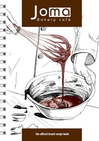
- 1. the official brand recipe book
- 2. 3 A brand is so much more than a logo or a set of graphics. It is everything our customers experience; our brand is what we say and how we say it, what we make and how we make it, and who we are in-store and out. In these pages you’ll find the core Joma ingredients for creating great brand stories and effective marketing materials. The basic recipes included showcase the best ways to use the ingredients to ensure consistent quality messaging across all mediums. But this is a recipe book, not a rule book. The first goal is always, always, always to showcase Joma in the greatest Joma-way possible, and occasionally that might mean adding a new ingredient, such as a texture, font or graphic. But like any good recipe, too many ingredients create muddy flavors, so use good judgment when mixing it up and when in doubt, stick to the core ingredients for great, visually tasty, Joma brand recipes. Enjoy creating! The Joma Team (that’s you too!) foreward
- 3. 4 5 Who we are and why we do what we do. the Joma way improving lives Whether it’s serving artfully prepared lattes and fresh baked goods to happy customers, pouring energy into the development of our diverse team, or reaching into our communities with time and resources, it all boils down to striving to improve lives one person at a time. our core We work daily to BE GREAT at what we do, WISE in how we do it, and to maintain a spirit of ADVENTURE when looking ahead. our family We focus on nurturing a healthy family environment in the workplace, and EMPOWERING our employees to experience growth in both their careers and personal lives. our community 10% OF OUR PROFIT supports local grassroots initiatives focused on meeting basic life needs. We provide MEANINGFUL EMPLOYMENT opportunities for disadvantaged persons. We seek COMMUNITY INVOLVEMENT through event sponsorship, volunteering, and creating space for people and causes to connect. Be Great. Be Wise. Be Adventurous. Born in the Mekong region, Joma has been Canadian owned and operated since 1996. From Luang Prabang to Phnom Penh, you’ll find a warm welcome and a great cup of fresh, organic coffee. And cookies. And pie.
- 4. 6 7 Pillars hold up the brand. All messaging is built on these. brand pillars international atmosphere • Welcoming • Modern • Clean • Comfortable • Homey • Reliable • WiFi/AC Joma is a light-hearted friend who makes you smile versus busting a gut laughing. Messaging should be honest, authentic but not take itself too seriously. Be silly sometimes. Because a lot of Joma customers and employees don’t speak English as their first language, avoid using too many puns or play on words that non-native speakers won’t understand. Once in awhile is okay though; it might just spark some good conversation. Joma is like a person with its own personality. This describes the way Joma acts. Every interaction with a customer is a conversation; this is how Joma sounds. personality tone of voice polite warm welcominginternational comfortable modern playful friendly honest wholesome foods & drinks • Homemade • Made from scratch • Made fresh everyday • No preservatives • Chemical-free • Fair-trade • Quality ingredients improving lives & communities • Opportunity to disadvantaged workers • 10% of profits to grass-root initiatives • Encouraging community involvement
- 5. 8 9 Joma Bakery Café. A key ingredient to creating brilliant brand expressions. masterbrand logo The masterbrand logo is the face of Joma and the core visual element throughout all brand expressions. It should always include “Bakery Cafe” and be used in full color whenever possible. When placing it on dark backgrounds, always use the reverse (i.e. white) version of the logo. Pages can easily get crowded. Minimum clearspace will keep the logo looking great. It’s always easy to say the logo needs to be bigger, but it can be this small. clearspace minimum size 2.5cm The recommended minimum size is one inch wide. Any smaller and “Bakery Cafe” is going to be really, really hard to read without a magnifying glass. Always* leave a minimum distance of the height of the ‘o’ around the logo regardless of the size or placement of the logo. This means no other logos, text or edges of the paper should cross the boundary of the minimum clearspace. *An exception may arise where the minimum clearspace is darn near impossible. Use your best judgment; if the logo looks good, go ahead. If the logo looks crowded, or lost, keep the clearspace.
- 6. 10 11 the New Yorker A classic, big-city breakfast bagel piled high with ham, egg and melted cheese. One of six fresh, hot breakfast sandwiches served all day long. Joma Toul Tom Pong St. 456 & 155 | Joma Norodom (BKK1) Norodom Blvd & St. 294 | Joma Toul Kork Corner of St. 337 & 528 This is Joma. And how to use it. logo & tagline *See page 12. Minimum clearspace. Minimum size: 4.19cm The current tagline “This is Joma” is carefully typeset and is never to be altered or adjusted until death—or new brand positioning—do you part. Treat this version of the logo with the same do’s and don’t’s* as you would the masterbrand logo.
- 7. 12 13 Joma Bakery Café. A key ingredient to creating brilliant brand expressions. Colour ties elements together that help people recognize Joma in the crowd. do’s & don’ts colour C/0 M/0 Y/0 K/100 HEX/231F20 C/0 M/0 Y/0 K/70 HEX/6D6E71 C/0 M/0 Y/0 K/40 HEX/A7A9AC C/0 M/0 Y/0 K/10 HEX/E6E7E8 C/0 M/53 Y/89 K/83 HEX/4F2600 We also use white. But white isn’t a colour. Or is it... C/0 M/37 Y/62 K/58 HEX/825A36 C/0 M/21 Y/35 K/33 HEX/B5967A C/0 M/5 Y/9 K/8 HEX/EBDFD3 Do not squish or stretch the logo. Very bad design. Do not change to a non-brand colour. Even on holidays. Do not outline it. Very hard to read. Doesn’t look good. Do not tip the logo over. It’s not “edgy”. Do not put on a complicated background. It’s gotta be legible. Do not add white behind letters, it’s not a two-colour logo. Do not add a drop shadow, or any other fancy photoshop effect. Do not add a gradient. Even if it looks “pretty”. Since the logo is the face of Joma, it’s kind of important to make sure it always looks good. So, lest the design gods strike you down, do not do any of the following to the logo under any* circumstances. *Any. Ever.
- 8. 14 15 typography basic recipe alternative recipe No one notices typography, unless it’s bad. Keep it clean, simple and unnoticeable. AaBbCcDdEeFfGgHhIiJjKkLlMm NnOoPpQqRrSsTtUuVvWwXxYyZz 1234567890!@#$%^&*() AaBbCcDdEeFfGgHhIiJjKkLlMm NnOoPpQqRrSsTtUuVvWwXxYyZz 1234567890!@#$%^&*() AaBbCcDdEeFfGgHhIiJjKkLlMm NnOoPpQqRrSsTtUuVvWwXxYyZz 1234567890!@#$%^&*() AaBbCcDdEeFfGgHhIiJjKkLlMm NnOoPpQqRrSsTtUuVvWwXxYyZz 1234567890!@#$%^&*() make headlines nice and big but in lowercase. The bold creates a strong presence, but the lowercase makes the message friendly and approachable. This body copy is Oswald Light in Sentence Case. This creates clear hierarchy and readability of the messaging. MIX IT UP WITH A LIGHT, BUT LARGE, ALL-CAPS HEADLINE. You can even use Oswald Demi-Bold as a body copy font, as long as there is a good contrast between the headline and the body copy. Oswald Extra Light Oswald Extra Light Italic Oswald Demi-Bold Oswald Demi-Bold Italic The core brand font is Oswald, a modern sans-serif face that is web-friendly. Mixing up the variations of the font is an easy way to freshen a design or change the tone of messaging while staying on brand. NOTE: As a designer you will get sick of looking at these font combinations loooooong before consumers ever do. Try to be as consistent as possible across designs, and refrain from adding extra fonts to spice things up.
- 9. 16 17 កខគឃងចឆជឈញដឋឌឍណ តថទធនបផពភមយរលវ ឝឞសហឡអ ០១២៣៤៥៦៧៨៩ កខគឃងចឆជឈញដឋឌឍណ តថទធនបផពភមយរលវ ឝឞសហឡអ ០១២៣៤៥៦៧៨៩ khmer fonts basic khmer recipe The graphic structures can be tricky, design with care. NOTE: Keep the leading as tight as possible with just enough space between the lines so the vowels aren’t crowded.. Koulen Kh Conent សូស្ដី សុខសប្បាយ នេះជាការផ្តន្ទា ទោសឧទាហរណ៍ មួយ។ បានបញ្ចប់រួចទៅហ�ើយ laotian fonts vietnamese fonts Ginny to add Ginny to add
- 10. 18 19 This library of icons can be used to add flavor to typographic messages like menus, textural elements for walls or packaging, or calling attention to specific elements in a design. They should never* be used as a main element. Think of them more as a little brother that sometimes tags along, but doesn’t always get to play with the big kids. icons Spice things up with these decorative illustrative elements. *Okay, there might be a time when it makes sense for one of these little doodles to take center stage, but consider it carefully before executing. texture recipes icon & typography recipes you look like you could use a refill. Get a FREE refill when you order a large americano. fresh baked. Icons can also be used to create textural elements from time to time. Texture could be used to spice up clothing, wrappers or packaging, borders or to break up large spaces. BUT! Use sparingly and only with approval from the Creative Director.
- 11. 20 21 All Joma brand recipes are built on a simple formula; a hero and a story. The photograph is the hero, and the illustration, headline and body copy is the story. The photographs, or heroes, are always Joma products—a piece of the Joma process, or the outcome of Joma involvement—they are never* people. The backgrounds are always drawn, painted, or created in some other way than photography. Using illustration creates a playful, approachable feel that bridges geography and cultures. When communicating high level messages such as the Joma process or ingredients, its strongly recommended to include a human element, such as a hand, in the drawing. This creates warmth and context to the messaging. After all, cakes don’t make themselves. When promoting a product, like pie (mmmm, pie), the pie should be the hero. Make the photo nice and big so viewers can see every delicious morsel. NOTE: The illustration style can evolve and change; it’s the formula of a photographic hero and an illustrative story that is at the heart of these brand ingredients. *There is no such thing as never. Someday, somewhere, there will be an instance where a humanoid makes sense to play the “hero”, but proceed with caution. Customers buy our food and beverages and we help them build experiences around them. photos & illustrations Photos makes things look freakin’ delicious. Drawings make things look fun. In the lush forests of southern Laos, a collective of farmers hand-pick only the ripest, organic Arabica coffee cherries to create a cup of coffee that you, and your tastebuds, will feel good about. Food tastes best when it’s fresher than fresh. From hydroponic lettuce grown in Cambodia, to free-range eggs in Vietnam, ingredients are sourced locally when possible and outsourced to only the best international suppliers. the Parisian An elegant breakfast croissant stuffed with bacon.
- 12. 22 Take one ad mat, either vertical or horizontal, add one product for promotion, a headline, and a call to action, a smart-ass comment at the end and voila! A fast and easy product promotion. Mix and match products and stories for fresh visual flavors. easy promotions recipe These stories await a Joma hero. mango cheesecake. Made fresh today. Buy a slice for $XX or a whole cake for $XX. Sharing optional. mango cheesecake. $XX a slice, $XX for whole. Sharing optional. mango cheesecake. Made fresh today. Buy a slice for $XX or a whole cake for $XX. Sharing optional.
- 13. These recipes are just the beginning. Use the ingredients to create new recipes and fresh looks. The most important thing is to always make the brand look awesome; sometimes that means sticking to the rules, occasionally that means bending them. When in doubt, have a coffee break, maybe a cookie, come back and use your best judgment. Enjoy! remember