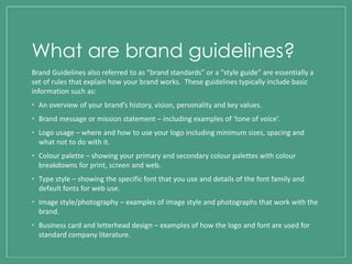
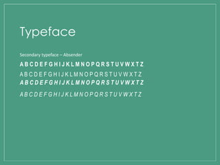
BRAND GUIDELINES
What are brand guidelines?
Brand Guidelines also referred to as “brand standards” or a “style guide” are essentially a
set of rules that explain how your brand works. These guidelines typically include basic
information such as:
• An overview of your brand’s history, vision, personality and key values.
• Brand message or mission statement – including examples of ‘tone of voice’.
• Logo usage – where and how to use your logo including minimum sizes, spacing and
what not to do with it.
• Colour palette – showing your primary and secondary colour palettes with colour
breakdowns for print, screen and web.
• Type style – showing the specific font that you use and details of the font family and
default fonts for web use.
• Image style/photography – examples of image style and photographs that work with the
brand.
• Business card and letterhead design – examples of how the logo and font are used for
standard company literature.
Brand identity
Brand identity refers to the unique set of brand associations that the brand aspires, creates
or maintains. These associations represent what the brand stands for and implies a promise
to customers for the organisation members.
The identity of a brand is key as it would be advertised across different regions and places
around the world and used through a variety of different mediums including posters, logos,
brand names, brochures and merchandise. It is therefore important to ensure the visual
branding and messaging of the brand is clear and consistent through key colours, font and
imagery to form a strong and stable brand which reinforces the identity of the product and
drives the audience and consumer of the work to relate and trust what they are seeing.
The logo is a key aspect of any brands identity as it gives a “face” to the brand so that people can
easily identify and remember the business. When reproducing any logo elements, it is
important to use only the original high resolution or vector graphic files, as well as ensuring you
are using the correct artwork for the application. It is also important to make sure the master
artwork is used at all times. For my logo design, I have chosen a simple layout including the
artist’s name ‘Ed Sheeran’ and the name of the album ‘X’, making it easily useable across all
mediums including the internet and print based work. Below are examples of my logo designs
and my finished magazine advertisement:
Logo
Typeface
Primary typeface – Albertsthal Typewriter
A B C D E F G H I J K L M N O P Q R S T U V W X T
Z
A B C D E F G H I J K L M N O P Q R S T U V W X T
Z
A B C D E F G H I J K L M N O P Q R S T U V W X T
a b c d e f g h i j k l m n o p q r s t u v w x y z
Secondary typeface – Absender
A B C D E F G H I J K L M N O P Q R S T U V W X T Z
Typeface
Colour
A colour palette is essential in establishing the brand itself as it communicates a clear and
consistent message about the image. The pantone colours of the colour palette should be
used wherever possible, with CMYK/RGB being matched as closely as possible depending
on the materials and print process. Black and white tones are also acceptable as accent
colours, in addition to the colours within the assigned scheme. Throughout my print work I
have included the colour scheme of orange, white and black as I believe these colours are
best suited to the genre and audience of my music video. The consistent colour scheme
makes it easier for the audience to easily recognise that this work belongs to the particular
artist ‘Ed Sheeran’.
C = 15 M = 56 Y = 86 K= 0 C = 0 M = 0 Y = 0 K= 0 C = 0 M = 0 Y = 0 K= 100

Brand Guidelines

  • 1.
  • 2.
    What are brandguidelines? Brand Guidelines also referred to as “brand standards” or a “style guide” are essentially a set of rules that explain how your brand works. These guidelines typically include basic information such as: • An overview of your brand’s history, vision, personality and key values. • Brand message or mission statement – including examples of ‘tone of voice’. • Logo usage – where and how to use your logo including minimum sizes, spacing and what not to do with it. • Colour palette – showing your primary and secondary colour palettes with colour breakdowns for print, screen and web. • Type style – showing the specific font that you use and details of the font family and default fonts for web use. • Image style/photography – examples of image style and photographs that work with the brand. • Business card and letterhead design – examples of how the logo and font are used for standard company literature.
  • 3.
    Brand identity Brand identityrefers to the unique set of brand associations that the brand aspires, creates or maintains. These associations represent what the brand stands for and implies a promise to customers for the organisation members. The identity of a brand is key as it would be advertised across different regions and places around the world and used through a variety of different mediums including posters, logos, brand names, brochures and merchandise. It is therefore important to ensure the visual branding and messaging of the brand is clear and consistent through key colours, font and imagery to form a strong and stable brand which reinforces the identity of the product and drives the audience and consumer of the work to relate and trust what they are seeing.
  • 4.
    The logo isa key aspect of any brands identity as it gives a “face” to the brand so that people can easily identify and remember the business. When reproducing any logo elements, it is important to use only the original high resolution or vector graphic files, as well as ensuring you are using the correct artwork for the application. It is also important to make sure the master artwork is used at all times. For my logo design, I have chosen a simple layout including the artist’s name ‘Ed Sheeran’ and the name of the album ‘X’, making it easily useable across all mediums including the internet and print based work. Below are examples of my logo designs and my finished magazine advertisement: Logo
  • 5.
    Typeface Primary typeface –Albertsthal Typewriter A B C D E F G H I J K L M N O P Q R S T U V W X T Z A B C D E F G H I J K L M N O P Q R S T U V W X T A B C D E F G H I J K L M N O P Q R S T U V W X T Z A B C D E F G H I J K L M N O P Q R S T U V W X T a b c d e f g h i j k l m n o p q r s t u v w x y z a b c d e f g h i j k l m n o p q r s t u v w x y z a b c d e f g h i j k l m n o p q r s t u v w x y z a b c d e f g h i j k l m n o p q r s t u v w x y z
  • 6.
    Secondary typeface –Absender A B C D E F G H I J K L M N O P Q R S T U V W X T Z A B C D E F G H I J K L M N O P Q R S T U V W X T Z A B C D E F G H I J K L M N O P Q R S T U V W X T Z A B C D E F G H I J K L M N O P Q R S T U V W X T Z Typeface
  • 7.
    Colour A colour paletteis essential in establishing the brand itself as it communicates a clear and consistent message about the image. The pantone colours of the colour palette should be used wherever possible, with CMYK/RGB being matched as closely as possible depending on the materials and print process. Black and white tones are also acceptable as accent colours, in addition to the colours within the assigned scheme. Throughout my print work I have included the colour scheme of orange, white and black as I believe these colours are best suited to the genre and audience of my music video. The consistent colour scheme makes it easier for the audience to easily recognise that this work belongs to the particular artist ‘Ed Sheeran’. C = 15 M = 56 Y = 86 K= 0 C = 0 M = 0 Y = 0 K= 0 C = 0 M = 0 Y = 0 K= 100