The document analyzes and summarizes the key elements of three fashion brand logos:
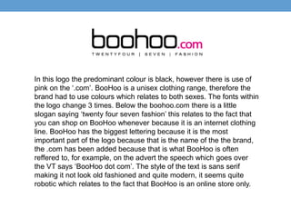
1) The BooHoo logo uses black as the predominant color with pink accents. It includes the brand name, ".com" designation, and slogan. Fonts and sizing are used to draw attention.
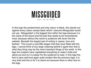
2) The Missguided logo solely uses black and includes the brand name in the largest font above the slogan. Capitalization and bolding make it stand out.
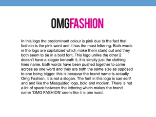
3) The OMG Fashion logo predominantly uses pink and includes the capitalized brand name with no slogan. Font and spacing unify the name as one word. All logos use sans serif, bold modern fonts.