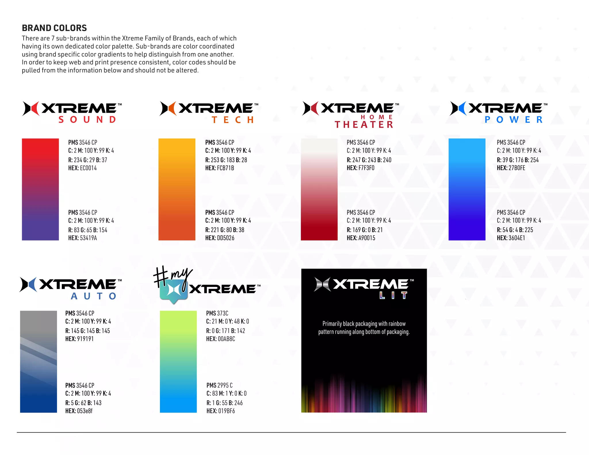
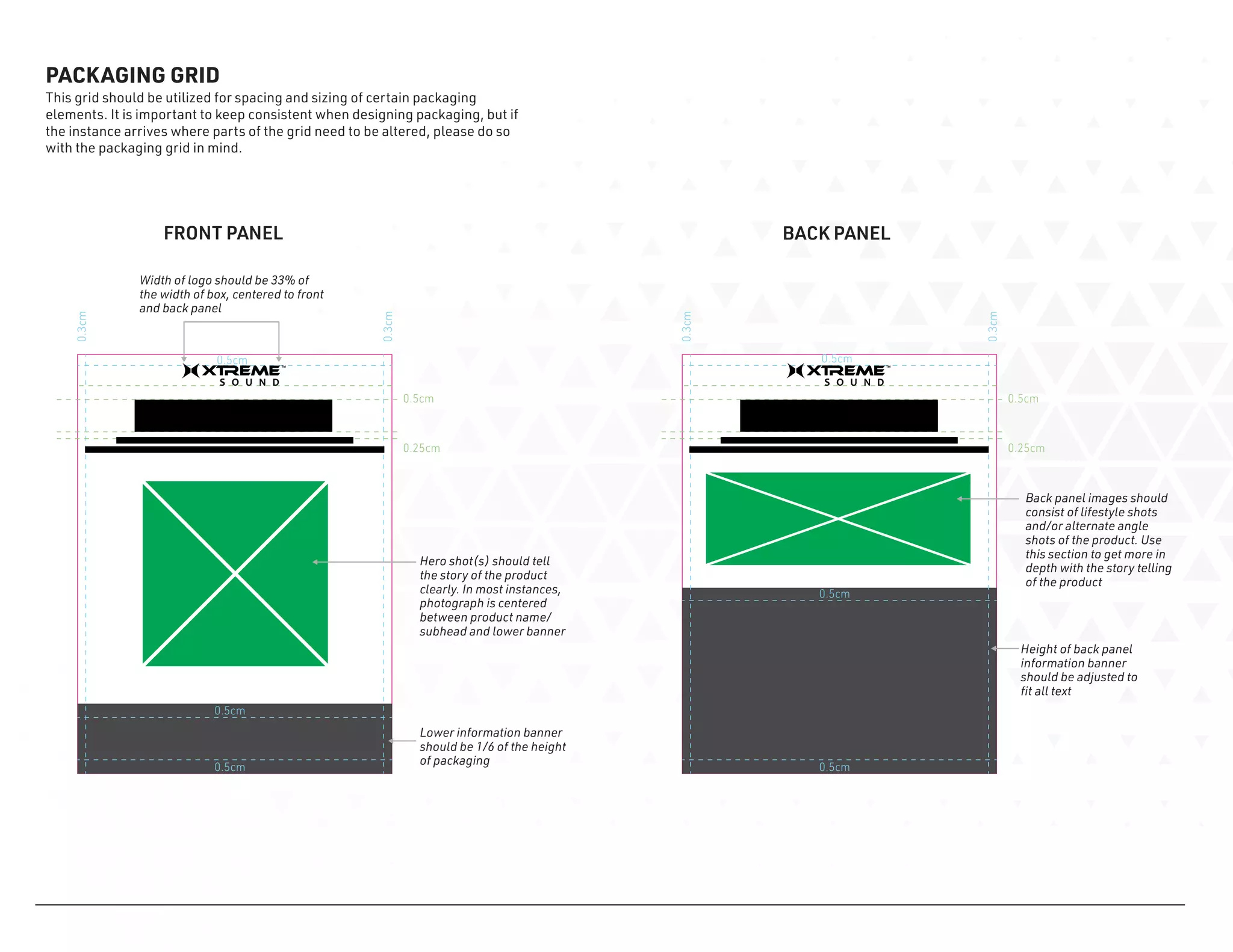
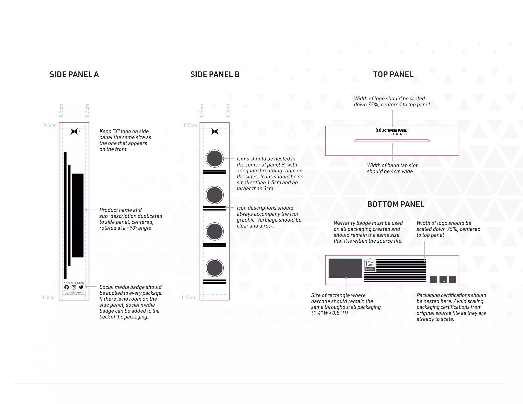
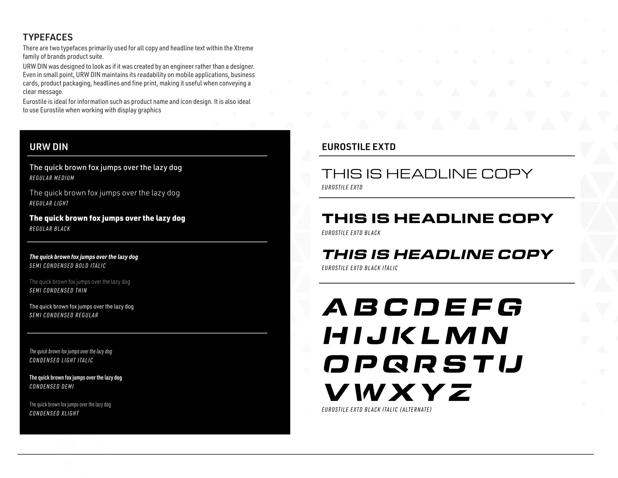
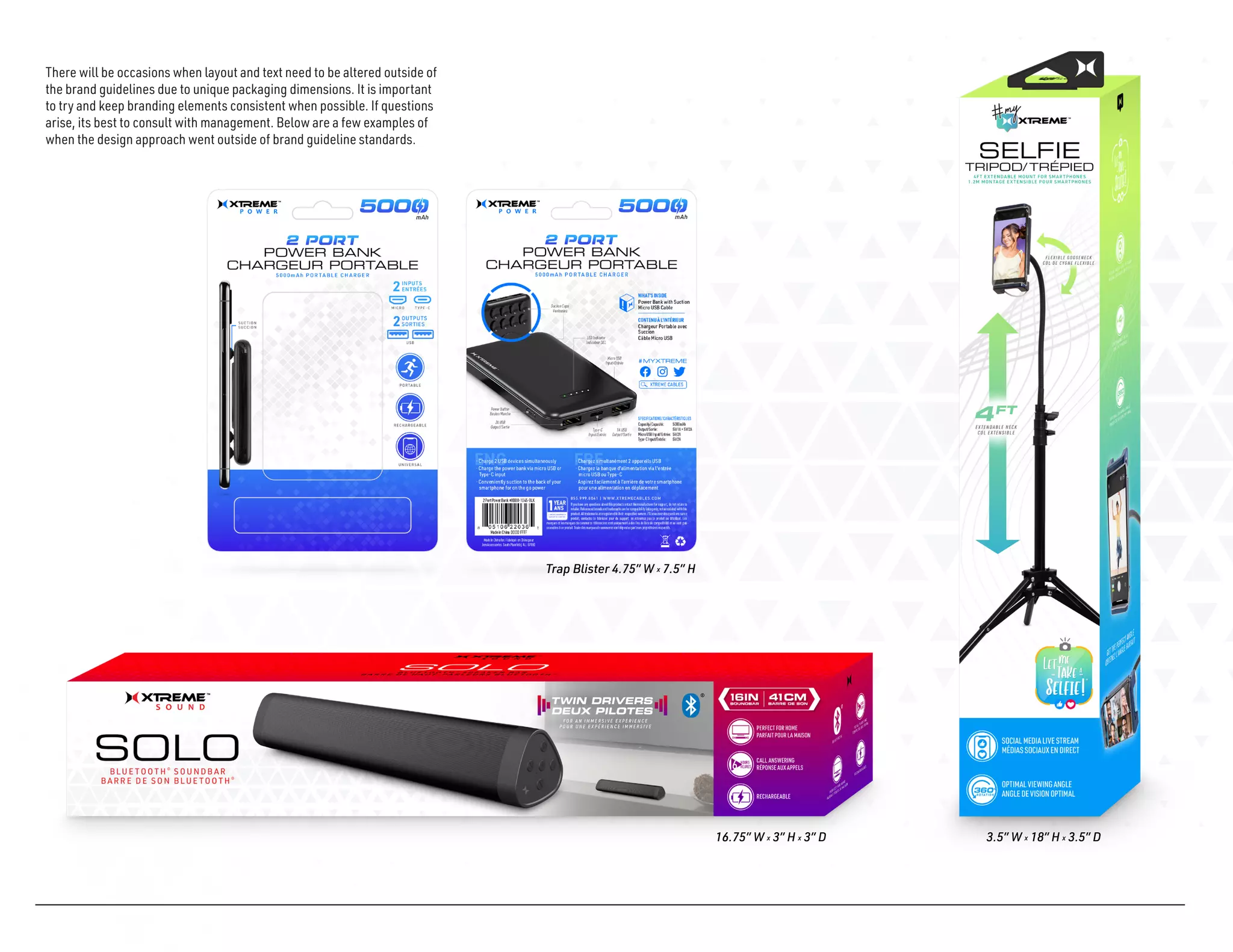
This brand manual provides guidelines for using the Houston Health Department's logo, seal, color palette, typography, graphics, imagery, and templates for various print materials like letterheads, banners, and presentations. Detailed instructions are given for proper usage of each branding element, with examples shown, to maintain a consistent brand identity across all communication. Accompanying files with the different logo and color options are referenced for inclusion with the distributed manual.
This document provides branding guidelines for Furever Home, including guidelines for proper usage of the logo, color palette, typefaces, and other visual elements. The document outlines three versions of the logo - primary, secondary, and tertiary - and provides rules for coloring, sizing, and formatting the logo. It also presents the approved color palette and provides examples of applying colors to the different logo versions. Further sections describe the approved typefaces, Abside and Bell MT, and provide guidance on using typography and visual elements to create hierarchy. The overall purpose is to ensure Furever Home's brand is represented consistently across marketing and design materials.
This document provides branding guidelines for Furever Home, including specifications for logo usage, colors, typography, and visual style. It outlines the primary, secondary and tertiary logo versions and rules for proper usage, spacing, sizing and color application. Color palettes are defined, including rules for using colors on the logo versus as accents. Approved typefaces, Abside and Bell MT, are identified for consistent branding. Visual hierarchy and ways to structure information are also addressed. The goal is to ensure Furever Home's brand is represented consistently across all marketing materials.
This branding guide document provides guidelines for Trueffect's corporate identity and brand elements such as their name, logo, colors, typefaces, and graphics. It aims to present a consistent brand image. The document outlines the logo construction and usage, approved color palette, primary and secondary typefaces for various applications, and typographic hierarchy rules. Sections provide details on each branding element and guidelines for correct usage to protect the company's brand assets.
The document provides guidelines for applying RER Capital Management's brand identity. It outlines the logo, colors, typography, layout principles, imagery style, and various stationery items. The logo consists of the "RER" brand symbol and descriptor within a black holding device. Layouts should follow grids for different formats and use simple graphic devices. Typography uses two typefaces - Sans B Plus for body copy and Serif B Plus for headlines. Imagery should have a vertical emphasis, toned down colors and not look directly at the camera. Various business cards, letterheads, envelopes and other examples are provided to bring the brand to life.
The document is a visual standards guide that introduces the new StartMesh identity and visual branding program. It provides guidelines for properly applying branding elements like the logo, typography, and colors to ensure a consistent brand image. The guide details the logo variations, minimum sizes, spacing, and applications. It also introduces the inspiration and purpose behind the branding elements.
Website Wars - Boohoo vs PrettyLittleThing vs Missguided vs ASOSDigivante
In our latest research at Digivante, we’ve compared 4 of the largest fashion retailer websites: Boohoo, PrettyLittleThing, Missguided and ASOS. We assessed each website based on its accessibility and compatibility across different devices and browsers.
Each platform is assessed based on their performance across these two fields. The winner is the fashion retailer website that performs best across these accessibility and compatibility tests.
Here are the results.
If you’d like to find out more about our unique and innovative approach to website and app testing, arrange to speak to a Solution Consultant at https://info.digivante.com/discovery-call
The document is an ACC brand guideline manual that provides guidance on proper usage of the ACC brand identity. It covers topics such as the logo rationale, logo specifications for size and color, acceptable typography, proper applications of the logo on business materials like business cards and letterhead, and examples of correct and incorrect uses of the logo. The purpose is to present a consistent brand image when applying the ACC logo to various materials.
This document provides branding and visual guidelines for Central Turf & Irrigation Supply. It outlines the proper uses of the company logo, approved typefaces, color palette, product icons, design elements and image choices to maintain a consistent brand identity across all communications. Adhering to these guidelines will ensure the company's identity remains strong and a consistent image is promoted to audiences.
Research indicated that CountryWide homes have higher resale absorption and perceived value in the York Region market. Surveys and internal discussions led to the same conclusion: after ten years, CountryWide had become known for their superior quality, detailed construction and ability to exceed customer expectations.
The offer is premium, so it should be advertised as such. A complete rebranding and repositioning was developed to reflect that. This effort resulted in the development of two brand books: the Strategic Marketing Positioning Book and the Corporate Style Guide. Together, they establish a new mission, vision, brand values and visual guidelines to make the company more appealing to a buyer looking for a premium offering.
The result: A New Level. It's not only a tagline, but the company's mindset on everything it touches: from the materials selections, the internal processes, staffing, the buyer's journey, and the way they communicate.
The Microlise brand guidelines document defines the branding standards that cascade through all Microlise Group sub-brands and marketing communications. It covers topics such as colour usage, the logo, typefaces, graphic devices, imagery, icons and product shots to maintain a consistent brand identity. Sub-brands like Human Resources, Transport Conference and Focus are also addressed and may have some unique branding elements defined within the guidelines.
This document provides branding guidelines for the Beyondsoft brand. It outlines the logo, colors, typography, icons and other visual elements that make up the brand identity. The logo signature includes the wordmark and tagline together, and guidelines specify minimum sizes for print and screen use. Corporate colors are defined, along with secondary and accent colors. Typography styles are designated for headers, subheaders and body text. Icon design specifications cover sizing, spacing and color usage. The guidelines aim to maintain a consistent brand message across all channels.
This document provides branding guidelines for the Smart Market brand. It outlines the proper uses of the primary, secondary, and tertiary logo marks along with specifications on minimum sizes, color versions, and clear space. It also establishes the brand color palette, approved typefaces and their proper usage, iconography, and graphic patterns that can be incorporated into marketing materials. The guidelines are intended to ensure consistent visual representation of the Smart Market brand across all applications and media.
This document provides branding guidelines for the Smart Market brand. It outlines the proper usage of elements like the primary, secondary, and tertiary logos; brand colors; typography; graphic elements; photography; and applications of the brand identity. Designers and marketers should reference this guide to ensure consistent representation of the Smart Market brand across different media and marketing materials.
The campaign guidelines for the full Sony Ericsson T610 Global Marketing Campaign. This was the first true JV product launched under the new brand, from concept through to launch. An extremely comprehensive campaign that was executed across all regions of the world and had variations of a TVC that ran at the same time.
This document provides style guidelines for Cherriots branding and communications, including colors, logos, photos, fonts, templates for various materials, writing tips, terminology, and formatting standards. It aims to ensure a consistent look and message across all of Cherriots' public-facing materials. Adhering to these guidelines helps build brand recognition and a positive public association with Cherriots.
The document provides branding guidelines for Kymeta's product logos. It describes the naming conventions used for their antenna products, which reference bird names and use letters and numbers to denote communications bands and size. It establishes color-coding for commercial, military, and government audiences and provides specifications for clear space, minimum size, and layout of the logos. Examples are given for applying the logos on a website, social media post, digital ads, trade show graphics, and product sheets. Contact information is provided for any additional branding questions.
PORT is an emergency service and supply company that provides assistance and supplies before, during, and after storms. The document outlines PORT's brand guidelines, including the logo, colors, fonts, and icon usage. The core blue, orange, and grey colors form the primary palette and should be used prominently. Pontiac Regular is reserved for the logo, while Conduit and Trade Gothic are the body text fonts. All designs using the logo must be approved.
The document provides branding guidelines for "if it barks" including specifications for their logo, color palette, typography and web styles. The master logo should always be used and logo variations can be used with the primary and secondary color palettes. Font families, heading styles, body copy styles, and combinations are also defined to ensure consistent branding across communications.
This document provides branding and store identity guidelines for Road Haven Cafe. It includes the cafe's logo designs and color specifications, acceptable uses of the logo, font styles, and examples of external and internal branding elements like signage, packaging, uniforms, and more. The guidelines are intended to help maintain a consistent brand image across all aspects of the cafe.
The document provides technical specifications and information about the Brother P-touch 7600 label maker. It details the machine's durability through various abrasion, adhesion, chemical and temperature resistance tests. It also lists the machine's hardware specifications, tape sizes, included accessories, label creation features and the benefits it provides for electricians and installers in creating professional labels. The document recommends using specialized tapes matched to application needs and surfaces, and highlights key features like automatic numbering, symbols, rechargeable battery and custom content upload.
The document provides brand logo guidelines for the C3 Centre logo. It specifies that the logo must have clear space around it at least 0.25 times the height and width of the logo to isolate it. The minimum size for the logo is 0.75 inches to ensure readability. The logo should always be used in solid black on a light background. It provides directions on proper logo placement, orientation, and usage, including in advertising. The logo is not to be altered or placed in improper contexts.
https://plus.google.com/106684444137478261279/posts/QeG49NEuHFR
Toys-R-US (FAO, Babies-R-US), Wayne, NJ- Manager (Packaging Design Manager-Consultant) (Advertising, Print, Packaging, Branding, P.O.P, Web & Digital Strategy) http://www.toysrus.com
• Offer complete multi-media services, from concept and design to final production including Branding, Packaging, PLM
Direction to vendor, online writing on proof and other’s multi-task & work with various Corporate & Partner Brands.
The Children’s Place, Secaucus, NJ - (Design Manager) (Advertising, Print, Packaging, Branding, Web)
• Managed projects, from concept to computer rendering and final product. For all Windows, Floor Set & Graphics.
• Managed Studio, Designers, Comp room, Vendors. Computer/Software upgrade & more.https://www.childrensplace.com/
Turn Up the Music Inc, http://www.drewsent.com, NJ - (Advertising, Print, Packaging, Branding, Web & Digital Strategy) Music Packaging, Children's Related CD/DVD, Catalogue, Visual Merchandising & Sales Marketing - Senior Designer
The document provides branding guidelines for using the Toys"R"Us logo, including specifications for color versions in CMYK or Pantone, a black and white version, minimum size restrictions, and guidelines for using the registered symbol. Corporate typefaces and rules for using star graphics are also addressed. Adhering to these standards helps maintain a consistent brand identity for Toys"R"Us globally.
These guidelines outline the proper use of the Director 2 Director corporate logo. The logo should appear on all marketing materials and be printed in the specified color values. There is a minimum size of 30mm wide for the full logo and 15mm for the acronym. The logo must have a clear space around it and not be modified, separated, or placed at an angle. It should only be used horizontally on white or pale backgrounds.
Nová vizuální identita AVG se sice nerealizovala v plném rozsahu, ale některé vybrané změny pomohly oživit značku. Tato prezentace například vedla k faceliftingu loga, které má od roku 2008 trojrozměrný efekt.
The document provides packaging guidelines for GE brand products. It outlines standards for featuring graphic signatures prominently and consistently across all point-of-sale packaging. The guidelines help simplify information, provide flexibility for varying content, and organize information by importance. Elements like grids, rules, bars and a limited type system are used to modernize and streamline packages while unifying all packaging applications under the GE identity. Specific directions are given for placement of graphic elements, typesetting of information, and use of color.
This document provides the style guidelines for a brand identity including typography, color palette, and logo housing specifications. It outlines:
1) The primary typefaces to be used for headers, subheaders, and body copy along with font sizes and leading for each.
2) The primary, secondary, and highlight brand colors shown in both RGB and CMYK values.
3) Requirements for logo housing including using the primary brand color on a white background as well as allowing for a colored background, and minimum size standards for print and web.
Fonts play a crucial role in both User Interface (UI) and User Experience (UX) design. They affect readability, accessibility, aesthetics, and overall user perception.
Explore the essential graphic design tools and software that can elevate your creative projects. Discover industry favorites and innovative solutions for stunning design results.
ARENA - Young adults in the workplace (Knight Moves).pdfKnight Moves
Presentations of Bavo Raeymaekers (Project lead youth unemployment at the City of Antwerp), Suzan Martens (Service designer at Knight Moves) and Adriaan De Keersmaeker (Community manager at Talk to C)
during the 'Arena • Young adults in the workplace' conference hosted by Knight Moves.
Maximize Your Content with Beautiful Assets : Content & Asset for Landing Page pmgdscunsri
Figma is a cloud-based design tool widely used by designers for prototyping, UI/UX design, and real-time collaboration. With features such as precision pen tools, grid system, and reusable components, Figma makes it easy for teams to work together on design projects. Its flexibility and accessibility make Figma a top choice in the digital age.
Revolutionizing the Digital Landscape: Web Development Companies in Indiaamrsoftec1
Discover unparalleled creativity and technical prowess with India's leading web development companies. From custom solutions to e-commerce platforms, harness the expertise of skilled developers at competitive prices. Transform your digital presence, enhance the user experience, and propel your business to new heights with innovative solutions tailored to your needs, all from the heart of India's tech industry.
PDF SubmissionDigital Marketing Institute in NoidaPoojaSaini954651
https://www.safalta.com/online-digital-marketing/advance-digital-marketing-training-in-noidaTop Digital Marketing Institute in Noida: Boost Your Career Fast
[3:29 am, 30/05/2024] +91 83818 43552: Safalta Digital Marketing Institute in Noida also provides advanced classes for individuals seeking to develop their expertise and skills in this field. These classes, led by industry experts with vast experience, focus on specific aspects of digital marketing such as advanced SEO strategies, sophisticated content creation techniques, and data-driven analytics.
Connect Conference 2022: Passive House - Economic and Environmental Solution...TE Studio
Passive House: The Economic and Environmental Solution for Sustainable Real Estate. Lecture by Tim Eian of TE Studio Passive House Design in November 2022 in Minneapolis.
- The Built Environment
- Let's imagine the perfect building
- The Passive House standard
- Why Passive House targets
- Clean Energy Plans?!
- How does Passive House compare and fit in?
- The business case for Passive House real estate
- Tools to quantify the value of Passive House
- What can I do?
- Resources
Practical eLearning Makeovers for EveryoneBianca Woods
Welcome to Practical eLearning Makeovers for Everyone. In this presentation, we’ll take a look at a bunch of easy-to-use visual design tips and tricks. And we’ll do this by using them to spruce up some eLearning screens that are in dire need of a new look.
2. PRIMARY LOGO
This is our primary logo, for all legal and promotional use as well as logo
markings for our line of products. The primary logo must have the text
“Digital Lifestyle Accessories” under the “Xtreme” to use ®.
The Product marking logo consist of the Xtreme wordmark along with
the “tm”, and can be applied as black, white or PMS Cool Gray 7C. “Digital
Lifestyle Accessories” is not used when applying logo as product
marking.
NOTE: Under no circumstances should the logo mark be altered in any
way. Approval from management should be sought if there are questions
pertaining to logo use.
PRIMARY LOGO
SECONDARY LOGO USE
PRODUCT MARKING LOGO
PMS COOL GRAY 7C
HEX: 97999B
RGB: 151 153 155
This portion of the “X”
logo can be can be
changed, depending on
use.
3. BRAND COLORS
There are 7 sub-brands within the Xtreme Family of Brands, each of which
having its own dedicated color palette. Sub-brands are color coordinated
using brand specific color gradients to help distinguish from one another.
In order to keep web and print presence consistent, color codes should be
pulled from the information below and should not be altered.
PMS 3546 CP
C: 2 M: 100 Y: 99 K: 4
R: 234 G: 29 B: 37
HEX: EC0014
PMS 3546 CP
C: 2 M: 100 Y: 99 K: 4
R: 83 G: 65 B: 154
HEX: 53419A
PMS 3546 CP
C: 2 M: 100 Y: 99 K: 4
R: 145 G: 145 B: 145
HEX: 919191
PMS 3546 CP
C: 2 M: 100 Y: 99 K: 4
R: 5 G: 62 B: 143
HEX: 053e8f
PMS 3546 CP
C: 2 M: 100 Y: 99 K: 4
R: 253 G: 183 B: 28
HEX: FCB71B
PMS 3546 CP
C: 2 M: 100 Y: 99 K: 4
R: 221 G: 80 B: 38
HEX: DD5026
PMS 373C
C: 21 M: 0 Y: 48 K: 0
R: 0 G: 171 B: 142
HEX: 00AB8C
Primarily black packaging with rainbow
pattern running along bottom of packaging.
PMS 2995 C
C: 83 M: 1 Y: 0 K: 0
R: 1 G: 55 B: 246
HEX: 019BF6
PMS 3546 CP
C: 2 M: 100 Y: 99 K: 4
R: 247 G: 243 B: 240
HEX: F7F3F0
PMS 3546 CP
C: 2 M: 100 Y: 99 K: 4
R: 169 G: 0 B: 21
HEX: A90015
PMS 3546 CP
C: 2 M: 100 Y: 99 K: 4
R: 39 G: 176 B: 254
HEX: 27B0FE
PMS 3546 CP
C: 2 M: 100 Y: 99 K: 4
R: 54 G: 4 B: 225
HEX: 3604E1
4. BRAND GRAPHICS
With each of the 7 sub-brands come unique graphic elements that help
them stand apart as their own category. Elements such as color,
background texture and call out badges help each sub brand to have its
own identity within the family of brands. Below are examples of how each
sub brand share similarities using the brand guidelines, yet are
distinguishable due to the use of distinct graphic elements.
5.
6. There may be occasions where the use of a lifestyle image is needed to
adequately tell the story. When using lifestyle images for the front panel,
be sure that the focal point remains with the product (hero shot). This
can be done by reducing saturation on certain elements of the lifestyle
image. For better understanding, please refer to the examples below.
7. ICONOGRAPHY
When creating icons for the Xtreme brand, the goal should be to achieve an icon
design that clearly conveys a message with simplistic design. The icon should
function within a circle as well as a standalone design. Consistent line weights
should be applied when designing icons across the board.
2PT LINE WEIGHT
CLEAR + SIMPLE MESSAGE
Eurostile LT Standard Bold is the primary typeface used
when designing text based icons
8. 0.5cm
0.5cm
0.5cm
0.5cm
0.3cm
0.25cm
0.3cm
0.5cm
0.5cm
0.5cm
0.5cm
0.3cm
0.25cm
0.3cm
PACKAGING GRID
This grid should be utilized for spacing and sizing of certain packaging
elements. It is important to keep consistent when designing packaging, but if
the instance arrives where parts of the grid need to be altered, please do so
with the packaging grid in mind.
Width of logo should be 33% of
the width of box, centered to front
and back panel
Lower information banner
should be 1/6 of the height
of packaging
Hero shot(s) should tell
the story of the product
clearly. In most instances,
photograph is centered
between product name/
subhead and lower banner
Back panel images should
consist of lifestyle shots
and/or alternate angle
shots of the product. Use
this section to get more in
depth with the story telling
of the product
Height of back panel
information banner
should be adjusted to
fit all text
FRONT PANEL BACK PANEL
9. 0.5cm
0.5cm
0.3cm
0.3cm
0.5cm
0.5cm
0.3cm
0.3cm
Product name and
sub-description duplicated
to side panel, centered,
rotated at a -90° angle
Kepp “X” logo on side
panel the same size as
the one that appears
on the front.
Icons should be nested in
the center of panel B, with
adequate breathing room on
the sides. Icons should be no
smaller than 1.5cm and no
larger than 3cm.
Social media badge should
be applied to every package.
If there is no room on the
side panel, social media
badge can be added to the
back ofthe packaging.
Width of logo should be scaled
down 75%, centered to top panel
Width of logo should be
scaled down 75%, centered
to top panel
Warranty badge must be used
on all packaging created and
should remain the same size
that it is within the source file.
Size of rectangle where
barcode should remain the
same throughout all packaging
(1.4” W x 0.8” H)
Width of hand tab slot
should be 4cm wide
SIDE PANEL A SIDE PANEL B TOP PANEL
BOTTOM PANEL
Packaging certifications should
be nested here. Avoid scaling
packaging certifications from
original source file as they are
already to scale.
Icon descriptions should
always accompany the icon
graphic. Verbiage should be
clear and direct.
10. TYPEFACES
There are two typefaces primarily used for all copy and headline text within the Xtreme
family of brands product suite.
URW DIN was designed to look as if it was created by an engineer rather than a designer.
Even in small point, URW DIN maintains its readability on mobile applications, business
cards, product packaging, headlines and fine print, making it useful when conveying a
clear message.
Eurostile is ideal for information such as product name and icon design. It is also ideal
to use Eurostile when working with display graphics
URW DIN
The quick brown fox jumps over the lazy dog
EUROSTILE EXTD
EUROSTILE EXTD
REGULAR MEDIUM
The quick brown fox jumps over the lazy dog
REGULAR LIGHT
The quick brown fox jumps over the lazy dog
REGULAR BLACK
SEMI CONDENSED BOLD ITALIC
The quick brown fox jumps over the lazy dog
SEMI CONDENSED THIN
The quick brown fox jumps over the lazy dog
SEMI CONDENSED REGULAR
CONDENSED LIGHT ITALIC
The quick brown fox jumps over the lazy dog
CONDENSED DEMI
The quick brown fox jumps over the lazy dog
CONDENSED XLIGHT
EUROSTILE EXTD BLACK
EUROSTILE EXTD BLACK ITALIC (ALTERNATE)
THIS IS HEADLINE COPY
EUROSTILE EXTD BLACK ITALIC
THIS IS HEADLINE COPY
11. WHEN TO USE WHAT TYPEFACE?
The packaging artwork below should serve as a guide on how and when to use
URW DIN and Eurostile. The objective is to always keep packaging consistent by
using typefaces appropriately. Doing so will maintain brand integrity.
Eurostile LT STD Bold Extended 2
Used sparingly as a method to add emphasis
URW DIN Condensed Italic (All Caps)
Mainly used to accentuate important product features
using the HEX color code: 515151
URW DIN Condensed Medium (All Caps)
URW DIN Condensed Bold (All Caps)
URW DIN Bold (All Caps)
URW DIN Semi Condensed Medium
Main body copy typeface
URW DIN Semi Condensed Regular Italic
Used alongside main body copy typeface, when
additional notes or call out important features are
needed
URW DIN Semi Condensed Medium
Eurostile LT STD Extended 2
URW DIN Medium
125-150 Tracking
FRONT PANEL BACK PANEL
12. SIDE PANEL A SIDE PANEL B TOP PANEL
BOTTOM PANEL
Text and typefaces duplicated
from front panel
URW DIN Medium (All Caps)
5.5-7pt Size, 150-200 Tracking
URW DIN Condensed Regular
Specification, 5-6pt Size
URW DIN MEDIUM
75 Tracking
URW DIN Condensed Regular
Fine Print 5-7pt Size, Align Justified
URW DIN Condensed Regular
Fine Print 5-7pt Size, Align Justified
URW DIN Condensed Regular
13. There will be occasions when layout and text need to be altered outside of
the brand guidelines due to unique packaging dimensions. It is important
to try and keep branding elements consistent when possible. If questions
arise, its best to consult with management. Below are a few examples of
when the design approach went outside of brand guideline standards.
16.75” W x 3” H x 3” D 3.5” W x 18” H x 3.5” D
Trap Blister 4.75” W x 7.5” H