Download as PDF, PPTX
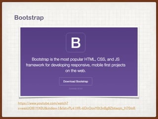
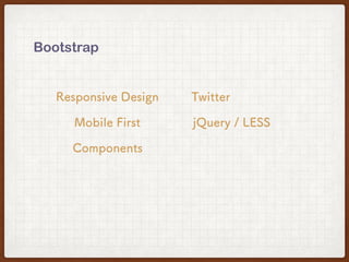

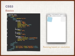
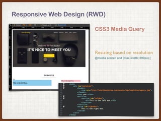
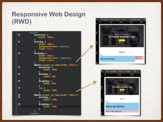


Bootstrap is a front-end framework for responsive web design that uses HTML, CSS and JavaScript to make responsive websites. It utilizes a mobile-first approach and responsive design principles to automatically resize and adapt content based on screen resolution using CSS media queries and a 12-column grid system. Bootstrap can also be easily integrated with JavaScript frameworks like AngularJS.


