This document contains research on magazine design conventions from various magazines. Key points include:
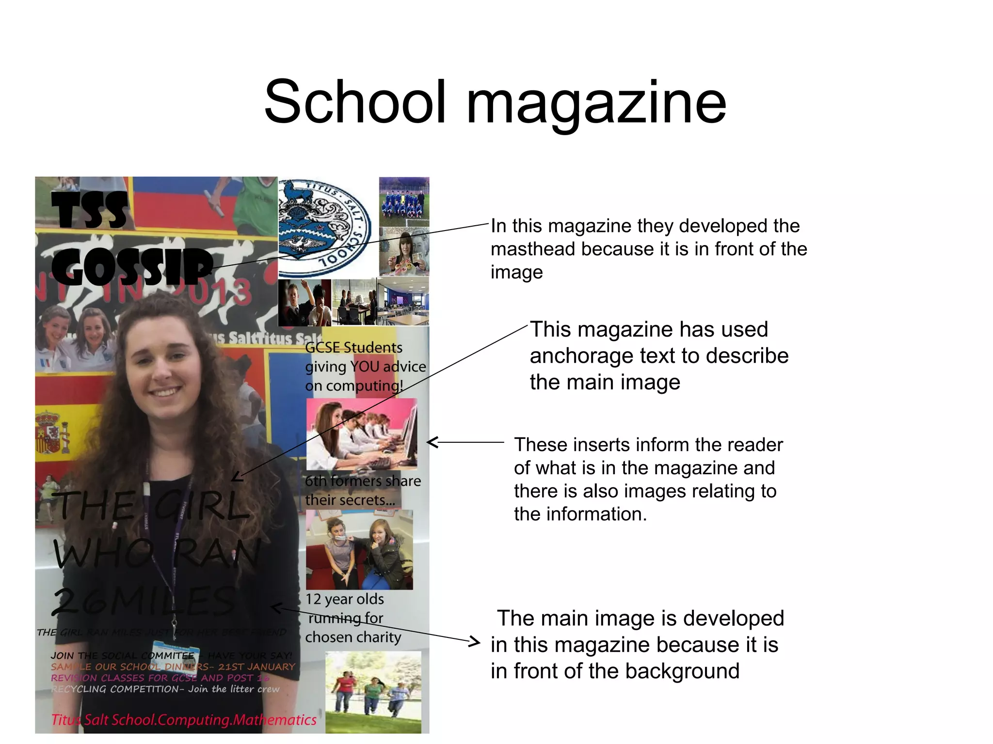
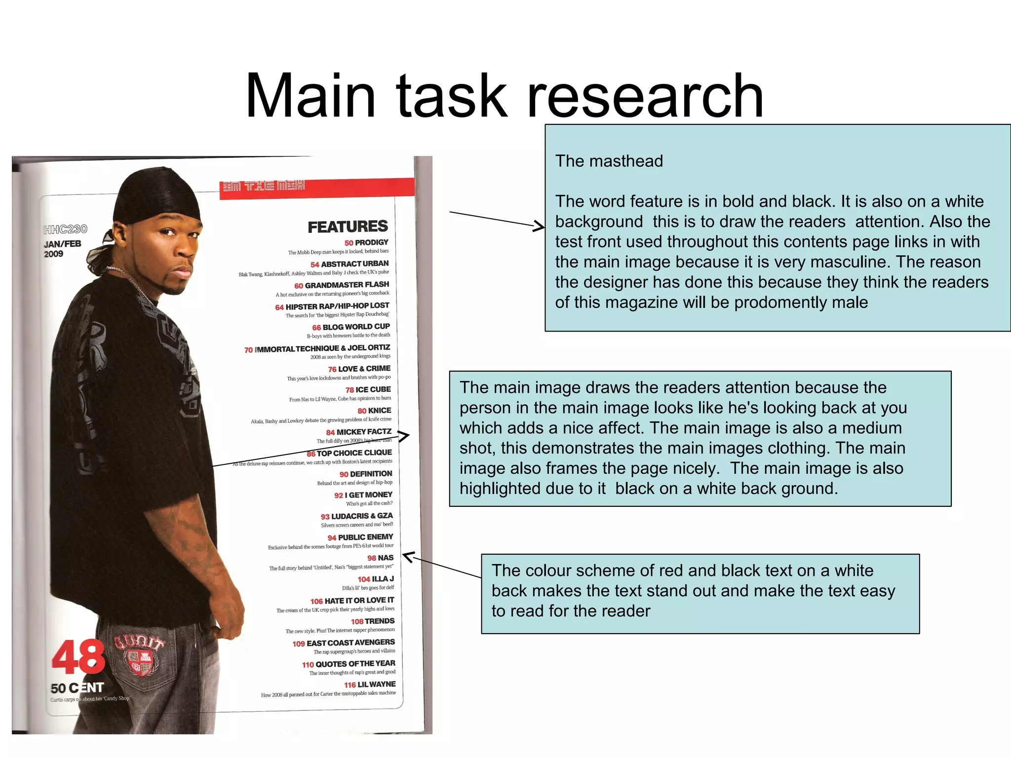
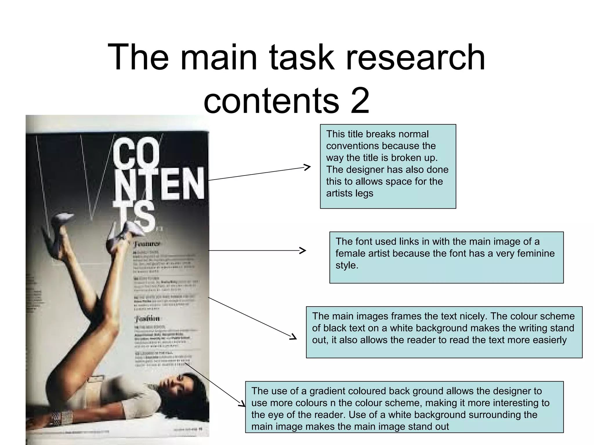
- Mastheads are often in front of main images or in a prominent position to draw reader attention.
- Main images are usually large and help frame the page. They stand out through techniques like contrasting colors.
- Color schemes, fonts, and layouts are tailored to the target audience to appeal to their tastes. Masculine styles use bolder designs while feminine styles are more delicate.
- Text is arranged clearly and uses high contrast colors like black on white for readability. Larger text draws the eye to important sections.
- Design elements like shapes, lines, and lighting styles aim to attract