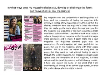
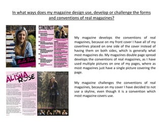
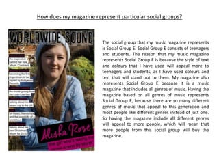
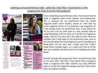
AS MEDIA
AS UNIT G321
FOUNDATION PORTFOLIO IN MEDIA
EVALUATION
Candidate Name Samantha Ryder
Candidate Number 4191
Centre Name The Leigh Academy
Centre Number 61101
In what ways does my magazine design use, develop or challenge the forms
and conventions of real magazines?
My magazine uses the conventions of real magazines as I
have used the convention of having my magazines title
directly at the top of my magazines cover, this is so that it is
clear to the reader what the magazine is called and so that
they can easily see the name when they are searching for
the magazine in a shop. One of the main conventions that I
used was a colour scheme. I decided to stick with a colour
scheme throughout my magazine so that it made the pages
more consistent and it made it seem more like a real
magazine. My magazines contents page uses the
conventions of a real magazine, as I have clearly listed the
pages that are in my magazine, along with their pages
numbers. This is so that the reader can easily find the
pages that they want to read without having to search
through the whole magazine. My magazines double page
spread uses the conventions of a real magazine, as I have
set out my interview into columns so that it is easy to read.
I have also placed the name of the artist that I am
interviewing at the top of my double page spread, so that
the readers know who the article is about.
In what ways does my magazine design use, develop or challenge the forms
and conventions of real magazines?
My magazine develops the conventions of real
magazines, because on my front cover I have all of my
coverlines placed on one side of the cover instead of
having them on both sides, which is generally what
most magazines do. My magazines double page spread
develops the conventions of real magazines, as I have
used multiple pictures on one of my pages, where as
most magazines just have a single picture covering the
page.
My magazine challenges the conventions of real
magazines, because on my cover I have decided to not
use a skyline, even though it is a convention which
most magazine covers use.
How does my magazine represent particular social groups?
The social group that my music magazine represents
is Social Group E. Social Group E consists of teenagers
and students. The reason that my music magazine
represents Social Group E is because the style of text
and colours that I have used will appeal more to
teenagers and students, as I have used colours and
text that will stand out to them. My magazine also
represents Social Group E because it is a music
magazine that includes all genres of music. Having the
magazine based on all genres of music represents
Social Group E, because there are so many different
genres of music that appeal to this generation and
most people like different genres instead of just one.
So having the magazine include all different genres
will appeal to more people, which will mean that
more people from this social group will buy the
magazine.
What kind of media institution might distribute my magazine and why?
The kind of media institution that might distribute my magazine is Bauer Media. This is because
Bauer Media is one of the biggest magazine distributers in the UK, and distributes magazines such
as Q, Kerrang and Mojo. Having Bauer Media distribute my magazine means that I can get it to a
wide range of people, most importantly my target audience. This is because it will be distributed
to shops and supermarkets where my target market will be able to purchase it.
Who would be the audience for my magazine?
The main audience for my magazine would be females and males, who are students aged 16 – 28.
My main audience is also anyone who is interested in different genres of music. My magazine is
aimed at both females and males, as it is about all different genres of music that could interest
either gender. However, the colour scheme that I have used does seem as if it is more aimed at
females then males. I also expect my main audience to be students, as they are the ones who are
most likely to be interested in reading the magazine to find out what is happening with some of
their favourite artists.
How did I attract/address my audience?
I attracted my audience by using text and colours that
would stand out to them. I used a range of different
styles of text on my magazine as it made it look more
interesting. The different styles of text were also used
to emphasise certain things, that would address my
audience, making them want to read it. The colours
that I have used will attract my audience as they are
the same colours throughout the magazine, which
keeps it consistent. This is because different colours
would make things look out of place and unattractive
to the reader. I also used images that would appeal to
my audience, as they clearly stand out and attract the
readers to the magazine.
What have I learnt about technologies from the process of constructing my
magazine?
For my magazine I used three of the four main types of technologies. The technologies that I used
were Physical technology, Digital technology and Software. The technology that I didn’t use for
my magazine was printing. The physical technology that I used for my magazine was a camera, I
used the camera so that I could take high quality photos to use for my magazine. The digital
technology that I used for my magazine was a computer as I used the software on it to edit and
design my magazine. The software that I used for my magazine was photoshop, I used photoshop
to design and edit together my magazines cover, contents page and double page spread.
Looking at my preliminary task - what do I feel that I have learnt in the
progression from it to the full product?
Since completing my preliminary task, I have learnt how to
make a magazine seem more realistic and professional.
This is because for my preliminary task my school
magazine didn’t seem realistic, where as I feel that my
music magazine seems as if it could be a real magazine. As
I had already done my preliminary task, it was easier for
me to carry out my main task as I was already used to
using Photoshop and the tools on it to edit my magazines
design. Also for my main task I was able to learn from the
mistakes that I had made on my preliminary task, such as
the text blending into the background and the background
being plain. On my main task I made sure that I didn’t
make these mistakes again, as I made sure that all of the
text was readable and that none of my backgrounds were
blank.
Overall, through the progression from my preliminary task
to my main task I feel that I have learnt how to properly
make a magazine that looks realistic, by using different
tools to create the magazines design and that I have learnt
from my original mistakes.

Evaluation

  • 1.
    AS MEDIA AS UNITG321 FOUNDATION PORTFOLIO IN MEDIA EVALUATION Candidate Name Samantha Ryder Candidate Number 4191 Centre Name The Leigh Academy Centre Number 61101
  • 2.
    In what waysdoes my magazine design use, develop or challenge the forms and conventions of real magazines? My magazine uses the conventions of real magazines as I have used the convention of having my magazines title directly at the top of my magazines cover, this is so that it is clear to the reader what the magazine is called and so that they can easily see the name when they are searching for the magazine in a shop. One of the main conventions that I used was a colour scheme. I decided to stick with a colour scheme throughout my magazine so that it made the pages more consistent and it made it seem more like a real magazine. My magazines contents page uses the conventions of a real magazine, as I have clearly listed the pages that are in my magazine, along with their pages numbers. This is so that the reader can easily find the pages that they want to read without having to search through the whole magazine. My magazines double page spread uses the conventions of a real magazine, as I have set out my interview into columns so that it is easy to read. I have also placed the name of the artist that I am interviewing at the top of my double page spread, so that the readers know who the article is about.
  • 3.
    In what waysdoes my magazine design use, develop or challenge the forms and conventions of real magazines? My magazine develops the conventions of real magazines, because on my front cover I have all of my coverlines placed on one side of the cover instead of having them on both sides, which is generally what most magazines do. My magazines double page spread develops the conventions of real magazines, as I have used multiple pictures on one of my pages, where as most magazines just have a single picture covering the page. My magazine challenges the conventions of real magazines, because on my cover I have decided to not use a skyline, even though it is a convention which most magazine covers use.
  • 4.
    How does mymagazine represent particular social groups? The social group that my music magazine represents is Social Group E. Social Group E consists of teenagers and students. The reason that my music magazine represents Social Group E is because the style of text and colours that I have used will appeal more to teenagers and students, as I have used colours and text that will stand out to them. My magazine also represents Social Group E because it is a music magazine that includes all genres of music. Having the magazine based on all genres of music represents Social Group E, because there are so many different genres of music that appeal to this generation and most people like different genres instead of just one. So having the magazine include all different genres will appeal to more people, which will mean that more people from this social group will buy the magazine.
  • 5.
    What kind ofmedia institution might distribute my magazine and why? The kind of media institution that might distribute my magazine is Bauer Media. This is because Bauer Media is one of the biggest magazine distributers in the UK, and distributes magazines such as Q, Kerrang and Mojo. Having Bauer Media distribute my magazine means that I can get it to a wide range of people, most importantly my target audience. This is because it will be distributed to shops and supermarkets where my target market will be able to purchase it.
  • 6.
    Who would bethe audience for my magazine? The main audience for my magazine would be females and males, who are students aged 16 – 28. My main audience is also anyone who is interested in different genres of music. My magazine is aimed at both females and males, as it is about all different genres of music that could interest either gender. However, the colour scheme that I have used does seem as if it is more aimed at females then males. I also expect my main audience to be students, as they are the ones who are most likely to be interested in reading the magazine to find out what is happening with some of their favourite artists.
  • 7.
    How did Iattract/address my audience? I attracted my audience by using text and colours that would stand out to them. I used a range of different styles of text on my magazine as it made it look more interesting. The different styles of text were also used to emphasise certain things, that would address my audience, making them want to read it. The colours that I have used will attract my audience as they are the same colours throughout the magazine, which keeps it consistent. This is because different colours would make things look out of place and unattractive to the reader. I also used images that would appeal to my audience, as they clearly stand out and attract the readers to the magazine.
  • 8.
    What have Ilearnt about technologies from the process of constructing my magazine? For my magazine I used three of the four main types of technologies. The technologies that I used were Physical technology, Digital technology and Software. The technology that I didn’t use for my magazine was printing. The physical technology that I used for my magazine was a camera, I used the camera so that I could take high quality photos to use for my magazine. The digital technology that I used for my magazine was a computer as I used the software on it to edit and design my magazine. The software that I used for my magazine was photoshop, I used photoshop to design and edit together my magazines cover, contents page and double page spread.
  • 9.
    Looking at mypreliminary task - what do I feel that I have learnt in the progression from it to the full product? Since completing my preliminary task, I have learnt how to make a magazine seem more realistic and professional. This is because for my preliminary task my school magazine didn’t seem realistic, where as I feel that my music magazine seems as if it could be a real magazine. As I had already done my preliminary task, it was easier for me to carry out my main task as I was already used to using Photoshop and the tools on it to edit my magazines design. Also for my main task I was able to learn from the mistakes that I had made on my preliminary task, such as the text blending into the background and the background being plain. On my main task I made sure that I didn’t make these mistakes again, as I made sure that all of the text was readable and that none of my backgrounds were blank. Overall, through the progression from my preliminary task to my main task I feel that I have learnt how to properly make a magazine that looks realistic, by using different tools to create the magazines design and that I have learnt from my original mistakes.