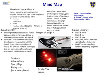
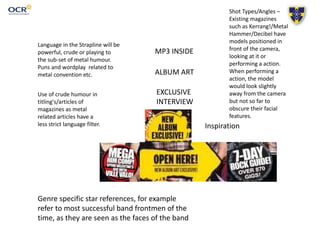
Mind Map
Masthead name ideas –
Names should be genre/convention
inspired. Similar font style to Kerrang! with
the worn down/shattered effect
• Hereticus
• ThrashNerve
• Sludge
• HeadbangCollider(Strapline – Metal is a
Physical Science!)
Colour schemes –
• Black & white
• Black & red
• Black & grey
• Black, red, white ( Red used
sporadically, a feature to
• Dark/Contrasting colours
scheme depending on genre.
Brand Identity –
• Showing links to Facebook and twitter
accounts. Use of # on page. Linked to
interviews/bigger articles will have #.
• I will use a consistent font which will
then become recognisable with the
brand. Due to the nature of metal
music, the font will be harsh looking as
that is a convention of metal music,
and creates connotations of conflict.
Images of props –
Stories –
Album drops
Tours/Gigs
Rising stars
(Interviews/Bands)
Metal/Sub Genres have
crude inspired images/gore
inspired titling of bands and
names ( Similar to Metal
Hammer and Kerrang!) .
Genres have differing
names and all have blanket
tropes that appeal to all
genres of metal.
Smoke/Fire
props.
Name – Feargus Bracken
Centre Name –
St Andrew’s Catholic School
Centre number – 64135
Language in the Strapline will be
powerful, crude or playing to
the sub-set of metal humour.
Puns and wordplay related to
metal convention etc.
Use of crude humour in
titling's/articles of
magazines as metal
related articles have a
less strict language filter.
MP3 INSIDE
ALBUM ART
EXCLUSIVE
INTERVIEW
Inspiration
Genre specific star references, for example
refer to most successful band frontmen of the
time, as they are seen as the faces of the band
Shot Types/Angles –
Existing magazines
such as Kerrang!/Metal
Hammer/Decibel have
models positioned in
front of the camera,
looking at it or
performing a action.
When performing a
action, the model
would look slightly
away from the camera
but not so far to
obscure their facial
features.

Mind Map

  • 1.
    Mind Map Masthead nameideas – Names should be genre/convention inspired. Similar font style to Kerrang! with the worn down/shattered effect • Hereticus • ThrashNerve • Sludge • HeadbangCollider(Strapline – Metal is a Physical Science!) Colour schemes – • Black & white • Black & red • Black & grey • Black, red, white ( Red used sporadically, a feature to • Dark/Contrasting colours scheme depending on genre. Brand Identity – • Showing links to Facebook and twitter accounts. Use of # on page. Linked to interviews/bigger articles will have #. • I will use a consistent font which will then become recognisable with the brand. Due to the nature of metal music, the font will be harsh looking as that is a convention of metal music, and creates connotations of conflict. Images of props – Stories – Album drops Tours/Gigs Rising stars (Interviews/Bands) Metal/Sub Genres have crude inspired images/gore inspired titling of bands and names ( Similar to Metal Hammer and Kerrang!) . Genres have differing names and all have blanket tropes that appeal to all genres of metal. Smoke/Fire props. Name – Feargus Bracken Centre Name – St Andrew’s Catholic School Centre number – 64135
  • 2.
    Language in theStrapline will be powerful, crude or playing to the sub-set of metal humour. Puns and wordplay related to metal convention etc. Use of crude humour in titling's/articles of magazines as metal related articles have a less strict language filter. MP3 INSIDE ALBUM ART EXCLUSIVE INTERVIEW Inspiration Genre specific star references, for example refer to most successful band frontmen of the time, as they are seen as the faces of the band Shot Types/Angles – Existing magazines such as Kerrang!/Metal Hammer/Decibel have models positioned in front of the camera, looking at it or performing a action. When performing a action, the model would look slightly away from the camera but not so far to obscure their facial features.