
Recommended
More Related Content
What's hot
What's hot (18)
Viewers also liked
Viewers also liked (17)
Similar to Angus and Julia Stone website reflects vintage folk audience
Similar to Angus and Julia Stone website reflects vintage folk audience (20)
Recently uploaded
Recently uploaded (20)
Angus and Julia Stone website reflects vintage folk audience
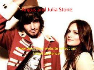
- 1. Angus and Julia Stone How does their website reflect our target audience?
- 2. Website Homepage The website’s homepage is designed in the style of a wall in an old-fashioned country house. This is an immediate reference to their music genre due to the vintage-styled picture-frames and globe model. The notice on the wall which is updated by the band, highlights a sense of innocence and also an idea that although they have achieved success, they aren’t out of touch with their fans. The record player in the corner of the page also acts as a musical reference and refers back to the band’s genre of more old-fashioned folk and country music. Further evidence of this band attempting to hark back to times gone by include a black and white framed picture as well as a 1950s-style television.
- 3. Band Merchandise Angus and Julia Stone have attempted to stay away from the traditional merchandise e.g. t- shirts and other forms of clothes. Instead, the merchandise consists of more obscure items, with the band staying true to their overall image of being different and not following the crowd. These items include a chord book, such as the one pictured below. At the moment, the band’s merchandise has a very Christmas-related theme, as they are currently selling ‘Christmas packs’, containing a variety of products, including both of their albums and the chord book. This is done to keep their audience feeling that the band are fully in touch with them and are rewarding them for their support.
- 4. Album Artwork The first album for A&S – ‘Down The Way’, is an early 20th century-style photo of a young man standing alone on a beach. This simple design for a cover shows that the band are minimalist in the way they represent themselves and their music. The fact that the first album doesn’t have a shot of the band also shows that they want to maintain their obscurity and rely on their music entirely to present themselves. The second album cover does include a shot of the band, this coming alongside them gaining more recognition across a wider audience. The boat in the background is metaphorical for the journey the band have been on since their first album and the open water in front of it shows they are continuing this journey.