Private Call Girls Bally - 8250192130 | 24x7 Service Available Near Me
Albumz
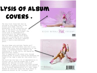
1. Analysis of Album Covers ♥ The very first thing that must be noticed on this album cover is the blatant pink theme. From the background, to the accessories and hair of the artist, to the actual name of the album- ‘Pink Friday’. The colour pink is stereotypically associated with the female gender, and as a female rapper, NickiMinaj uses this to portray her as a strong, powerful woman in the music industry- within a heavily male-dominated genre. The pink theme also portrays ‘barbie girl’ connotations, and NickiMinaj uses this in all areas of her work, from the presentation of the album, to nicknaming herself ‘Barbie’ and referencing it in her lyrics, and naming her dedicated fans ‘barbz’. This is supported in the album cover through presenting her as plastic looking and extending the length of her legs to make her look almost doll-like. One could say this has a lot of representation in society, and it could be argued that it goes against the feminist attitude I mentioned previously, as women in society are often accused of being too appearance-obsessed and that Barbie is not an accurate representation of a ‘real’ woman. However we could also argue that NickiMinaj is presenting herself as the ‘ultimate’ woman.
2. Analysis of Album Covers ♥ Paolo Nutini’s album cover for‘Sunny Side Up’ perfectly emulates the cheery disposition of the title. The use of illustration is fun and childlike, portraying that the music within the album will be just as cheerful. The use of having a drawn image of the artist as opposed to a photograph conveys the entire package of artist, album and music as a piece of art. The images used on the album convey a relaxed, homely feel. The image of ‘Paolo’ seated at the table, eating his eggs ‘sunny side up’ shows the album as something pleasant to chill out and listen to. The guitar in the background and rainbow landscape also assist this chilled out tone, and the guitar portrays that the album is mostly acoustic. The brightly coloured background of red, green and yellow is summery, emphasising the connotations of ‘sunny’ in the title. The use of colours green and red portray the colours of the Italian flag, and therefore represents the Italian descent of the artist.
3. Analysis of Album Covers ♥ Eliza Doolittle’s self-titled debut album seeks to portray the artist’s personality. The variety of images on the front cover express a number of fun elements, topped off by the image of the artist holding a dice, conveying connotations of games and leisure. The array of images feature iconic London buildings, like the Gherkin and the BT Tower, representing the artist’s home town and patriotism. The bright colours of the different shapes, animals and objects create an eye-catching image, complimented by the artist’s patterned clothing. The cover aims to appeal to a British audience, not only using the references to London, but also the hints of black clouds in the sky, conveying typical British weather. The back of the album again features the artist, wearing brightly coloured shoes and clothing, taking on a playful pose in the centre of the cover. The use of bold, childlike fonts which look like ribbons and banners continue the less-than-serious theme, and suggest that the music on the album itself will be of the same tone.