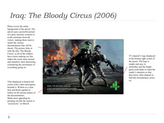
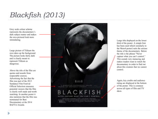
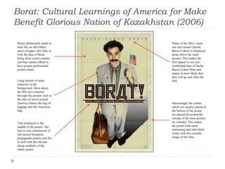
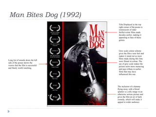
Ancillary Product Research:
Newspaper Adverts
Guy Southam A2 Media
Iraq: The Bloody Circus (2006)
Title displayed in bottom left
corner with a short description
beneath it. Written in a clear
font and block capitals to
reflect on the serious nature of
the documentaries.
Made more appealing by
pointing out that the season is
‘exclusively’ on More4.
Photo covers the entire
background of the advert. The
advert uses a powerful picture
of a grim warzone scenario to
evoke emotions from the
viewer, making them want to
watch the various
documentaries that will be
shown. The picture links in
with the title ‘The Bloody
Circus’ as all of the soldiers
have clown makeup on; this
makes the scene more surreal
and somehow more harrowing,
considering the seriousness of
everything going on.
TV channel’s logo displayed
in the bottom right corner of
the poster. The logo is
simple and easy to
remember and the bright
green used helps to catch the
reader’s attention so that
they know what channel to
find this documentary series
on.
This is Spinal Tap (1984)
Quote with several other quotes
below positioned at the top of the
poster. The largest quote is the
simplest and most memorable out
of the three and is red and written
in block capitals in order to grab
the reader’s attention; this is
probably the first thing they will
look at when they read the advert.
Photo of the band posing in the
middle of the page. The band
members are deliberately wearing
clothes that make them look like a
generic metal band of the time,
making them more appealing to
fans of the music genre. The photo
is also reminiscent of photos
displayed on the insides of album
sleeves; this again reinforces ideas
about the film being about music
and heavy metal.
Yellow background colour makes
the poster bright, colourful and
more appealing to the reader.
Title displayed on the lower third
of the poster is deliberately made
to look like a generic metal band
logo similar to ones used by other
bands at the time.
Information such as stars,
director, producer, companies
involved and age rating are
displayed at the very bottom of
the poster. As this is not crucial
information, it is written in a
fairly small font size and is in a
pale blue which does not grab the
eye as much as the more
important things written in red.
Blackfish (2013)
Grey scale colour scheme
represents the documentary’s
dark subject matter and makes
the orca pictured look more
intimidating.
Large picture of Tilikum the
orca takes up the background.
The picture looks fairly dark
and is clearly meant to
represent Tilikum as
dangerous.
Above the title of the film are
quotes and awards from
respectable sources.
Advertising the fact that the
film was part of the 2013
Sundance Film Festival
Official Selection reassures
potential viewers that the film
is clearly well made and worth
watching. In another poster it
also mentions that the film was
nominated for Best
Documentary at the 2014
BAFTA Awards.
Large title displayed on the lower
third of the poster. A simple font
has been used which (similarly to
the More4 poster) suits the serious
theme of the documentary. Below
the title is the phrase “Never
capture what you can’t control.”
This sounds very menacing and
makes readers want to watch the
documentary in order to find out
about this creature that we cannot
control.
Again, key credits and audience
rating are displayed at the bottom
of the poster. This is common
across all types of film and TV
show.
Borat: Cultural Learnings of America for Make
Benefit Glorious Nation of Kazakhstan (2006)
Poster deliberately made to
look like an old folded
piece of paper; this links in
with the idea of Borat
being from a poor country
and thus cannot afford to
have proper professional
posters made.
Large picture of main
character in the
background. Ideas about
the film are connoted
through this picture such as
the idea of travel around
America (hence the bag of
luggage and the American
flag.
Title displayed in the
middle of the poster. The
font is very reminiscent of
old eastern European
propaganda posters and fits
in well with the old and
cheap aesthetic of the
whole poster.
Interestingly the credits
which are usually placed at
the bottom of the poster
are placed all around the
outside of the main picture
lie a border. This makes
the poster look more
interesting and odd which
works with the comedic
image of the film.
Name of the film’s main
star and creator (Sacha
Baron Cohen) is displayed
alone above the main
picutre. This makes the
film appeal to any pre-
established fans of Sacha
Baron Cohen films and
makes it more likely that
they will go and what the
film.
Man Bites Dog (1992)
Long list of awards down the left
side of the poster shows the
viewer that the film is successful
and thusly worth watching.
Title Displayed in the top
right corner of the poster is
reminiscent of older
thriller/crime films made
decades earlier, making it
appealing to fans of these
genres.
Grey scale colour scheme
gives the film a noir feel and
makes it stand out as most
films made during this time
were filmed in colour. The
use of grey scale makes the
picture seem more menacing
and pays tribute to earlier
films that may have
influenced this one.
The inclusion of a dummy
flying away with a blood
splatter is a silly image in an
otherwise serious picture and
gives the film an air of dark
comedy, which will make it
appeal to wider audience.

Ancillary product research

  • 1.
    Ancillary Product Research: NewspaperAdverts Guy Southam A2 Media
  • 2.
    Iraq: The BloodyCircus (2006) Title displayed in bottom left corner with a short description beneath it. Written in a clear font and block capitals to reflect on the serious nature of the documentaries. Made more appealing by pointing out that the season is ‘exclusively’ on More4. Photo covers the entire background of the advert. The advert uses a powerful picture of a grim warzone scenario to evoke emotions from the viewer, making them want to watch the various documentaries that will be shown. The picture links in with the title ‘The Bloody Circus’ as all of the soldiers have clown makeup on; this makes the scene more surreal and somehow more harrowing, considering the seriousness of everything going on. TV channel’s logo displayed in the bottom right corner of the poster. The logo is simple and easy to remember and the bright green used helps to catch the reader’s attention so that they know what channel to find this documentary series on.
  • 3.
    This is SpinalTap (1984) Quote with several other quotes below positioned at the top of the poster. The largest quote is the simplest and most memorable out of the three and is red and written in block capitals in order to grab the reader’s attention; this is probably the first thing they will look at when they read the advert. Photo of the band posing in the middle of the page. The band members are deliberately wearing clothes that make them look like a generic metal band of the time, making them more appealing to fans of the music genre. The photo is also reminiscent of photos displayed on the insides of album sleeves; this again reinforces ideas about the film being about music and heavy metal. Yellow background colour makes the poster bright, colourful and more appealing to the reader. Title displayed on the lower third of the poster is deliberately made to look like a generic metal band logo similar to ones used by other bands at the time. Information such as stars, director, producer, companies involved and age rating are displayed at the very bottom of the poster. As this is not crucial information, it is written in a fairly small font size and is in a pale blue which does not grab the eye as much as the more important things written in red.
  • 4.
    Blackfish (2013) Grey scalecolour scheme represents the documentary’s dark subject matter and makes the orca pictured look more intimidating. Large picture of Tilikum the orca takes up the background. The picture looks fairly dark and is clearly meant to represent Tilikum as dangerous. Above the title of the film are quotes and awards from respectable sources. Advertising the fact that the film was part of the 2013 Sundance Film Festival Official Selection reassures potential viewers that the film is clearly well made and worth watching. In another poster it also mentions that the film was nominated for Best Documentary at the 2014 BAFTA Awards. Large title displayed on the lower third of the poster. A simple font has been used which (similarly to the More4 poster) suits the serious theme of the documentary. Below the title is the phrase “Never capture what you can’t control.” This sounds very menacing and makes readers want to watch the documentary in order to find out about this creature that we cannot control. Again, key credits and audience rating are displayed at the bottom of the poster. This is common across all types of film and TV show.
  • 5.
    Borat: Cultural Learningsof America for Make Benefit Glorious Nation of Kazakhstan (2006) Poster deliberately made to look like an old folded piece of paper; this links in with the idea of Borat being from a poor country and thus cannot afford to have proper professional posters made. Large picture of main character in the background. Ideas about the film are connoted through this picture such as the idea of travel around America (hence the bag of luggage and the American flag. Title displayed in the middle of the poster. The font is very reminiscent of old eastern European propaganda posters and fits in well with the old and cheap aesthetic of the whole poster. Interestingly the credits which are usually placed at the bottom of the poster are placed all around the outside of the main picture lie a border. This makes the poster look more interesting and odd which works with the comedic image of the film. Name of the film’s main star and creator (Sacha Baron Cohen) is displayed alone above the main picutre. This makes the film appeal to any pre- established fans of Sacha Baron Cohen films and makes it more likely that they will go and what the film.
  • 6.
    Man Bites Dog(1992) Long list of awards down the left side of the poster shows the viewer that the film is successful and thusly worth watching. Title Displayed in the top right corner of the poster is reminiscent of older thriller/crime films made decades earlier, making it appealing to fans of these genres. Grey scale colour scheme gives the film a noir feel and makes it stand out as most films made during this time were filmed in colour. The use of grey scale makes the picture seem more menacing and pays tribute to earlier films that may have influenced this one. The inclusion of a dummy flying away with a blood splatter is a silly image in an otherwise serious picture and gives the film an air of dark comedy, which will make it appeal to wider audience.