This document provides information on different types of graphs used to organize and display data:
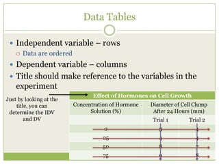
1) Tables organize data with independent variables in rows and dependent variables in columns to allow analysis of relationships between variables.
2) Line graphs show changes in a continuous variable over time and can indicate trends, while bar graphs display continuous or discrete data but are less useful for extrapolating information.
3) Circle graphs represent the parts of a whole and show the frequency of categories, making them well-suited for displaying percentage data.