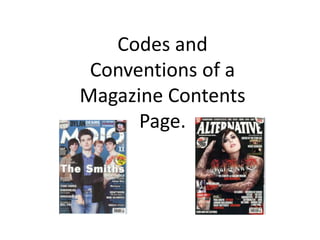
4. Both MOJO and ALTERNATIVE show the
date and the issue number on the
contents page.
ALTERNATIVE shows a picture
of the front cover of the
magazine on the contents
page. Not all magazines do
this, just like MOJO. However,
those who do, the front cover
reminds the audience what
the main article is and what
they should look out for.
5. Both MOJO and ALTERATIVE use the same
typography on the contents page as they do
on the front cover for the title. The
typography also has connotations of the
genre of the magazine. This is especially
highlighted in ALTERNATIVE as it has a
splattered red background behind ‘contents’.
The red has many different connotations
that relate the alternative and rock music.
6. MOJO and ALTERNATIVE both show credit to
those who contributed to the magazine but
go about it in different ways. MOJO shows
credit to the three who have produced a
great article or one-off art piece. It is
presented in a jokey manor with irrelevant
back stories in some cases followed by a few
serious words of their gratitude. This will
keep the audience entertained and make
them want to look for their pieces of work.
ALTERNATIVE presents a more commonly
used Editors letter. The editor, Phil, talks
about the magazine and what is included. He
also discusses the hard workings of Kat Von
D in this article to applaud her for what she
has achieved and thank her for being a big
part of this issue.
7. Both images have direct address with the audience. Kat
Von D in particular allures the audience. The dark
makeup on a dark background really makes her stand
out. Whereas, Just like the genre the main image of Bob
Dylan in MOJO is more relaxed.
The picture on the MOJO contents page covers some of
the writing at the top, as this is a well established
magazine the audience will know what it is. The images
relate to the article, the genre and the personality of
the singers.