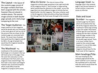
1. The Layout – the layout of
the contents page consist of
the page numbers that have
been assigned with the articles
however they are placed in
random places. The second
image consists in both double
page spreads and is fairly large
comparing to the rest.
The Target Audience- The
target audience of this magazine
would be people who are interested
in the music genre of rock as a lot of
the pictures that are shown on the
contents page are associated with
bands. The social class of people
that would buy this magazine would
be ABC1, the age of people that
would buy this magazine would be
15 to 25years old.
The Masthead- The
masthead on the contents page is
fairly large as it is located in the top
left hand corner of the page, it has
the same font and colour as the
masthead on the front cover as Q
magazine have a brand image. The
font style is very classic and elegant
however very round and simplistic
which could reflect how the
magazine is trying to come across.
Main headings/Title-
The main heading for the
contents page would be the
word ‘Contents’ as it is close to
the masthead and in very bold
style font which would draw the
readers attention to it.
Language Used- The
language used in the contents
page is very formal however in
certain articles it may come
across as informal.
Date and Issue
Number- The magazine
contents page has the dates
which are located at the top
left of the magazine above the
masthead in fairly large writing
to give the reader information
of what age the issue they are
reading also the date is located
next the page number in the
bottom right hand corner of
the double page spread. There
is no issue number that is
stated on the contents page
however it is one of the codes
and conventions that a
magazine should have for the
front cover of the magazine.
Mise-En-Scene- The mise en scene of the
magazines contents page would be on the right hand side
of the magazine there is ‘ the Q review’ in large writing
which would draw the attention to the reader., across the
page there are many different images of articles that are
based further into the magazine. The colour scheme used
in the Q magazine is Red and white as they have followed
this through from the front cover through to the contents
page.