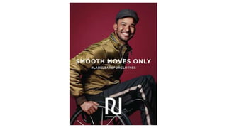
Use of Language – The advertisement contains limited text, focusing the viewers'
attention on the model and the specific campaign moto. At first the reader
would notice ‘SMOOTH MOVES ONLY’, a play on words relating to the subject.
Jordan Luce is the face of this advert, a wheelchair basketball player. ‘Smooth
moves’ can relate to the clean movements of a wheelchair but also the ‘coolness’
of his high-level skills. The use of ‘only’ allows the reader to understand that the
quality of these clothes create a sense of ability of ‘smooth moves’ and with
them you can be nothing less. Beneath this text the advertisement states
'#LABELSAREFORCLOTHES'. This is the overall name of River Island's campaign,
creating an understanding that if labels are for clothes, they are not for people.
This language creates a sense of inclusivity and uniqueness for the readers as
they are being told to be themselves.
Layout – The positioning of the image makes out that the focus isn't on the fact
the model is a wheelchair user, and instead on him as a person. Demonstrating
uniqueness as a whole person instead of the ‘obvious’ thing that makes a person
different, linking to the message of the campaign.
Use of colour – These colours are very sleek and send a message about the
brand and how they want to be perceived in a clean, cool way. The simplicity of
all the colours makes focus easy on every piece of the advert as it is hard to miss
any points as everything stands out on its own. The way the clothes stand out
helps to emphasise the campaign and the uniqueness it supports.
Brand identity/ Logo – The River Island logo is recognizable to a lot of the British
public very quickly. The logo is very simple and made up of the two letters, R and
I, in the name River Island. It is very sleek, fitting into the identity that the
company wants to create.
Typography- Similar to the language, layout, and colours in this campaign, the
typography is also simple and sleek. Overall tying every aspect of the advert
together. The font is a proportionally pleasing size and the text is also in capitals,
keeping consistency throughout the writing.
Branding- Due to the simplicity of the advertisement, the colours aren’t
distracting and the language is simple and minimal, you will see the River Island
logo very quickly. The logo is likely to be quickly recognizable to the general
British public, but if not, beneath the logo is their website domain which states
the company’s full name. This unfortunately limits quick viewers that have
potential of interest to those who already recognise the brand.
AIDA Analysis
Attention-
• 1st level of response
• Thinking about the product and becoming aware of it’s attributes and benefits
• Triggered through advertising
Understanding that the brand creates clothing options for you and that these
clothes are unique and ‘smooth’. What outfits the customer can create and how
they will feel through this expression.
Interest-
• The affective stage
• Customers are beyond mere knowledge and begin to develop attitudes,
preferences and potentially interests.
Develop an understanding of the campaign values of ‘#LABELSAREFORCLOTHES’,
this can create a deeper interest in the clothing if they share this attitude. Viewers
may also start to understand the significance of the model.
Desire-
• Develop interest into a need, imagine themselves with the product
• Understand features of information they have learned
How the customer would wear/act with these clothes. They may visit River Island in
person or online to view items, or research the campaign further
Action-
• Final stage where customers take action such as visiting a retailer
The customer may learn further information about prices and clothing options
Use of Language- The language in this campaign
in minimal but simple when used. Reading left to
right, your attention is first drawn to ‘REAL LIFE.
REAL BEAUTY’, this repetition of the word real
emphasises the message of the campaign with
how the truth is the most beautiful. The
simplicity creates an easy message. The campaign
is regarded as ‘#BeautifullyRealMoms’, an
understandable message that also compliments
the mothers seeing this advert.
Layout- The use of the Z pattern in this advert
has the viewer follow the text in the top left
(learning the values of the campaign) to the mum
of the image and then follow down the height of
the figures (seeing those in this family). The
reader then follows along to the text in the
bottom right, understanding the campaign with
their motto, ‘#BeautifullyRealMoms’.
Use of colour- The colour in this image does not feel ‘picked out’ and ‘thought
through’ as it isn’t, this helps demonstrate the ‘messiness’ of true families that mums
must supervise.
Branding - Dove has always been known for the truthfulness that makes us unique and beautiful and this campaign continues to show
those values. The advert contains an image of a mum and her children being a true family of mess and many emotions, the language used
also emphasises this message.
Brand Identity/ Logo – This campaign signifies the launch of babyDove, the logo is the same as the other Dove products so is instantly
recognisable to those who already know their main line. The logo features a dove in a block colour, creating a clean and soft look which
benefits a sensitive soap brand.
Typography- Each piece of text is individual, whether it be in caps, a soft font or a subtle hashtag.
AIDA Analysis
Attention-
• 1st level of response
• Thinking about the product and becoming aware of it’s attributes and
benefits
• Triggered through advertising
The viewers may feel seen and appreciated. The product would benefit them if
they are in a similar situation as it is created for real families.
Interest-
• The affective stage
• Customers are beyond mere knowledge and begin to develop attitudes,
preferences and potentially interests.
The viewer may feel comforted in the fact that the product is suited to them and
build interest around the safe feeling relating to this.
Desire-
• Develop interest into a need, imagine themselves with the product
• Understand features of information they have learned
As the viewer may relate to the demonstrated situation, they can picture
themselves with the product easily. This builds a want for the product, and they
may start to decide whether to put in further research to the products.
Action-
• Final stage where customers take action such as visiting a retailer
The viewer may take the easiest route to find the product and look at the
options they have in the collection.
Use of Language- The language is very
hard-hitting in this campaign, creating
questioning emotions in viewers and a
want to help. The questions use blunt
and simple language that shows the
reality to many people.
Layout- The layout ensures that the
viewer sees the faces full of emotion
and the text with strong language.
Everything is central.
Use of colour- The images are edited
to emphasise the realness of these
people and their emotions regarding
what they are facing. The text is in red
and white, the red relates to and
reminds you of Shelter and the white
creates a contrast to the text that
differs in each campaign piece.
Brand Identity/ Logo- The Shelter logo is respectfully simple and also easy to recognisable.
Typography- The font, size and capitals create a bold feeling to the fierce connotations of the text.
Branding- The branding is simplistic but eye-catching. Allowing the viewer to notice the logo/name and the website, the features that a
charity wants to be noticed, helping their cause.
Attention-
• 1st level of response
• Thinking about the product and becoming aware of its attributes
and benefits
• Triggered through advertising
Initial emotions without the influence of thinking or other’s opinions.
The viewer is likely to feel upset at first glance due to the negative
denotations of the campaign.
Interest-
• The affective stage
• Customers are beyond mere knowledge and begin to develop
attitudes, preferences and potentially interests.
The viewer will read the text on the page and understand the
connotations of the campaign, building further emotions through
empathy/sympathy.
Desire-
• Develop interest into a need, imagine themselves with the
product
• Understand features of information they have learned
The viewers’ upset emotions may develop and as they read further
they learn how they can help/ gain more information about the cause.
Action-
• Final stage where customers take action such as visiting a retailer
The viewer may support Shelter through donations and educating
themselves.

Media Text Analysis.pptx

  • 2.
    Use of Language– The advertisement contains limited text, focusing the viewers' attention on the model and the specific campaign moto. At first the reader would notice ‘SMOOTH MOVES ONLY’, a play on words relating to the subject. Jordan Luce is the face of this advert, a wheelchair basketball player. ‘Smooth moves’ can relate to the clean movements of a wheelchair but also the ‘coolness’ of his high-level skills. The use of ‘only’ allows the reader to understand that the quality of these clothes create a sense of ability of ‘smooth moves’ and with them you can be nothing less. Beneath this text the advertisement states '#LABELSAREFORCLOTHES'. This is the overall name of River Island's campaign, creating an understanding that if labels are for clothes, they are not for people. This language creates a sense of inclusivity and uniqueness for the readers as they are being told to be themselves. Layout – The positioning of the image makes out that the focus isn't on the fact the model is a wheelchair user, and instead on him as a person. Demonstrating uniqueness as a whole person instead of the ‘obvious’ thing that makes a person different, linking to the message of the campaign. Use of colour – These colours are very sleek and send a message about the brand and how they want to be perceived in a clean, cool way. The simplicity of all the colours makes focus easy on every piece of the advert as it is hard to miss any points as everything stands out on its own. The way the clothes stand out helps to emphasise the campaign and the uniqueness it supports.
  • 3.
    Brand identity/ Logo– The River Island logo is recognizable to a lot of the British public very quickly. The logo is very simple and made up of the two letters, R and I, in the name River Island. It is very sleek, fitting into the identity that the company wants to create. Typography- Similar to the language, layout, and colours in this campaign, the typography is also simple and sleek. Overall tying every aspect of the advert together. The font is a proportionally pleasing size and the text is also in capitals, keeping consistency throughout the writing. Branding- Due to the simplicity of the advertisement, the colours aren’t distracting and the language is simple and minimal, you will see the River Island logo very quickly. The logo is likely to be quickly recognizable to the general British public, but if not, beneath the logo is their website domain which states the company’s full name. This unfortunately limits quick viewers that have potential of interest to those who already recognise the brand.
  • 4.
    AIDA Analysis Attention- • 1stlevel of response • Thinking about the product and becoming aware of it’s attributes and benefits • Triggered through advertising Understanding that the brand creates clothing options for you and that these clothes are unique and ‘smooth’. What outfits the customer can create and how they will feel through this expression. Interest- • The affective stage • Customers are beyond mere knowledge and begin to develop attitudes, preferences and potentially interests. Develop an understanding of the campaign values of ‘#LABELSAREFORCLOTHES’, this can create a deeper interest in the clothing if they share this attitude. Viewers may also start to understand the significance of the model. Desire- • Develop interest into a need, imagine themselves with the product • Understand features of information they have learned How the customer would wear/act with these clothes. They may visit River Island in person or online to view items, or research the campaign further Action- • Final stage where customers take action such as visiting a retailer The customer may learn further information about prices and clothing options
  • 6.
    Use of Language-The language in this campaign in minimal but simple when used. Reading left to right, your attention is first drawn to ‘REAL LIFE. REAL BEAUTY’, this repetition of the word real emphasises the message of the campaign with how the truth is the most beautiful. The simplicity creates an easy message. The campaign is regarded as ‘#BeautifullyRealMoms’, an understandable message that also compliments the mothers seeing this advert. Layout- The use of the Z pattern in this advert has the viewer follow the text in the top left (learning the values of the campaign) to the mum of the image and then follow down the height of the figures (seeing those in this family). The reader then follows along to the text in the bottom right, understanding the campaign with their motto, ‘#BeautifullyRealMoms’. Use of colour- The colour in this image does not feel ‘picked out’ and ‘thought through’ as it isn’t, this helps demonstrate the ‘messiness’ of true families that mums must supervise. Branding - Dove has always been known for the truthfulness that makes us unique and beautiful and this campaign continues to show those values. The advert contains an image of a mum and her children being a true family of mess and many emotions, the language used also emphasises this message. Brand Identity/ Logo – This campaign signifies the launch of babyDove, the logo is the same as the other Dove products so is instantly recognisable to those who already know their main line. The logo features a dove in a block colour, creating a clean and soft look which benefits a sensitive soap brand. Typography- Each piece of text is individual, whether it be in caps, a soft font or a subtle hashtag.
  • 7.
    AIDA Analysis Attention- • 1stlevel of response • Thinking about the product and becoming aware of it’s attributes and benefits • Triggered through advertising The viewers may feel seen and appreciated. The product would benefit them if they are in a similar situation as it is created for real families. Interest- • The affective stage • Customers are beyond mere knowledge and begin to develop attitudes, preferences and potentially interests. The viewer may feel comforted in the fact that the product is suited to them and build interest around the safe feeling relating to this. Desire- • Develop interest into a need, imagine themselves with the product • Understand features of information they have learned As the viewer may relate to the demonstrated situation, they can picture themselves with the product easily. This builds a want for the product, and they may start to decide whether to put in further research to the products. Action- • Final stage where customers take action such as visiting a retailer The viewer may take the easiest route to find the product and look at the options they have in the collection.
  • 9.
    Use of Language-The language is very hard-hitting in this campaign, creating questioning emotions in viewers and a want to help. The questions use blunt and simple language that shows the reality to many people. Layout- The layout ensures that the viewer sees the faces full of emotion and the text with strong language. Everything is central. Use of colour- The images are edited to emphasise the realness of these people and their emotions regarding what they are facing. The text is in red and white, the red relates to and reminds you of Shelter and the white creates a contrast to the text that differs in each campaign piece. Brand Identity/ Logo- The Shelter logo is respectfully simple and also easy to recognisable. Typography- The font, size and capitals create a bold feeling to the fierce connotations of the text. Branding- The branding is simplistic but eye-catching. Allowing the viewer to notice the logo/name and the website, the features that a charity wants to be noticed, helping their cause.
  • 10.
    Attention- • 1st levelof response • Thinking about the product and becoming aware of its attributes and benefits • Triggered through advertising Initial emotions without the influence of thinking or other’s opinions. The viewer is likely to feel upset at first glance due to the negative denotations of the campaign. Interest- • The affective stage • Customers are beyond mere knowledge and begin to develop attitudes, preferences and potentially interests. The viewer will read the text on the page and understand the connotations of the campaign, building further emotions through empathy/sympathy. Desire- • Develop interest into a need, imagine themselves with the product • Understand features of information they have learned The viewers’ upset emotions may develop and as they read further they learn how they can help/ gain more information about the cause. Action- • Final stage where customers take action such as visiting a retailer The viewer may support Shelter through donations and educating themselves.