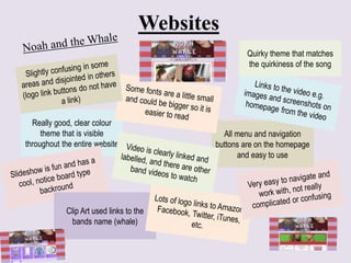
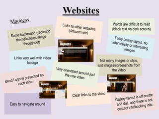
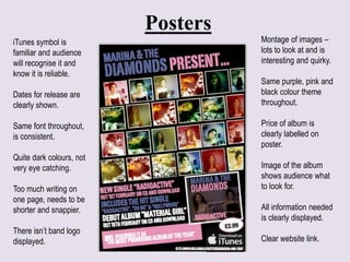
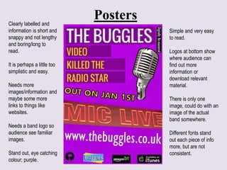
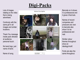
This document provides reviews of marketing materials for a band, including their website, posters, and digital packaging. For the website, it notes the clear color theme, use of clip art related to the band's name, and easy to use navigation. However, it also points out that some text is difficult to read. The posters receive mixed feedback, with praise for the variety of images and clear information labeling, but criticism that the colors are not very eye-catching and there is too much text. The digital packaging is praised for its consistent images relating to a music video, thank you message, and inclusion of production details, but it does not feature the band's logo.

