
Recommended
More Related Content
Viewers also liked
Similar to Aritst Name Fonts For The Double Page Spread
Similar to Aritst Name Fonts For The Double Page Spread (20)
More from annabelle parish
More from annabelle parish (13)
Recently uploaded
Recently uploaded (20)
Aritst Name Fonts For The Double Page Spread
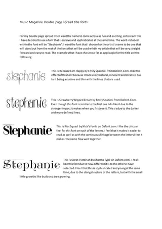
- 1. Music Magazine Double page spread title fonts For my double page spreadtitle Iwantthe name to come across as funand exciting,sotoreachthis I have decidedtouse a fontthat iscursive and sophisticatedatthe same time.The wordincluded withinthe fontwill be “Stephanie”.Iwantthe fontthat I choose for the artist’sname to be one that will standoutfromthe restof the fontsthat will be usedwihtinmyarticle thatwill be verystraight forwardand easyto read.The examplesthatIhave chosenso far as applicaple forthe title are the following: Thisis Because Iam Happy by EmilySpadoni fromDafont.Com.Ilike the effectof thisfontbecause itlooksverynatural,innocentandcreative due to it beingacursive andthinwiththe lines thatare used. Thisis StrawberryWippedCreambyEmilySpadoni fromDafont.Com. Eventhoughthisfontis similartothe firstone I do like itdue tothe strongerimpactit makeswhenyoufirstsee it.Thissi sdue to the darker and more definedlines. Thisis RiotSquad byNick’sFonts on Dafont.com.Ilike the cirlcuar feel forthisfontoneach of the letters.Ifeel thatitmakesiteasierto readas well aswiththe continuouslinkage betweenthe lettersIfeel it makes the name flow well together. Thisis Great VictorianbyDharmaType on Dafont.com. I reall like thisfontdue tohow differentitistothe othersI have selected.Ifeel thatthisissophisitcatedandyoungatthe same time,due tothe stongstructure of the letters,but withthe small little growthslike budsonatree growing.
- 2. Thisis RieslingbyBrightIdeasonDafont.com.Ireallylike thispiece andam attractedto it due to the simplisticlookithas.The use of the soft linesrefelcts youth,soit relatestothe youngmodel I have usedasmy artist.Alsothe use of the curvescan relate tothe modelsimageandhernatural verycurlyhair. Thisis Jandauirkygirl by KimberlyGeswinfromDafont.com.WhenIfirstsaw thisfontI reallylikesitdue tothe S lookingabit like atrebbleclef,butnow that I see itwithall pf the otherfontsI feel itdoesn’thave the same impacdtasthe othersas the rest of it justlookstoosimple. Thisis CirkusbyEvans Unique FontsonDafont.com.Eventhoughthisisa verysimple fontIlike the veryequal letterspanse,alongwiththe smaller details.I love the use of the thicklinesthatdo change indepththroughout the whole font. Thisis RomanaCaps ClassicSquaresbyMandfredKleinonDafont.com.Ichose thisone due to the complete contrastof itcompaeredto the otherfontsI have chosen.Ireall love how boldthisisand how eye catchingitis, whichmeansitwill have alarge impact whensaton the page because itisso bold.The use of the individualtilescreatesastronglookwhichcreatesa more edgy vibe,whichIdon’tfeel will gowiththe lookIammainlythinkingof formydouble page spreadbutI am goingto ask people whoare withintthe targetaudiencewhichone theypreferandwhy.