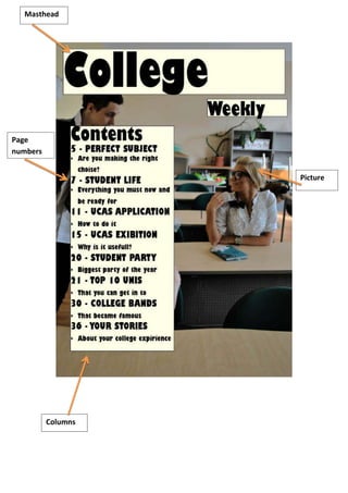
2. The masthead “College weekly” tells us the name of the magazine and is boldly shown at
the top of the page. This is a constant reminder of the magazine that we are reading making
it more memorable. The typeface is bubbly which connotes fun and games. This is an
interesting font to juxtapose with students because of the way that they are stereotyped to
drink loads and go out to have fun. The black font against the cream background also makes
it stand out along with the size of the writing. This cream and black carries on to be part of a
consistent colour scheme.
The Contents page layout is in a column so that it is easily noticeable and also easy to find
what you are looking for, creating a structure. The numbers by each story also help you to
find what page you are looking for within the magazine. The fact that there isn’t much text
and aren’t lots of pictures cluttered everywhere makes it seem a more modern day contents
page.
The picture which is also the background of the page is of two students in a classroom. The
girl is smiling which connotes happiness and joy within college life and this is being
promoted to all their buyers and target audiences. The fact that the picture is so big and
demanding it makes the whole page very easy to read as everything is in its place.
There are a few typing errors such as “Are you making the right choise?” and “Everything
you must now and be ready for” These suggest that the magazine is informal and written
with the intention of colloquial language being used.
Some of the features within the contents reach out to students in a personal way such as “
Your stories” reading stories from other students about their college experiences could help
certain other students to feel more relaxed about specific things that have happened to
them since they were at college.