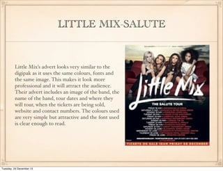
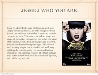
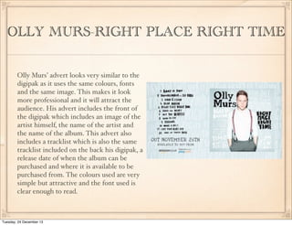
RESEARCH
(ANCILLARY)
analysis of three advertisements
Naziara Khanam

Tuesday, 24 December 13
LITTLE MIX-SALUTE

Little Mix’s advert looks very similar to the
digipak as it uses the same colours, fonts and
the same image. This makes it look more
professional and it will attract the audience.
Their advert includes an image of the band, the
name of the band, tour dates and where they
will tour, when the tickets are being sold,
website and contact numbers. The colours used
are very simple but attractive and the font used
is clear enough to read.

Tuesday, 24 December 13
JESSIE J-WHO YOU ARE

Jessie Js’ advert looks very professional as it uses
simple colours and fonts. Also the image used will
attract the audience as it makes it easier to see who
the main artist is. This advert includes a very clear
image of the artist, the name of the artist, the name
of the album, what album and singles are included,
a website and record company logos. The colours
used are very simple but attractive and work very
well together. Additionally the font used is clear
enough for the audience to read. The black colours
used in the advert work well with her black lipstick,
nail polish, top and hair.

Tuesday, 24 December 13
OLLY MURS-RIGHT PLACE RIGHT TIME
Olly Murs’ advert looks very similar to the
digipak as it uses the same colours, fonts
and the same image. This makes it look
more professional and it will attract the
audience. His advert includes the front of
the digipak which includes an image of the
artist himself, the name of the artist and
the name of the album. This advert also
includes a tracklist which is also the same
tracklist included on the back his digipak, a
release date of when the album can be
purchased and where it is available to be
purchased from. The colours used are very
simple but attractive and the font used is
clear enough to read.

Tuesday, 24 December 13

Analyse three real adverts

  • 1.
    RESEARCH (ANCILLARY) analysis of threeadvertisements Naziara Khanam Tuesday, 24 December 13
  • 2.
    LITTLE MIX-SALUTE Little Mix’sadvert looks very similar to the digipak as it uses the same colours, fonts and the same image. This makes it look more professional and it will attract the audience. Their advert includes an image of the band, the name of the band, tour dates and where they will tour, when the tickets are being sold, website and contact numbers. The colours used are very simple but attractive and the font used is clear enough to read. Tuesday, 24 December 13
  • 3.
    JESSIE J-WHO YOUARE Jessie Js’ advert looks very professional as it uses simple colours and fonts. Also the image used will attract the audience as it makes it easier to see who the main artist is. This advert includes a very clear image of the artist, the name of the artist, the name of the album, what album and singles are included, a website and record company logos. The colours used are very simple but attractive and work very well together. Additionally the font used is clear enough for the audience to read. The black colours used in the advert work well with her black lipstick, nail polish, top and hair. Tuesday, 24 December 13
  • 4.
    OLLY MURS-RIGHT PLACERIGHT TIME Olly Murs’ advert looks very similar to the digipak as it uses the same colours, fonts and the same image. This makes it look more professional and it will attract the audience. His advert includes the front of the digipak which includes an image of the artist himself, the name of the artist and the name of the album. This advert also includes a tracklist which is also the same tracklist included on the back his digipak, a release date of when the album can be purchased and where it is available to be purchased from. The colours used are very simple but attractive and the font used is clear enough to read. Tuesday, 24 December 13