Download to read offline
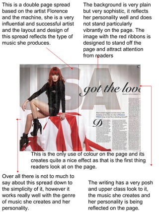
This double page spread features the artist Florence and the Machine. The simple yet sophisticated background design reflects her musical style and personality. A prominent image using red ribbons is meant to attract readers' attention from the page. The only color used, along with an upper-class style of writing, effectively represent Florence and the Machine's music and persona through a simple yet effective layout.


