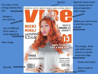
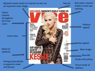
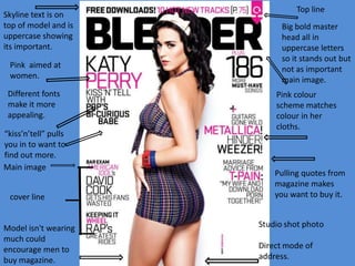
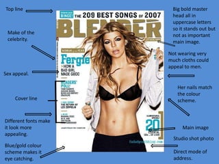
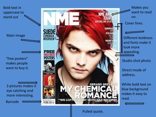
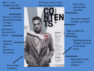
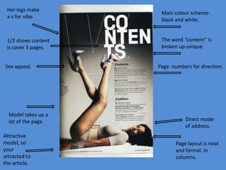
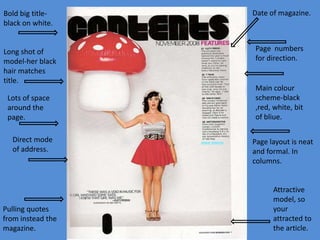
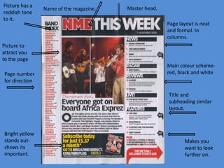
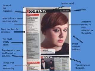
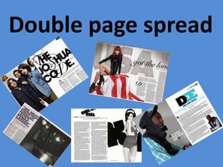
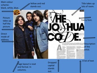
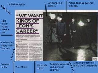
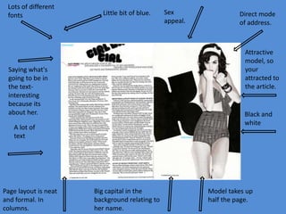
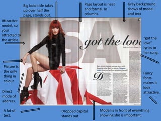
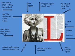
Magazine front
cover
By Abbie Strich
Top line
The colour of the
writing matches the
hair.
Orange is
eye catching

Lots of different
fonts makes it
more appealing

Big bold master head
so it stands out but
not as important
main image.

Makes you want to buy
it and find out the
answer.

Main image
The orange , black
and white colour
scheme is spread
across the page.
Studio shot photo
Barcode

Direct mode of
address.
Big bold master head so it stands out but not
as important main image.

Colour
scheme
throughout
the front
cover.

Top line

Red colour scheme
makes it more eye
catching.

Political
appeal.

Cover lines
Sex appeal.
Name of
celebrity.

Main image
Barcode

Posing provocatively
to appeal to male
and female.
Skyline text is on
top of model and is
uppercase showing
its important.
Pink aimed at
women.
Different fonts
make it more
appealing.
“kiss’n’tell” pulls
you in to want to
find out more.
Main image

cover line

Model isn't wearing
much could
encourage men to
buy magazine.

Top line
Big bold master
head all in
uppercase letters
so it stands out but
not as important
main image.
Pink colour
scheme matches
colour in her
cloths.

Pulling quotes from
magazine makes
you want to buy it.
Top line

Make of the
celebrity.

Big bold master
head all in
uppercase letters
so it stands out but
not as important
main image.
Not wearing very
much cloths could
appeal to men.

Sex appeal.

Cover line

Different fonts make
it look more
appealing.

Blue/gold colour
scheme makes it
eye catching.

Her nails match
the colour
scheme.

Main image
Makes you
want to read
on.

Bold text in
uppercase to
stand out

Cover lines.
Main image

Different boldness
and fonts make it
look more
appealing.

“free posters”
makes people
want to buy it.

White bold text on
blue background
makes it easy to
read.

3 pictures makes it
eye catching and
more interesting.
Barcode
Pulled quote.
Contents page
Big “v” in the
background=vibe

Picture is in front of
everything showing
it is most
important.
Red heart is
the only bit of
colour
Attractive
model, so
your
attracted to
the content.

Direct mode
of address.

1/3 shows there is more
than one page of content

Main colour
scheme-black
and white

The word “contents”
is broken up-unique

Page numbers for
direction.
Subheading saying
“fashion” shows its
not all about
music.

Page layout is neat
and formal. In
columns.
Her legs make
a v for vibe.

1/3 shows content
is cover 3 pages.

Sex appeal.

Model takes up a
lot of the page.

Main colour schemeblack and white.

The word “content” is
broken up-unique

Page numbers for direction.

Direct mode
of address.
Page layout is neat
and formal. In
columns.
Bold big titleblack on white.

Date of magazine.

Long shot of
model-her black
hair matches
title.

Page numbers
for direction.

Lots of space
around the
page.
Direct mode
of address.

Pulling quotes
from instead the
magazine.

Main colour
scheme-black
,red, white, bit
of bliue.
Page layout is neat
and formal. In
columns.

Attractive
model, so
your
attracted to
the article.
Picture has a
reddish tone
to it.

Name of the magazine.

Master head.
Page layout is neat
and formal. In
columns.

Picture to
attract you
to the page
Page number
for direction

Main colour schemered, black and white

Title and
subheading similar
layout.

Bright yellow
stands outshows its
important.

Makes you
want to look
further on.
Name of
the
magazine.

Master head.

Date.

Main colour schemeblack red white.

Attractive
model, so
your
attracted to
the article.

Page numbers for
direction.
Not much
empty
space.
Page layout is neat
and formal. In
columns.
Things that
are
reoccurring

Direct
mode of
address.

Two picture on
the page.
Double page spread
Main colour
schemeblack, white, blue.

Yellow and red
stands out.

Title takes up
lots of room.

Picture
takes up
half the
picture.

Fancy font.

Direct
mode of
address.
Description
of the
artist.

Page layout is neat
and formal. In
columns.

Dropped
capital
stands
out.

A lot of text
Direct mode of
address.

Pulled out quote.

Picture takes up over half
the page.

Bold
colour
makes
it stand
out.

Summarising
what's in the
interview.

Dropped
capital.

A lot of text

Not much
colour

Page layout is neat
and formal. In
columns.

Main colour schemeblack, white and purple
Lots of different
fonts

Little bit of blue.

Direct mode
of address.

Attractive
model, so
your
attracted to
the article.

Saying what's
going to be in
the textinteresting
because its
about her.

Black and
white

A lot of
text

Page layout is neat
and formal. In
columns.

Sex
appeal.

Big capital in the
background relating to
her name.

Model takes up
half the page.
Big bold title takes
up over half the
page, stands out.

Page layout is neat
and formal. In
columns.

Attractive
model, so
your
attracted to
the article.

“got the
love”
lyrics to
her song.

Picture is
the only
thing in
colour

Fancy
fonts
makes it
look
attractive.

Direct
mode of
address.
A lot of
text.

Grey background
shows of model
and text

Dropped capital
stands out.

Model is in front of everything
showing she is important.
Main colour
scheme-white,
black and red.

Sex
appeal.

Dropped capital
stands out.

Big ‘L’ for
lady-makes
it look
better.

A lot of
text

One picture
takes up half
the page.

Attracts male readers
because of the photo

No title just
the artists
name.

Written
in
columns.

Page layout is neat
and formal.

Second
dropped
capital.

Media magazine codes and conventions

  • 1.
  • 2.
    Top line The colourof the writing matches the hair. Orange is eye catching Lots of different fonts makes it more appealing Big bold master head so it stands out but not as important main image. Makes you want to buy it and find out the answer. Main image The orange , black and white colour scheme is spread across the page. Studio shot photo Barcode Direct mode of address.
  • 3.
    Big bold masterhead so it stands out but not as important main image. Colour scheme throughout the front cover. Top line Red colour scheme makes it more eye catching. Political appeal. Cover lines Sex appeal. Name of celebrity. Main image Barcode Posing provocatively to appeal to male and female.
  • 4.
    Skyline text ison top of model and is uppercase showing its important. Pink aimed at women. Different fonts make it more appealing. “kiss’n’tell” pulls you in to want to find out more. Main image cover line Model isn't wearing much could encourage men to buy magazine. Top line Big bold master head all in uppercase letters so it stands out but not as important main image. Pink colour scheme matches colour in her cloths. Pulling quotes from magazine makes you want to buy it.
  • 5.
    Top line Make ofthe celebrity. Big bold master head all in uppercase letters so it stands out but not as important main image. Not wearing very much cloths could appeal to men. Sex appeal. Cover line Different fonts make it look more appealing. Blue/gold colour scheme makes it eye catching. Her nails match the colour scheme. Main image
  • 6.
    Makes you want toread on. Bold text in uppercase to stand out Cover lines. Main image Different boldness and fonts make it look more appealing. “free posters” makes people want to buy it. White bold text on blue background makes it easy to read. 3 pictures makes it eye catching and more interesting. Barcode Pulled quote.
  • 7.
  • 8.
    Big “v” inthe background=vibe Picture is in front of everything showing it is most important. Red heart is the only bit of colour Attractive model, so your attracted to the content. Direct mode of address. 1/3 shows there is more than one page of content Main colour scheme-black and white The word “contents” is broken up-unique Page numbers for direction. Subheading saying “fashion” shows its not all about music. Page layout is neat and formal. In columns.
  • 9.
    Her legs make av for vibe. 1/3 shows content is cover 3 pages. Sex appeal. Model takes up a lot of the page. Main colour schemeblack and white. The word “content” is broken up-unique Page numbers for direction. Direct mode of address. Page layout is neat and formal. In columns.
  • 10.
    Bold big titleblackon white. Date of magazine. Long shot of model-her black hair matches title. Page numbers for direction. Lots of space around the page. Direct mode of address. Pulling quotes from instead the magazine. Main colour scheme-black ,red, white, bit of bliue. Page layout is neat and formal. In columns. Attractive model, so your attracted to the article.
  • 11.
    Picture has a reddishtone to it. Name of the magazine. Master head. Page layout is neat and formal. In columns. Picture to attract you to the page Page number for direction Main colour schemered, black and white Title and subheading similar layout. Bright yellow stands outshows its important. Makes you want to look further on.
  • 12.
    Name of the magazine. Master head. Date. Maincolour schemeblack red white. Attractive model, so your attracted to the article. Page numbers for direction. Not much empty space. Page layout is neat and formal. In columns. Things that are reoccurring Direct mode of address. Two picture on the page.
  • 13.
  • 14.
    Main colour schemeblack, white,blue. Yellow and red stands out. Title takes up lots of room. Picture takes up half the picture. Fancy font. Direct mode of address. Description of the artist. Page layout is neat and formal. In columns. Dropped capital stands out. A lot of text
  • 15.
    Direct mode of address. Pulledout quote. Picture takes up over half the page. Bold colour makes it stand out. Summarising what's in the interview. Dropped capital. A lot of text Not much colour Page layout is neat and formal. In columns. Main colour schemeblack, white and purple
  • 16.
    Lots of different fonts Littlebit of blue. Direct mode of address. Attractive model, so your attracted to the article. Saying what's going to be in the textinteresting because its about her. Black and white A lot of text Page layout is neat and formal. In columns. Sex appeal. Big capital in the background relating to her name. Model takes up half the page.
  • 17.
    Big bold titletakes up over half the page, stands out. Page layout is neat and formal. In columns. Attractive model, so your attracted to the article. “got the love” lyrics to her song. Picture is the only thing in colour Fancy fonts makes it look attractive. Direct mode of address. A lot of text. Grey background shows of model and text Dropped capital stands out. Model is in front of everything showing she is important.
  • 18.
    Main colour scheme-white, black andred. Sex appeal. Dropped capital stands out. Big ‘L’ for lady-makes it look better. A lot of text One picture takes up half the page. Attracts male readers because of the photo No title just the artists name. Written in columns. Page layout is neat and formal. Second dropped capital.