The Evolution of Animation in Film - Mark Murphy Director
Advert case study 3
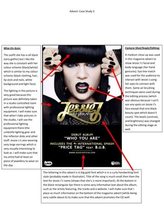
1. Advert: Case Study 3
Camera Shot/Angle/Editing:
A medium close-up was used
in this magazine advert to
show Jessie J’s facial and
body language (her hand
gestures). Eye-line match
was used for the audience to
interact with Jessie J using
her eyes to connect with
them. Some air brushing
techniques were used during
the editing process (which
was obvious because I can’t
see any spots on Jessie J’s
face except that one black
beauty spot which doesn’t
count). The levels (contrast,
and brightness) was changed
during the editing stage as
well.
Mise-En-Scen:
The outfit she has is all black
(very gothic) but I like the
way she is constant with her
colour scheme (black/white)
which is similar to my colour
scheme (black clothing, hair,
lip stick and nails, white
background and light face).
The lighting in this picture is
very good because this
picture was definitely taken
in a studio controlled room
with professional lighting
equipment. I will make sure
that when I take pictures in
the studio, I will use the
professional lighting
equipment there (the
umbrella lighting gear and
the reflector disks and other
stuff. Jessie J is also wearing
very large earrings which is
very visually interesting to
look at. I will make sure that
my artist had at least on
piece of jewellery to wear on
the day.
The lettering in this advert is in big gold font which is in a curly handwriting font
style (probably made in illustrator). Title of the song is much small then then the
text for Jessie J’s name (shows that she’s is more important). At the bottom in
the black rectangular bar there is some very informative text about the album,
such as the artists featuring, the tracks and a website. I will make sure that I
place as much information on the bottom of the magazine advert (while being
very subtle about it) to make sure that this advert promotes the CD well.