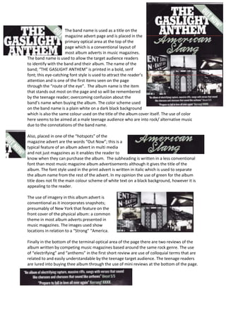
1. The band name is used as a title on the
magazine advert page and is placed in the
primary optical area at the top of the
page which is a conventional layout of
most album adverts in music magazines.
The band name is used to allow the target audience readers
to identify with the band and their album. The name of the
band; “THE GASLIGHT ANTHEM” is printed in a bold, serif
font; this eye-catching font style is used to attract the reader’s
attention and is one of the first items seen on the page
through the “route of the eye”. The album name is the item
that stands out most on the page and so will be remembered
by the teenage reader; overcoming confusion about the
band’s name when buying the album. The color scheme used
on the band name is a plain white on a dark black background
which is also the same colour used on the title of the album cover itself. The use of color
here seems to be aimed at a male teenage audience who are into rock/ alternative music
due to the connotations of the band name.
Also, placed in one of the “hotspots” of the
magazine advert are the words “Out Now”; this is a
typical feature of an album advert in multi media
and not just magazines as it enables the reader to
know when they can purchase the album. The subheading is written in a less conventional
font than most music magazine album advertisements although it gives the title of the
album. The font style used in the print advert is written in italic which is used to separate
the album name from the rest of the advert. In my opinion the use of green for the album
title does not fit the main colour scheme of white text on a black background, however it is
appealing to the reader.
The use of imagery in this album advert is
conventional as it incorporates snapshots;
presumably of New York that feature on the
front cover of the physical album: a common
theme in most album adverts presented in
music magazines. The images used show
locations in relation to a “Strong” “America.
Finally in the bottom of the terminal optical area of the page there are two reviews of the
album written by competing music magazines based around the same rock genre. The use
of “electrifying” and “anthems” in the first short review are use of colloquial terms that are
related to and easily understandable by the teenage target audience. The teenage readers
are lured into buying thee album through the use of mini reviews at the bottom of the page.