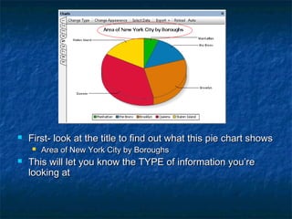
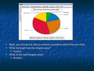
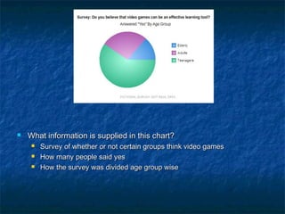
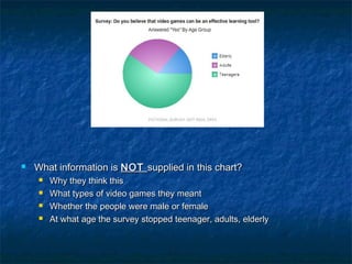
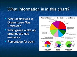
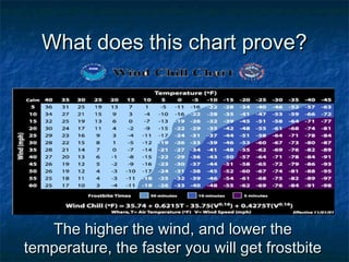
2. First- look at the title to find out what this pie chart shows
Area of New York City by Boroughs
This will let you know the TYPE of information you’re
looking at
3. Next, you should be able to answer questions about this pie chart.
What borough has the largest area?
Queens
What is the next largest area?
Brooklyn
4. What information is supplied in this chart?
Survey of whether or not certain groups think video games
How many people said yes
How the survey was divided age group wise
5. What information is NOT supplied in this chart?
Why they think this
What types of video games they meant
Whether the people were male or female
At what age the survey stopped teenager, adults, elderly
6. What information is in this chart?
What contributes to
Greenhouse Gas
Emissions
What gases make up
greenhouse gas
emissions
Percentage for each
7. Reading Charts and Graphs
You need to be able to identify the
information in the chart
You should be able to use the information
to explain what is NOT in the chart. What
doesn’t it tell you?
You should be able to use the information
to extrapolate information
8. Bar Chart
What does this chart
show?
Revenues by year
What year had the
highest revenue?
2006
What year had the
lowest revenue?
2008
9. Using charts to prove a hypothesis
What hypothesis is
NOT supported by
this graph?
Fertilizers make plants
grow taller than just
water
This is not supported
because water and
Peters appear to affect
plants the same
10. What does this chart prove?
The higher the wind, and lower the
temperature, the faster you will get frostbite
11. Tips
Pay attention to color coding, and labels
Always read the title, and supplementary
information on the chart/graph
Think of what the chart tells you, as well
as what it does not tell you
Be careful of questions that include NOT
and EXCEPT