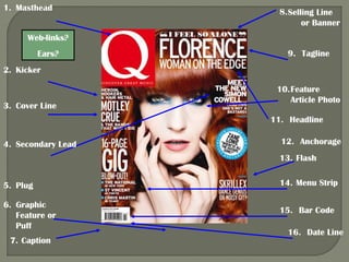
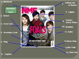
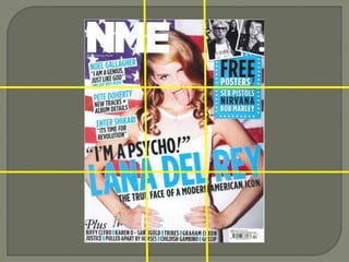
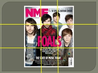
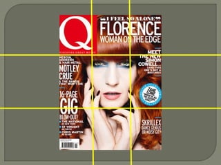
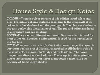
Rebecca Harrington
What you get on front covers
1. Masthead

8. Selling Line
or Banner

Web-links?
Ears?

9. Tagline

2. Kicker

3. Cover Line

10. Feature
Article Photo
11. Headline

4. Secondary Lead

12. Anchorage
13. Flash

5. Plug
6. Graphic
Feature or
Puff
7. Caption

14. Menu Strip
15. Bar Code
16. Date Line
1. Masthead

Selling Line
or Banner

7.
Web-links?

8. Tagline

Ears?
2. Kicker
9.
3. Cover Line

Feature
Article Photo

10. Headline
4. Secondary Lead

5. Plug

11. Teller

12.Menu Strip
13.Bar Code

6. Caption

14. Date Line









The masthead is the same colour regardless of the
cover image on each issue. This is useful to the
audience as the magazine is easily recognisable.
The meaning added by the interaction between
anchorage and photos is more of a understanding
about the image, the artist(s) in it and what the article/
interview with them is about.
The use of language, taglines and kickers hit at it been
a little gossipy with news about artists and gigs.
I believe the cover image and the headline are
regarded as most important on the cover as these are
what you first notice.
The type of language used and the tone of the
language is quite chatty and informative.
How front covers are conceived and laid out






COLOUR – There is colour scheme of this edition is red, white and
blue. The colour scheme switches according to the image. All of the
colour is in the Masthead and the photograph. The blue eye shadow is
brought out by blue underlining of text. The red and white masthead
is very bright and eye catching.
FONTS –They are two different fonts used. One basic font is used for
most of the text however a different font is used for the quotation in
the tag line.
STYLE –The cover is very bright due to the cover image, the layout is
very neat but has a lot of information packed in. All the font being in
the same colour makes it look tidy and professional. The cover
images uses direct mode of address. The image is quite mysterious
due to the placement of her hands it also looks a little futuristic
because of the blue eye shadow.




USE OF SPACE –The rule of thirds has been used to place the main
features of the subject to be placed in the centre. The hair of the
artist is used to frame the photograph. The masthead is in the top
left hand corner however the layout of the magazine is not typical
as the headline is in the top right apposed to the bottom of the
mid-third. The cover line and the kicker are on the left hand side
however the secondary lead is on the right. There is no dead or
white space as the whole of the magazine is taken up by the cover
photo.
CONCLUDE –The layout follows most of the typical conventions. It
is very bright so catches your attention. It is packed with text
leaving no dead shape.

Magazine conventions

  • 1.
  • 2.
    What you geton front covers
  • 3.
    1. Masthead 8. SellingLine or Banner Web-links? Ears? 9. Tagline 2. Kicker 3. Cover Line 10. Feature Article Photo 11. Headline 4. Secondary Lead 12. Anchorage 13. Flash 5. Plug 6. Graphic Feature or Puff 7. Caption 14. Menu Strip 15. Bar Code 16. Date Line
  • 4.
    1. Masthead Selling Line orBanner 7. Web-links? 8. Tagline Ears? 2. Kicker 9. 3. Cover Line Feature Article Photo 10. Headline 4. Secondary Lead 5. Plug 11. Teller 12.Menu Strip 13.Bar Code 6. Caption 14. Date Line
  • 5.
         The masthead isthe same colour regardless of the cover image on each issue. This is useful to the audience as the magazine is easily recognisable. The meaning added by the interaction between anchorage and photos is more of a understanding about the image, the artist(s) in it and what the article/ interview with them is about. The use of language, taglines and kickers hit at it been a little gossipy with news about artists and gigs. I believe the cover image and the headline are regarded as most important on the cover as these are what you first notice. The type of language used and the tone of the language is quite chatty and informative.
  • 6.
    How front coversare conceived and laid out
  • 10.
       COLOUR – Thereis colour scheme of this edition is red, white and blue. The colour scheme switches according to the image. All of the colour is in the Masthead and the photograph. The blue eye shadow is brought out by blue underlining of text. The red and white masthead is very bright and eye catching. FONTS –They are two different fonts used. One basic font is used for most of the text however a different font is used for the quotation in the tag line. STYLE –The cover is very bright due to the cover image, the layout is very neat but has a lot of information packed in. All the font being in the same colour makes it look tidy and professional. The cover images uses direct mode of address. The image is quite mysterious due to the placement of her hands it also looks a little futuristic because of the blue eye shadow.
  • 11.
      USE OF SPACE–The rule of thirds has been used to place the main features of the subject to be placed in the centre. The hair of the artist is used to frame the photograph. The masthead is in the top left hand corner however the layout of the magazine is not typical as the headline is in the top right apposed to the bottom of the mid-third. The cover line and the kicker are on the left hand side however the secondary lead is on the right. There is no dead or white space as the whole of the magazine is taken up by the cover photo. CONCLUDE –The layout follows most of the typical conventions. It is very bright so catches your attention. It is packed with text leaving no dead shape.