


![Make it keyboard accessible
Make the keyboad
experience good, too
Don‘t jump
around in the
content
Make sure
everything
interactive is in
the [Tab] order
34](https://image.slidesharecdn.com/wq-31tips-show-130529153336-phpapp01/85/6-Awesomely-Practical-Tips-Making-content-better-for-everyone-34-320.jpg)
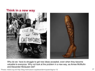


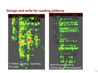
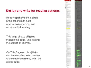
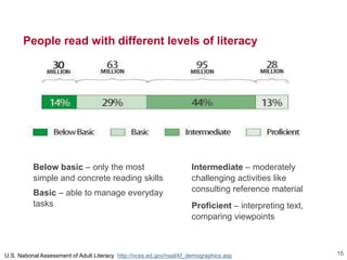
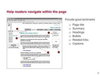
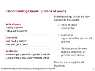
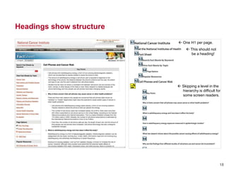
The document outlines practical UX design tips, emphasizing the importance of accessibility and creating content that caters to a diverse audience. It discusses strategies for improving user interaction, such as using clear headings, meaningful alt text for images, and maintaining engagement across multiple devices. The text encourages designers to adopt a mindset that values responsiveness and inclusivity in web design.