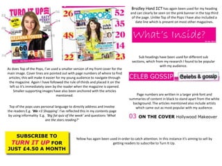
Bradley Hand ICT has again been used for my heading
                                                                                   and can clearly be seen on the pink banner in the top third
                                                                                    of the page. Unlike Top of the Pops I have also included a
                                                                                       date line which is present on most other magazines.


                                                                                          Sub headings have been used for different sub
                                                                                     sections, which from my research I found to be popular
                                                                                                        with my audience.
As does Top of the Pops, I’ve used a smaller version of my front cover for the
main image. Cover lines are pointed out with page numbers of where to find
 articles; this will make it easier for my young audience to navigate through
 the magazine. Again I have followed the rule of thirds and placed it on the
  left so it’s immediately seen by the reader when the magazine is opened.
     Smaller supporting images have also been anchored with the articles
                                    mentioned.                                         Page numbers are written in a larger pink font and
                                                                                   summaries of content in black to stand apart from the white
                                                                                     background. The articles mentioned also include artists
 Top of the pops uses personal language to directly address and involve               which came out as most popular with my audience.
the readers E.g. ‘We <3 Shopping’. I’ve reflected this in my contents page
 by using informality E.g. ‘Big fat quiz of the week’ and questions ‘What
                          are the stars reading?’


                                              Yellow has again been used in order to catch attention. In this instance it’s aiming to sell by
                                                                      getting readers to subscribe to Turn It Up.
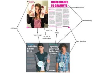
Stand First


                                                         Main Heading


Pull Quote
                               Drop Cap
                                          Copy
             Main Image
                           By Line &
                          Photo credit
                                                 Page Numbers

6 7

  • 1.
    Bradley Hand ICThas again been used for my heading and can clearly be seen on the pink banner in the top third of the page. Unlike Top of the Pops I have also included a date line which is present on most other magazines. Sub headings have been used for different sub sections, which from my research I found to be popular with my audience. As does Top of the Pops, I’ve used a smaller version of my front cover for the main image. Cover lines are pointed out with page numbers of where to find articles; this will make it easier for my young audience to navigate through the magazine. Again I have followed the rule of thirds and placed it on the left so it’s immediately seen by the reader when the magazine is opened. Smaller supporting images have also been anchored with the articles mentioned. Page numbers are written in a larger pink font and summaries of content in black to stand apart from the white background. The articles mentioned also include artists Top of the pops uses personal language to directly address and involve which came out as most popular with my audience. the readers E.g. ‘We <3 Shopping’. I’ve reflected this in my contents page by using informality E.g. ‘Big fat quiz of the week’ and questions ‘What are the stars reading?’ Yellow has again been used in order to catch attention. In this instance it’s aiming to sell by getting readers to subscribe to Turn It Up.
  • 2.
    Stand First Main Heading Pull Quote Drop Cap Copy Main Image By Line & Photo credit Page Numbers