The document provides a review of the contents page of a magazine. It summarizes that the masthead is prominently displayed and the text is large. While the additional photos provide a rock feel, the editor photo is not rock-related and readers likely do not care who edited the magazine. The subscription box is praised for having details to sign up for the magazine, which is good for business.
Security and availability are one of the most important requirements of online business applications. DNS is a critical part of ensuring that applications are fast and always available to guarantee non-stop access to online business applications. The F5 BIG-IP GTM provides intelligent traffic redirection and helps to direct users to the nearest data centre in order to provide the best user experience.
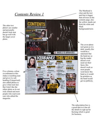
1. The Masthead is
clear and the text
Contents Review 1 and font is bigger
than all texts on the
contents page, also
the yellow stands out
from the white and
The other two
black
photo's are smaller
backgrounds/texts
and personally
doesn't look neat
but go well with
the larger cover
photo.
The cover photo
isn't great as it is
dark, usually this
would be a
statement that
the band are so
big the reader
doesn't even
need see their
faces; this
doesn't work as
most people
Five columns, colour wont know this
co-ordinated so this band so it would
makes everything neat be pointless as
and gives it a sub the band would
heading (Categorised) get no publicity.
also added photos to
give it that rock feel.
But I don't like the
editor photo as its not
rock related and most
people who read wont
care who edited the
magazine.
The subscription box is
a good idea as it has all
the details to sigh up for
Kerrang which is good
for business.