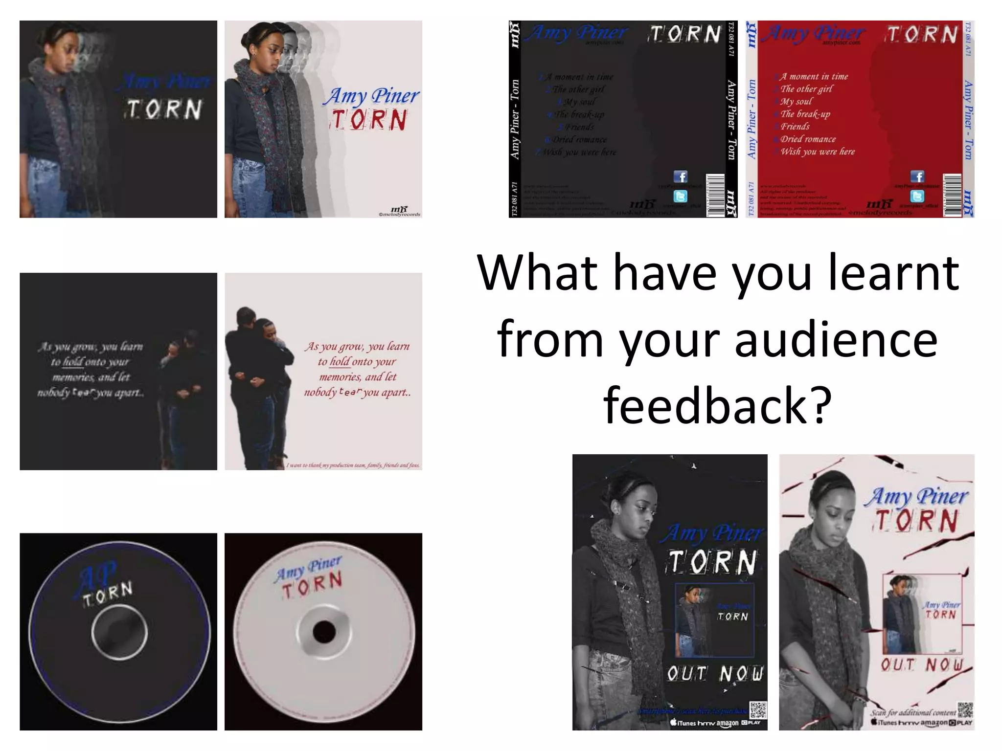
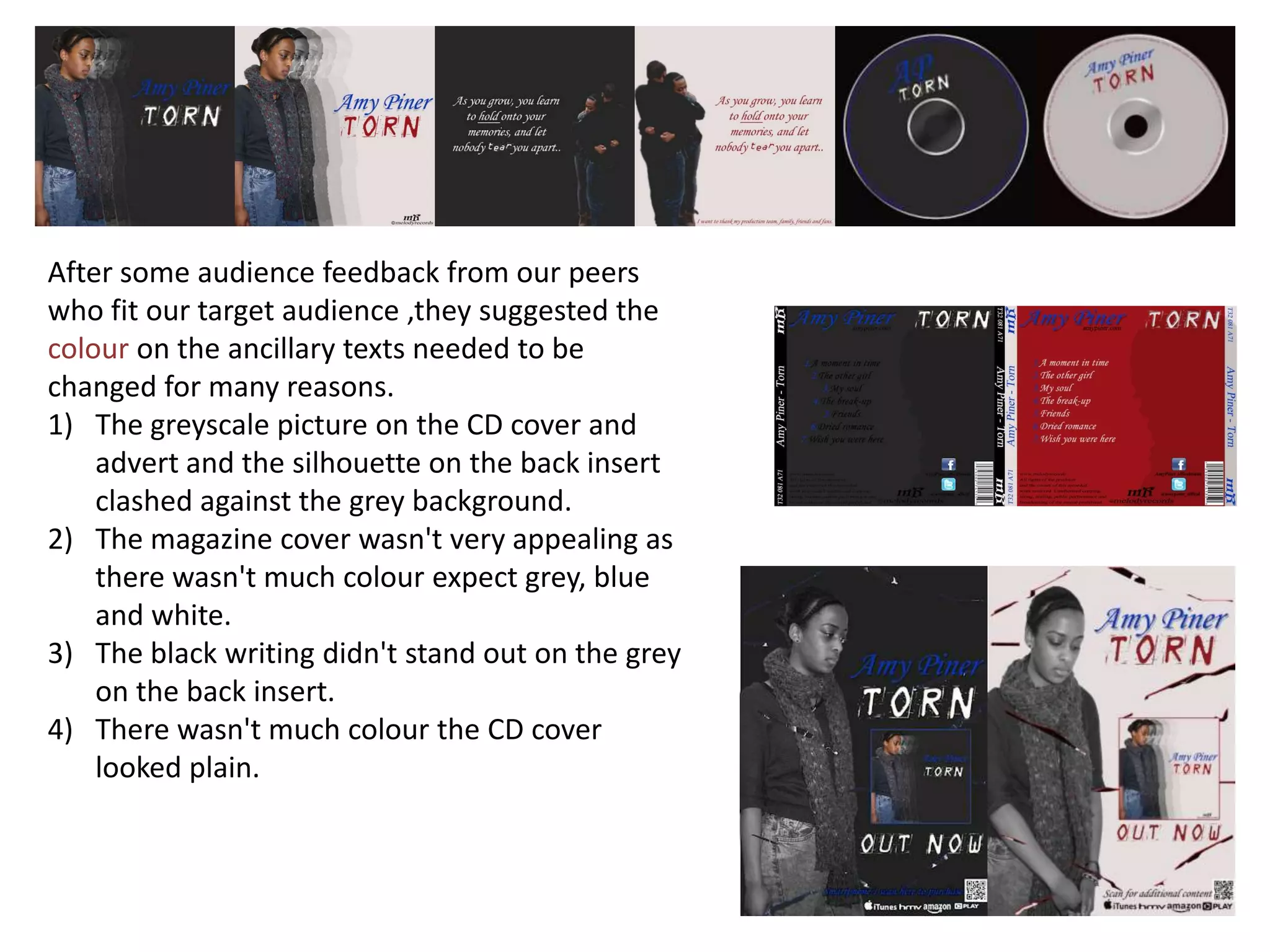
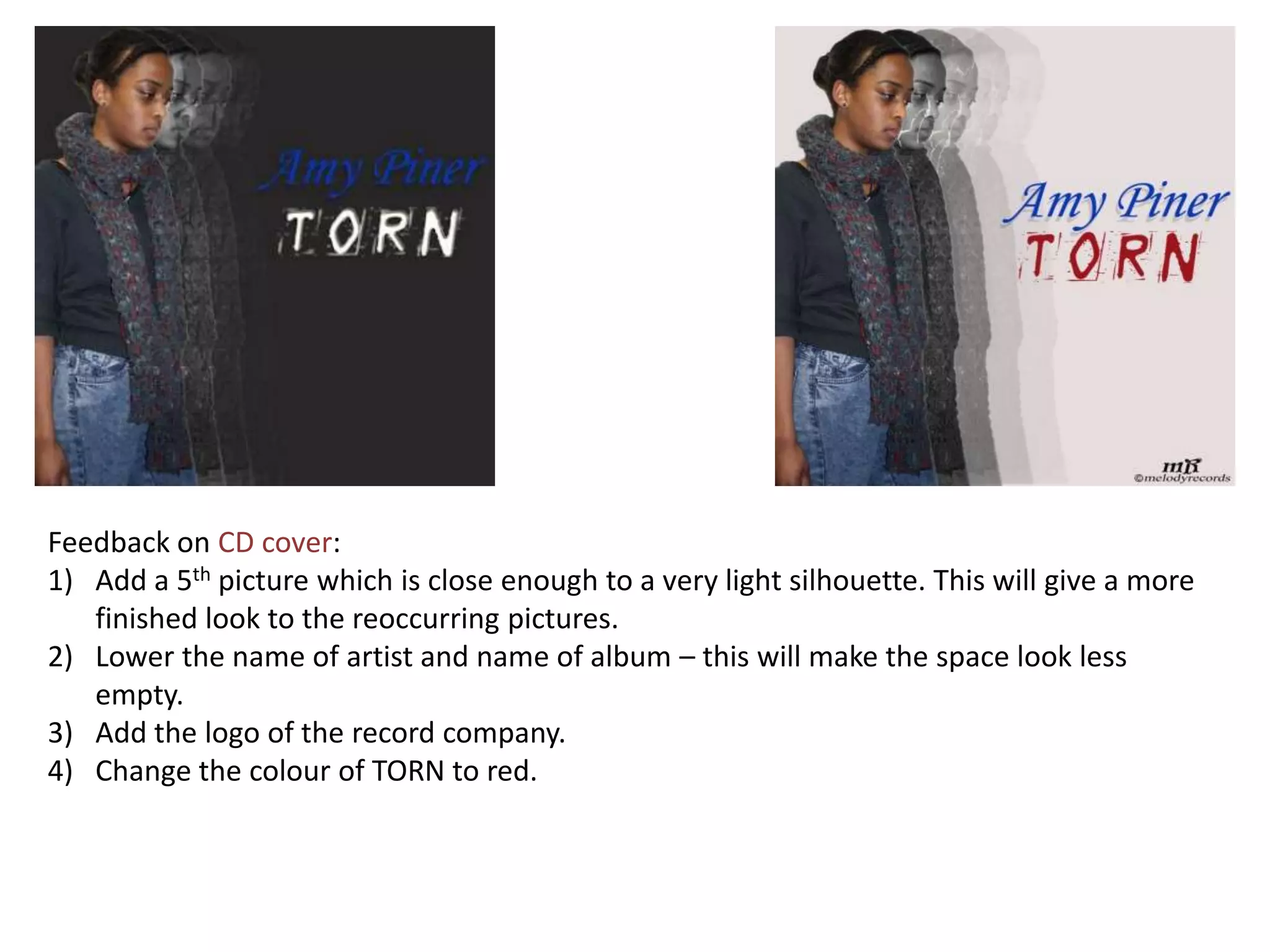
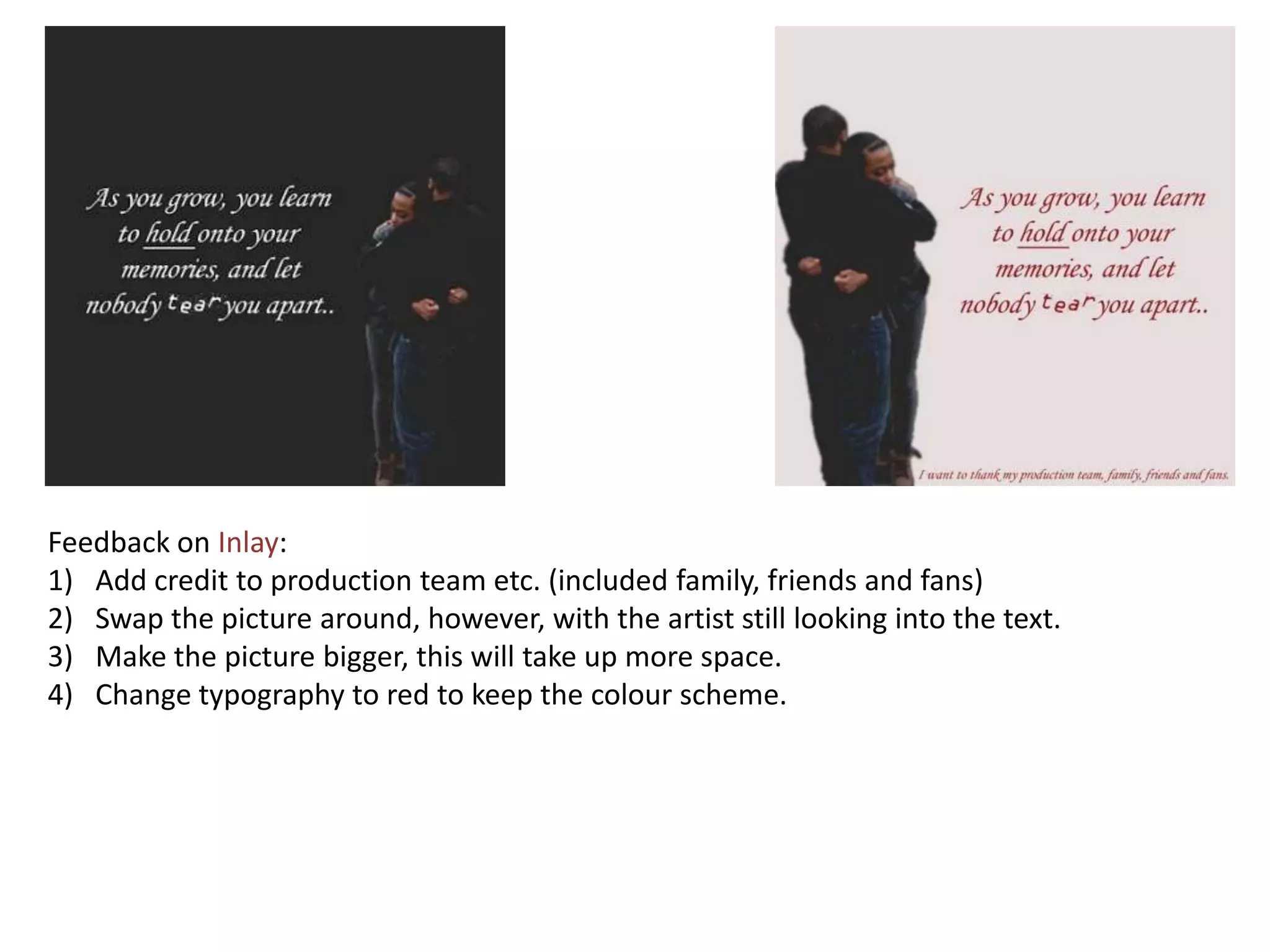
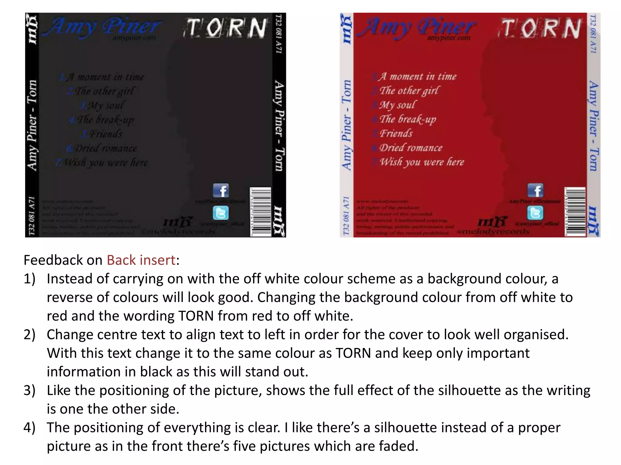
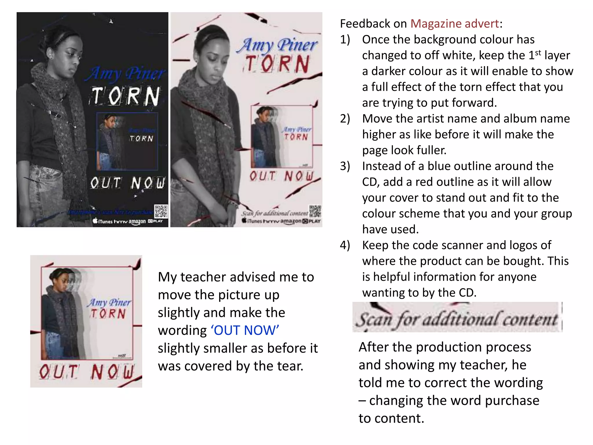
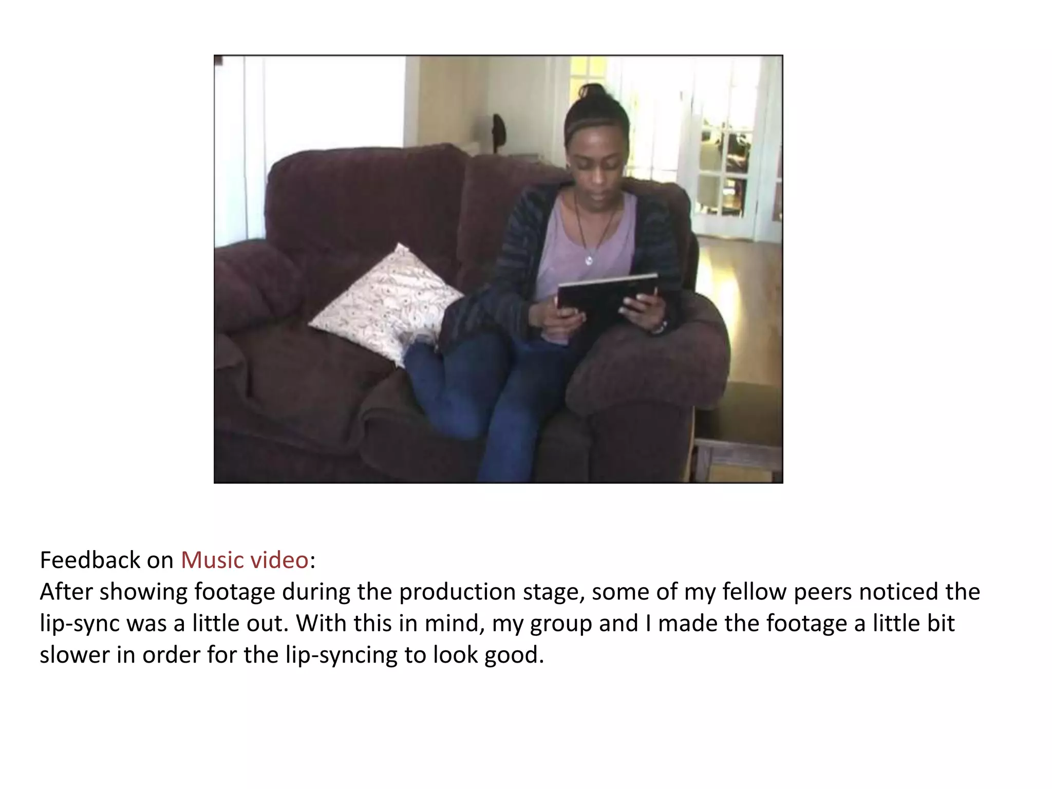
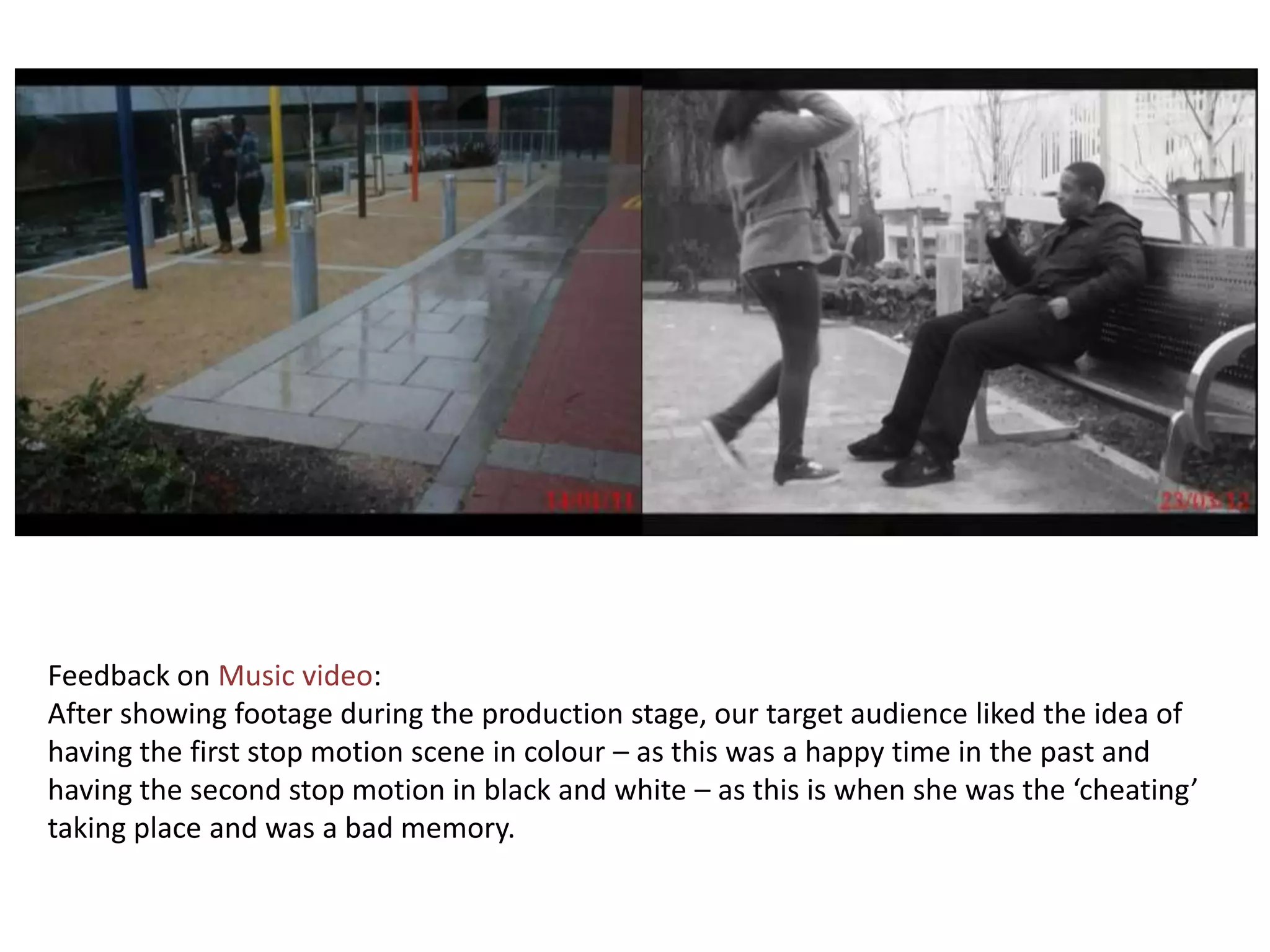
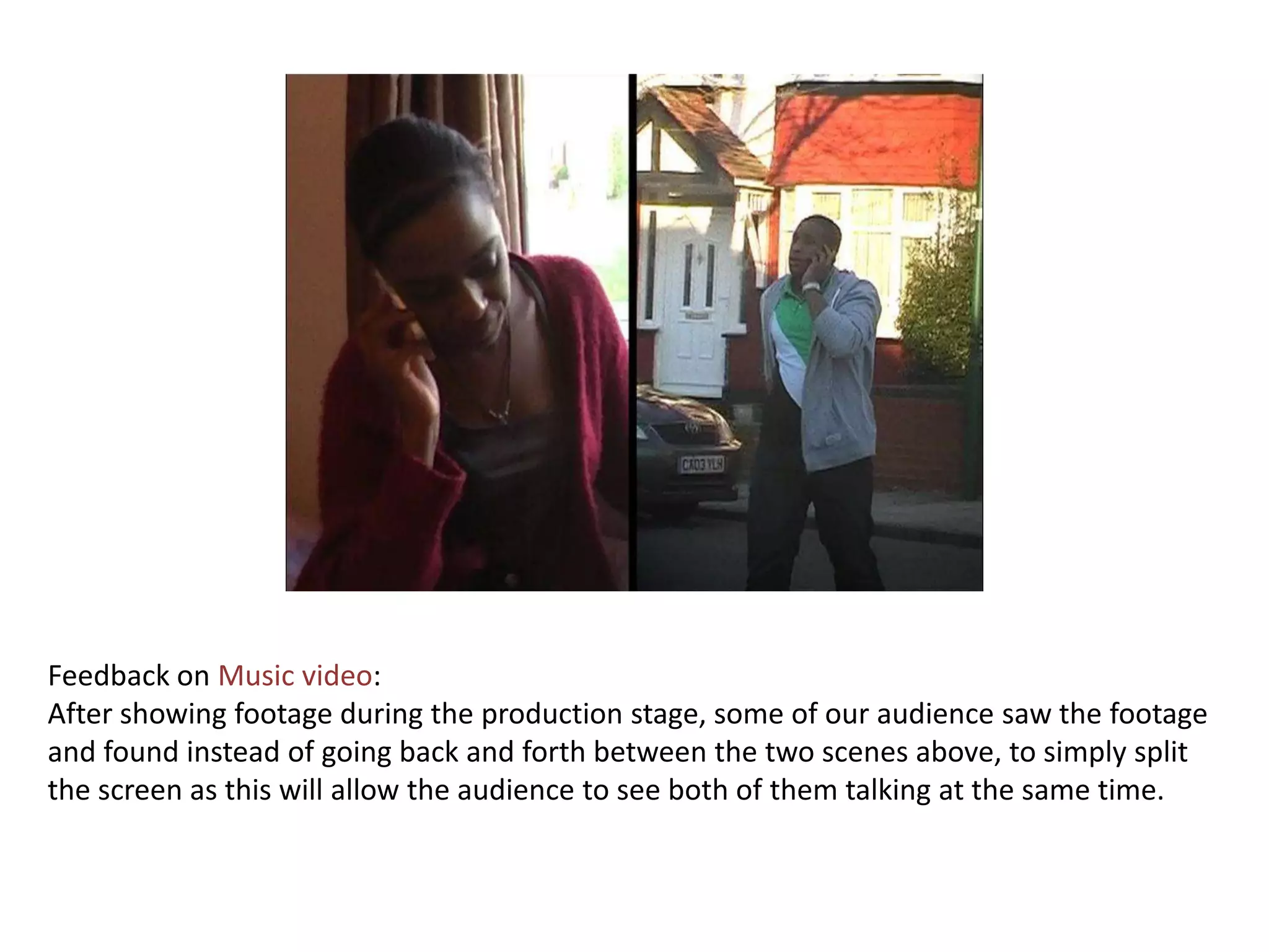
What have you learnt
from your audience
    feedback?
After some audience feedback from our peers
who fit our target audience ,they suggested the
colour on the ancillary texts needed to be
changed for many reasons.
1) The greyscale picture on the CD cover and
    advert and the silhouette on the back insert
    clashed against the grey background.
2) The magazine cover wasn't very appealing as
    there wasn't much colour expect grey, blue
    and white.
3) The black writing didn't stand out on the grey
    on the back insert.
4) There wasn't much colour the CD cover
    looked plain.
Feedback on CD cover:
1) Add a 5th picture which is close enough to a very light silhouette. This will give a more
   finished look to the reoccurring pictures.
2) Lower the name of artist and name of album – this will make the space look less
   empty.
3) Add the logo of the record company.
4) Change the colour of TORN to red.
Feedback on Inlay:
1) Add credit to production team etc. (included family, friends and fans)
2) Swap the picture around, however, with the artist still looking into the text.
3) Make the picture bigger, this will take up more space.
4) Change typography to red to keep the colour scheme.
Feedback on Back insert:
1) Instead of carrying on with the off white colour scheme as a background colour, a
   reverse of colours will look good. Changing the background colour from off white to
   red and the wording TORN from red to off white.
2) Change centre text to align text to left in order for the cover to look well organised.
   With this text change it to the same colour as TORN and keep only important
   information in black as this will stand out.
3) Like the positioning of the picture, shows the full effect of the silhouette as the writing
   is one the other side.
4) The positioning of everything is clear. I like there’s a silhouette instead of a proper
   picture as in the front there’s five pictures which are faded.
Feedback on Magazine advert:
                                1) Once the background colour has
                                   changed to off white, keep the 1st layer
                                   a darker colour as it will enable to show
                                   a full effect of the torn effect that you
                                   are trying to put forward.
                                2) Move the artist name and album name
                                   higher as like before it will make the
                                   page look fuller.
                                3) Instead of a blue outline around the
                                   CD, add a red outline as it will allow
                                   your cover to stand out and fit to the
                                   colour scheme that you and your group
                                   have used.
                                4) Keep the code scanner and logos of
                                   where the product can be bought. This
My teacher advised me to           is helpful information for anyone
move the picture up                wanting to by the CD.
slightly and make the
wording ‘OUT NOW’
slightly smaller as before it      After the production process
was covered by the tear.           and showing my teacher, he
                                   told me to correct the wording
                                   – changing the word purchase
                                   to content.
Feedback on Music video:
After showing footage during the production stage, some of my fellow peers noticed the
lip-sync was a little out. With this in mind, my group and I made the footage a little bit
slower in order for the lip-syncing to look good.
Feedback on Music video:
After showing footage during the production stage, our target audience liked the idea of
having the first stop motion scene in colour – as this was a happy time in the past and
having the second stop motion in black and white – as this is when she was the ‘cheating’
taking place and was a bad memory.
Feedback on Music video:
After showing footage during the production stage, some of our audience saw the footage
and found instead of going back and forth between the two scenes above, to simply split
the screen as this will allow the audience to see both of them talking at the same time.

3 what have you learnt from your audience feedback

  • 1.
    What have youlearnt from your audience feedback?
  • 2.
    After some audiencefeedback from our peers who fit our target audience ,they suggested the colour on the ancillary texts needed to be changed for many reasons. 1) The greyscale picture on the CD cover and advert and the silhouette on the back insert clashed against the grey background. 2) The magazine cover wasn't very appealing as there wasn't much colour expect grey, blue and white. 3) The black writing didn't stand out on the grey on the back insert. 4) There wasn't much colour the CD cover looked plain.
  • 3.
    Feedback on CDcover: 1) Add a 5th picture which is close enough to a very light silhouette. This will give a more finished look to the reoccurring pictures. 2) Lower the name of artist and name of album – this will make the space look less empty. 3) Add the logo of the record company. 4) Change the colour of TORN to red.
  • 4.
    Feedback on Inlay: 1)Add credit to production team etc. (included family, friends and fans) 2) Swap the picture around, however, with the artist still looking into the text. 3) Make the picture bigger, this will take up more space. 4) Change typography to red to keep the colour scheme.
  • 5.
    Feedback on Backinsert: 1) Instead of carrying on with the off white colour scheme as a background colour, a reverse of colours will look good. Changing the background colour from off white to red and the wording TORN from red to off white. 2) Change centre text to align text to left in order for the cover to look well organised. With this text change it to the same colour as TORN and keep only important information in black as this will stand out. 3) Like the positioning of the picture, shows the full effect of the silhouette as the writing is one the other side. 4) The positioning of everything is clear. I like there’s a silhouette instead of a proper picture as in the front there’s five pictures which are faded.
  • 6.
    Feedback on Magazineadvert: 1) Once the background colour has changed to off white, keep the 1st layer a darker colour as it will enable to show a full effect of the torn effect that you are trying to put forward. 2) Move the artist name and album name higher as like before it will make the page look fuller. 3) Instead of a blue outline around the CD, add a red outline as it will allow your cover to stand out and fit to the colour scheme that you and your group have used. 4) Keep the code scanner and logos of where the product can be bought. This My teacher advised me to is helpful information for anyone move the picture up wanting to by the CD. slightly and make the wording ‘OUT NOW’ slightly smaller as before it After the production process was covered by the tear. and showing my teacher, he told me to correct the wording – changing the word purchase to content.
  • 7.
    Feedback on Musicvideo: After showing footage during the production stage, some of my fellow peers noticed the lip-sync was a little out. With this in mind, my group and I made the footage a little bit slower in order for the lip-syncing to look good.
  • 8.
    Feedback on Musicvideo: After showing footage during the production stage, our target audience liked the idea of having the first stop motion scene in colour – as this was a happy time in the past and having the second stop motion in black and white – as this is when she was the ‘cheating’ taking place and was a bad memory.
  • 9.
    Feedback on Musicvideo: After showing footage during the production stage, some of our audience saw the footage and found instead of going back and forth between the two scenes above, to simply split the screen as this will allow the audience to see both of them talking at the same time.