
Recommended
More Related Content
Viewers also liked
Viewers also liked (11)
Similar to Magazine analysis
Similar to Magazine analysis (20)
Recently uploaded
Recently uploaded (20)
Magazine analysis
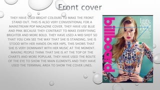
- 1. THEY HAVE USED BRIGHT COLOURS TO MAKE THE FRONT STAND OUT. THIS IS ALSO VERY CONVENTIONAL FOR A MAINSTREAM POP MAGAZINE COVER. THEY HAVE USE BLUE AND PINK BECAUSE THEY CONTRAST TO MAKE EVERYTHING BRIGHTER AND MORE BOLD. THEY HAVE USED A MID SHOT SO THAT YOU CAN SEE THE WAY THAT SHE IS STANDING. SHE IS STOOD WITH HER HANDS ON HER HIPS, THIS SHOWS THAT SHE IS VERY DOMINANT WITH HER MUSIC AT THE MOMENT. MAKING PEOPLE THINK THAT SHE IS AT THE TOP OF THE CHARTS AND MORE POPULAR. THEY HAVE USED THE ROUTE OF THE EYE TO SHOW THE MAIN ELEMENTS AND THEY HAVE USED THE TERMINAL AREA TO SHOW THE COVER LINES.
- 2. THEY HAVE USED A WHITE BACKGROUND TO MAKE SURE THAT YOU CAN READ AND SEE EVERYTHING ON THE PAGE CLEARLY. THEY HAVE USED BLACK WRITING AS WELL TO DO THIS. THE CONTRAST OF BLUE THAT THEY HAVE USED SHOWS CLEARLY THE SEPARATIONS BETWEEN THE INFORMATION. THE FONTS THAT THEY HAVE USED FOR THE TITLES ARE ALL SANS-SERIF. THIS MAKES THEM STAND OUT MORE AND SHOWS THEIR IMPORTANCE. THEY HAVE USED SERIF FONTS FOR THE SMALLER WRITING TO MAKE THE MOOD OF THE PAGE LESS HARSH. THE LAYOUT IS VERY ORDERED AND ORGANISED WHICH IS CONVENTIONAL FOR A CONTENTS PAGE. THEY HAVE USED THE STENCIL STYLE FOR THE TITLES BECAUSE IT IS MORE EYE CATCHING.
- 3. THEY HAVE USED A WHITE BACK GROUND WITH BURST OF COLOUR TO MAKE THEM STAND OUT MORE AND SUIT THE TITLE OF SUMMER. THEY HAVE USED A BUBBLY FONT SO THAT IT LOOKS MORE LAID BACK AND CHILL. ALSO THE WHITE BACK GROUND MAKES THE WRITING CLEARER. THE FACT THAT THEY HAVE USED SUCH A BIG PICTURE OF HIM ATTRACTS ATTENTION FROM HIS FANS. THE PICTURE IS A MID-SHOT THIS SHOWS HIS POSITION AND HIS OUTFIT. HIS OUTFIT LOOKS VERY CASUAL AND CHILLED. THE POSE THAT HE IS STANDING IN LOOKS LIKE AND AIRPLANE WHICH CONNOTES FREEDOM AND FEELING FREE.