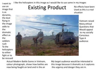
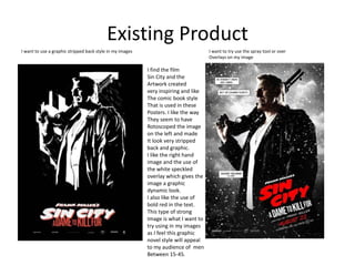
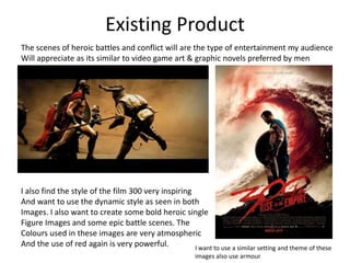
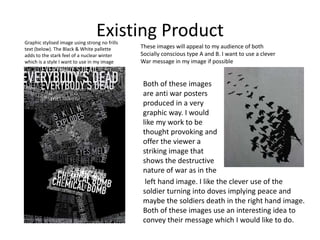
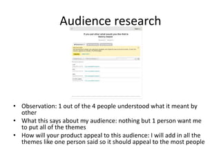
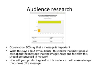
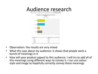
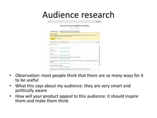
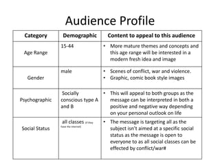
The researcher conducted product research by finding inspiring war-themed images online to use as inspiration. Questionnaires were distributed to classmates to gather feedback, but better questions could have been asked. Two interviews provided quick responses but lacked detail. Overall the response was positive, but the research highlighted that the project's message needs clarity. Distributing surveys to classmates provided quick feedback but risks bias, and limited questions reduced detail.
The proposal is for an image or series of images titled "War Never Changes" that combines scenes from historical and modern battles to show how warfare has remained similar over time but technology has advanced. The goal is to create a thought-provoking work that highlights how wars are still fought for the same reasons. The genre will be a combination image using photos and scenes from films and games with historical significance from various conflicts. It aims to appeal to those interested in art, politics, and social issues by illustrating the futility and ongoing nature of war, while also entertaining through its mixed-media approach. Legal and ethical considerations include ensuring the content is appropriate for the target 15-44 age range and avoiding potential copyright issues with the source
The document summarizes research conducted to inform a creative project about historical battles. Product research involved finding inspiring images online depicting conflict through the ages. Questionnaires gathered audience feedback via an online survey of classmates. Interviews provided direct input from two students. While the methods uncovered audience interests, better questioning and a more diverse sample could have strengthened insights. The response was positive but clarified the need for a clear message. Distributing surveys to classmates was convenient but risked biased responses.
The document discusses the mood boards and initial ideas for a final project exploring the theme that "war never changes." It describes the images in the mood boards as depicting historical battles with a moody, dynamic feel. While the final product will not use the same colors or styles as the mood boards, the inspiration is to merge old and new battle scenes to feel out of time. The informal proposal outlines a concept of editing historical battle images to create new, poignant photos and wallpapers about the nature of war. The target audience is described as well as discounted self-portrait and celebrity ideas that were considered but not chosen due to limited appeal or difficulty executing the concept well.
The proposal is for an image titled "War Never Changes" that combines scenes from historical and modern battles to show how warfare has remained similar over time despite technological changes. The image genre will be a dramatic combination photo using ancient and modern battle scenes to convey the message that wars have been fought for millennia for the same reasons. The target audience is those interested in protest art, contemporary art, current affairs, politics and social issues who are aged 12 and older and can understand the impacts of war, though the concept may appeal more to men. Legal considerations include using content that won't infringe copyright or upset viewers by depicting impossible battles.
Benjamin evaluated his production process for creating propaganda posters and a trailer for a video game. His research included a survey that provided audience feedback, but he only interviewed two people qualitatively. For planning, he analyzed similar trailers but did not do extensive planning. He felt he managed his time well by focusing on poster and trailer creation. Technical weaknesses included the logo not matching the color scheme. Peer feedback praised the professional quality but noted the trailer did not specify what it advertised and the intro was too long. Benjamin agreed the trailer intro needed reducing and disagreed that more dogfights should be added to the trailer.
The product research provided useful examples of existing medieval and fantasy works to help inform the design of the animated sword fight. Questionnaires helped identify what elements audiences enjoy in the genre, such as intense fight scenes, so those aspects could be incorporated. However, interviews revealed some people are not interested in fantasy or action, so the product may not appeal to all. Overall, the research methods helped gain audience insights but had limitations in only reaching a small sample.
The filmmaker created a poster and review to promote their short film. The poster uses bold imagery and minimal colors to draw attention and convey the thriller genre. A review was written for an independent film magazine to give details on the film's strengths and weaknesses for niche audiences. While the poster and review both promote the film, linking them more directly could improve marketing of the film's dual thriller and comedic elements.
Joe Dolan is generating ideas for an ancillary product poster. Some theme ideas include a dark, gloomy theme focusing on danger and uncertainty, a humorous theme to represent drama in a lighthearted way, and a romantic theme featuring a popular love triangle. Image ideas consist of a love triangle with two women vying for a man's attention, a scared isolated female, and a drug addict in danger. Tagline suggestions are "He's behind you...", "Me or Her?", and "Where is she?". Other ideas include including contact information and links to social media. Next steps are to take professional photos, arrange the layout, and edit the poster in Photoshop.
The document analyzes different types of magazines in terms of their target audiences and design elements. It discusses magazines for men, women, and children separately, noting their typical color schemes, content, and themes that appeal to each audience. One section specifically examines the cover of an "Empire" magazine about Captain America, identifying elements like its dark colors, central image, logo, and anchorage text that provide context. Another section describes the target audience and design of a magazine aimed at an "alternative tribe" interested in gaming, comics, and films.
George Silke created a magazine for his target audience of males aged 20-30 by researching existing magazines. He found that Empire magazine and sports magazines appealed to this demographic. In his PowerPoint, he included magazines for different audiences to gain perspective. As he continued production, he experimented with layouts and used the grid tool to help format pages like the contents page and double page spreads. He took inspiration from Empire magazine for the overall format and conventions of his magazine. For the cover, he applied knowledge of magazine design conventions by using different fonts and colors focused on Iron Man and Thor to appeal to his target audience interested in action and sci-fi Marvel movies.
The document discusses the process of creating a film poster. It began with researching conventions from other posters within similar genres. This included colors, text placement, and camera angles used. The poster aims to catch audience attention while following conventions. Two inspirational posters, American Assassin and John Wick, portrayed a lone protagonist on a mission of revenge. Elements were taken from these, such as including a secondary character. American Sniper also influenced text placement and use of imagery to provoke questions. The final poster challenges conventions by focusing on the protagonist's lost love rather than aggression, and uses layout and overlay to draw attention to the image rather than text. Overall, the poster aims to be imaginative while adhering to and challenging
The document discusses the filmmaker's research and planning for their horror film titled "Unsettled". They conducted primary research by surveying people of different ages and backgrounds. Secondary research involved analyzing data on horror movie audiences in 2018. The filmmaker determined their target audience would be ages 15-25 based on the macabre themes. They considered different ideas for poster themes, focusing on the main character and using a red/black color scheme. Teaser posters would gradually reveal more information to build anticipation. The theatrical poster would contain the most details. Feedback on initial ideas would help inform draft posters that best appeal to the target audience.
The document discusses the effectiveness of combining a main film product with ancillary texts like a trailer, poster, and magazine. It summarizes each element and how they work together to promote an action thriller film targeted at 16-24 year olds. The magazine cover features images of the antagonist and protagonists that set the dark and mysterious tone. Promoting the film through social media is discussed as an effective free marketing strategy. Both the poster and magazine use a black and white aesthetic and images that enhance the unknown and suspenseful nature of the film.
This document provides guidance and examples to help students answer questions about media texts. It discusses the four main areas examined: media forms, representations, audiences, and institutions. Students are instructed to take detailed notes on elements like mise-en-scene, camera work, sound, and editing when analyzing clips. Sample questions look at how these technical elements create meaning and how texts target audiences. Institutional topics cover the advantages and disadvantages of independent productions versus working with major studios.
The document discusses the effectiveness of a short film, radio trailer, and film poster in conveying the film's message that you cannot hide from the consequences of your actions. The film shows this message through the protagonist losing his life at the end. The poster also depicts this message by showing the protagonist hiding under a bed from the antagonist's intimidating feet. While the magazine cover borrows another magazine's format, it uses recognizable actor faces to catch fans' attention. The poster stands out through its landscape format and high contrast monochromatic style, making it eye-catching for larger displays, whereas the magazine is best suited to niche film publications.
The document discusses the effectiveness of a short film, radio trailer, and film poster in conveying the film's message that you cannot hide from the consequences of your actions. The film shows this message through the protagonist losing his life at the end. The poster also depicts this message by showing the protagonist hiding under a bed from the antagonist's intimidating feet. While the magazine cover borrows another magazine's format, it uses recognizable actor faces to catch fans' attention. The poster stands out through its landscape format and high contrast monochromatic style, making it eye-catching for larger displays, whereas the magazine is best suited to niche film magazines.
The document provides an evaluation of the student's media studies advanced portfolio project which included creating a film trailer, blog, film poster, and magazine cover.
The student analyzed existing horror film trailers and conventions to develop their thriller genre trailer about three teenage students at an old school building. Feedback indicated the unexpected antagonist and vulnerable teen characters were appealing.
Technologies like cameras, iMovie, Photoshop, and surveys were used at different stages for construction, research, planning and evaluation. Lessons included managing time better on ancillary tasks and improving background music in the trailer.
The student conducted research for both their AS and A2 media productions. For AS, they analyzed horror film openings to understand how to build tension. They took inspiration from films like Nightmare on Elm Street and Texas Chainsaw Massacre. For A2, the student researched expository documentaries on YouTube and Channel 4 to inform their documentary on cosplayers. Key sources of analysis included conventions, editing techniques, and use of music to set mood. The research processes were similar in analyzing techniques and atmosphere/tension, but differed in genres and depth of analysis between AS and A2.
The document discusses feedback the filmmaker received on their short film project from target audiences and peers at various stages of production. During planning, a focus group provided ideas for shots and the film's title. Screenings of early cuts yielded feedback on audio, storyline, and scenes in need of reshooting. Peer reviews of marketing materials informed changes to the film poster and magazine review. Additional feedback during and after production suggested accessibility improvements.
The combination of the filmmaker's main product (film) and ancillary texts (poster and magazine review) effectively promote the film. The poster and review tie into the film by featuring stills and conveying the film's emotion of fear/distress. Both highlight the main character Levi to create intrigue. Similar designs and imagery were used to connect the products and instantly signal they relate to the same film. The genre and plot are represented accurately across the materials to engage the intended audience. Overall, a cohesive brand identity was achieved through the consistent theme running through the finalized products.
The documents discuss a filmmaker's poster, review, and how they work together to promote their short film. The poster uses bold imagery and color to intrigue audiences about the thriller and comedic aspects of the film. The review is well-suited for a niche magazine and focuses on strengths to recommend the film. Both the poster and review merge the film's thriller and comedic genres to effectively advertise and sell the short film.
The student created a film trailer, poster, and magazine to promote their film. These media products both challenged and followed conventions of their respective genres. The trailer used techniques like switching between color and black-and-white footage to challenge conventions. The poster included glowing effects on the characters but lacked a slogan, challenging some conventions. Feedback was gathered from the target audience to evaluate the media products and campaign.
The document evaluates how the media product challenges stereotypes about geeks and cosplayers. It used YouTube and Blogger to present the social documentary examining cosplayers' lifestyles. Interviews showed cosplayers dressing in costumes from anime and video games to conform to conventions but also portrayed them as social, fashionable, and extroverted rather than outcasts. Cutaways at a convention depicted cosplayers interacting to further challenge negative stereotypes about the community.
1. The document proposes a video game magazine called "Tides of War" targeted towards males aged 16-24 from upper middle class backgrounds. Photoshop will be used to create fan art images for the cover.
2. The magazine will include a review of Skyrim, an interview with one of its creators, and advertisements. Sections and issue numbers will mimic an actual magazine.
3. The proposal acknowledges weaknesses in writing long-form articles but strengths in layout and design.
The document analyzes surveys about topics such as psychosis, life after death, blood donation, pets, autism, art and music talents, and beliefs about souls. It examines the responses to understand the audience and determine how a product could appeal to them, noting that the audience has mixed beliefs but an interest in helping others. Insights from the surveys will be used to incorporate beliefs, experiences, and facts into products to resonate with the diverse audience.
The document provides an evaluation of Andrew Bennett's media studies foundation portfolio. It summarizes his short film about a teenage superhero. The film uses conventions of the superhero genre like having a male teenage protagonist and including an action sequence chase scene. It represents teenagers and adults, with the adults shown professionally reporting news. The target audience is teenage males who enjoy action and adventure. Paramount Pictures UK would be a suitable distributor as it focuses on UK audiences and superhero films. Through making the film, Andrew learned filming techniques and how to professionally edit using iMovie.
Question 5. How did you attract/address your audience?therealchrisbolton
The document summarizes how the filmmaker addressed their audience through conventions of the thriller genre. These included fast-paced editing, dark color schemes, costumes and props like knives. The antagonist was designed to match those in thrillers like Hannibal Lecter. Techniques like rack focus on teeth molds and victim photos added tension. Color correction, contrast and a blue tint created an eerie, cool atmosphere associated with the thriller genre. This attracted the intended audience.
George Silke analyzed existing action/adventure film posters to inform the creation of a poster for their film "Dead Star", which is set in space. Key elements like main characters, fonts, and taglines were incorporated. Inspiration was drawn from blockbuster posters like "Avengers Assemble". The target audience for "Dead Star" is young adults, as it stars actors like Emma Watson popular with that demographic. Three posters were created - a teaser, main, and female-targeted version. Strengths and weaknesses of each were noted.
The student experimented with different image editing techniques, including combining elements from different eras, applying filters, and using the lasso tool to highlight and color parts of images. They felt their best work was a rotoscoped image of a knight that looked similar to the original version and contained a lot of detail.
This document contains 4 process summaries from experiments conducted by a student:
1. The student used a filter gallery and sliders to transform an original image into a more abstract look, without using other settings.
2. In Photoshop, the student selected parts of a plane image, added matching colors, and filled areas with solid color to make a cartoony, graphic look without using sliders.
3. The student again selected parts of an image and colored them to make a contrast between the black and white background and colored overlay, giving a 3D appearance to the plane.
4. A student found an image online, used a filter gallery to transform it into something like an oil painting
This document summarizes experiments conducted to create a final product. It describes using a filter gallery and sliders to manipulate an original image, changing its colors. For the final product, the student will use filter effects and include how highlights are important. They also reflect that combining two images may have improved the work and could be tried in the future.
This document provides information for a pre-production planning process. It includes style sheets with color schemes, discounted color schemes, layout examples, and resources, contingencies, health and safety considerations, and a schedule for a 7-day production period involving selecting and editing images to create a composite work.
The document outlines the pre-production process for a creative project involving digital images. It includes style sheets showing color schemes with dynamic effects, layouts demonstrating composition techniques, and resources needed. Potential issues and solutions are identified in the contingency plan. Health and safety concerns like eye strain are addressed. A weekly schedule is provided detailing the technical steps and resources required each day to select, edit, and finalize composite images within the deadline.
The document provides an evaluation of an FMP (Final Major Project) production process. It summarizes the strengths and weaknesses of the research, planning, time management, target audience appeal, technical qualities, and aesthetic qualities. It also includes 3 pieces of peer feedback on the project, praising the visuals but providing suggestions for improving outlines and making some images less cluttered. The student agrees with some feedback and disagrees with other parts.
The document describes the process used by the author to create several digital images through rotoscoping techniques. For the first image, the author merged a helicopter formation over a medieval battle with nuclear imagery in the background. For subsequent images, the author used the lasso tool to select and colorize parts of soldier and knight images, giving them a simplified yet futuristic or graphic style. The author felt the knight image was their most successful as it remained similar to the original but in a stripped back, bold, and epic presentation.
The document provides an evaluation of the strengths and weaknesses of various research methods and production processes used for an FMP project focusing on conflict imagery. Surveys, interviews, experiments, and analyzing pre-existing products were evaluated. Planning, time management, targeting the audience, and technical and aesthetic qualities of the images were also assessed. Peer feedback praised the impactful imagery but suggested improvements could be made to clarity and rotoscoping techniques. The document demonstrates thorough self-evaluation and reflection on how the project could be enhanced.
Here are some key points to evaluate your research:
- Product research provided examples to analyze common conventions, but didn't give insight into audience preferences.
- Questionnaires reached a wider audience but required sorting through large amounts of data.
- Interviews allowed targeted questions but the small sample size meant results weren't generalizable.
- Distributing surveys by email was convenient but risked less serious responses compared to in-person.
Overall, using multiple methods helped overcome individual limitations and triangulate findings. The research informed design decisions but also highlighted areas needing more exploration. Continued testing with audiences can further refine work to best meet their needs and interests.
Here are some key points to evaluate your research:
- Product research provided examples to analyze common successful elements, but didn't give specifics for your target audience.
- Questionnaires reached a wider audience but required sorting through large amounts of data.
- Interviews allowed focused questions but with a small sample size.
- Surveys distributed by email were convenient but risked less serious responses than face-to-face.
Overall the mix of methods helped overcome individual limitations by triangulating findings. Focusing research directly on your target demographic strengthened the results. Continuing to gather audience feedback will help refine your work.
The interviewee expressed interest in a few anime designs for the product. They wanted the colors and characters to be developed most. They thought the idea of an anime portfolio was good for people interested in anime. They did not provide any additional feedback on animations.
[/SUMMARY]
- The research involved interviewing two people about their preferences for motion posters in the science fiction genre and analyzing responses to a questionnaire from a target audience.
- The interviews found that the audience prefers subtle, natural animations and darker, cyberpunk-inspired visual styles. They also enjoy realistic cartoon art and prominent main characters.
- The questionnaire showed that the target audience is primarily young adult males who prefer bold, striking posters with bright colors and animated imagery over typography. They have an interest in science fiction and action genres.
This research provided useful insights into designing motion posters that will appeal to the target demographic. The interviews uncovered style preferences
Here are a few suggestions to improve your research evaluation:
- Provide more specific numbers for how many responses you received from each method. This adds credibility and allows the reader to better assess the strengths/weaknesses.
- Discuss any limitations of your research methods. For example, with interviews you may have only spoken to 2 people so the responses are not generalizable.
- Consider doing additional research like an online survey to cast a wider net. This could address some weaknesses.
- Reflect on how representative your sample was of the target audience. Did you capture a range of ages, genders, interests? This impacts validity.
- Discuss any biases that may have influenced responses. For example, social
Here are a few suggestions to improve your research evaluation:
- Provide more specific numbers for how many responses you received from each method. This gives a better sense of scale.
- Discuss any limitations of your sample (e.g. most respondents were friends/classmates). This shows awareness of potential biases.
- Consider adding a section on how you analyzed the data from each method. Did you look for trends? Compare responses? This demonstrates how you drew insights.
- Reflect on how representative your sample was of your target audience. Were there any gaps? This helps strengthen your audience profile.
- Suggest additional research methods that could provide more robust insights (e.g. focus groups). Shows
Here are the key observations from Interview 1:
- The person would be willing to wear a t-shirt with their favorite superhero logo or face on it.
- They would buy a poster from their favorite sci-fi film if they had room for it.
- They prefer dark colored t-shirts over colorful ones.
- They would spend up to £15 on a t-shirt.
- They would spend £10 on a poster.
- They prefer short sleeve t-shirts.
The answers were brief but provided clear insights into their preferences and willingness to purchase sci-fi and superhero merchandise like t-shirts and posters. This helps validate that products featuring superheroes and sci
1) The student's film "The Disappearance of Oliver Barrett" is an action film about a political candidate who is kidnapped by an alt-left group.
2) They plan to promote the film on Instagram, YouTube, and upload the full movie to YouTube.
3) Primary research in the form of surveys found that most teenagers learn about films through social media and prefer action film marketing to include compelling storylines or elements of their favorite genres.
The document provides an analysis of existing game poster products that were researched. Some common features identified across the posters included the prominent use of the color red and a consistent layout with title placement at the bottom. Aspects the researcher intends to incorporate into their own work include the use of red to convey mystery, following the standard poster layout, and keeping some details ambiguous to intrigue audiences without overloading the design with text. The intended primary audience is identified as males aged 16-24 based on the questionnaire responses, though females and some older individuals may also be interested.
Here are some key advantages and disadvantages of how you distributed your survey:
Advantage: Distributing through friends and peers on Blackboard allowed you to cast a wide net and get responses from a diverse group of people. This helps ensure you get a representative sample for your research.
Disadvantage: Distributing online means you have less control over who responds. You don't know much about the demographic makeup of respondents. The answers may not accurately reflect the target audience you have in mind for your film project.
Some other distribution methods you could have tried include:
- In-person surveys to friends/classmates. This allows clarifying questions.
- Surveys at public locations your target audience frequents (
The document discusses a student's media project where they created a movie trailer, poster, and magazine cover for a horror film. For each piece, the student aimed to follow conventions of real media products in the genre while also adding some unique and challenging elements. For the movie trailer, they researched what their target audience of teenagers and young adults liked in horror films. For the poster and magazine cover, the student used bold fonts, prominent imagery, and color schemes typical in horror media to draw in viewers, but placed the imagery in an unconventional way on the cover. They took inspiration from real movie marketing while putting their own creative spin on the elements.
The researcher conducted product research, questionnaires, and interviews to evaluate audience preferences for a horror film trailer. Strengths included gaining design ideas from existing products and getting detailed feedback from interviews. However, research methods also had weaknesses like products not fully aligning with the concept and questionnaires limiting detailed responses. The response was mixed as audiences desired different elements like runtime, themes, and plot devices, making it challenging to appeal to all. Overall, the research provided useful insights but showed diverse opinions that the trailer will need to balance.
The document discusses consumer generated content using eBay as an example. Some key points:
- eBay allows people to buy and sell products/services, allowing some to make a living by buying items cheaply and reselling them at market price.
- Sellers must put in effort to research products and determine their value to be successful.
- The audience is motivated to generate content as it can lead to more sales opportunities through recommendations and exposure to potential buyers.
The document discusses how the student's media project of a movie trailer uses conventions of real movie trailers. The student researched their target audience of teenagers and created a horror movie trailer. Their trailer, poster, and magazine cover follow conventions like strong visuals and fonts but also challenge some conventions, like having the main character face away from the audience on the magazine cover. The student analyzes how their project aligns with theories of narrative structure and character roles but does not fully follow the theories since only a trailer is shown rather than the full movie.
The researcher conducted product research by analyzing existing video game posters to understand how they conveyed story and appeal through visual elements like color and silhouettes. Questionnaires and interviews provided insights into gamers' preferences, though low survey response was a limitation. Overall the research illuminated key aspects to include in an appealing poster.
The document summarizes research conducted on existing animation products and audience research. Product research examined stick figure fighting animations, color representation of elements in Avatar, character usage in Naruto posters, and rotoscope animation in Lord of the Rings. Questionnaires and interviews provided insights into audience preferences for comedy, ranged weapons, color symbolism, and references to classic games. The research evaluation discusses strengths and weaknesses of the different research methods and response received.
The research provided inspiration for incorporating subliminal messaging and meaning into photographs. However, analyzing older pictures from before 1990 as product examples had weaknesses since the goal is for the work to appeal to modern audiences. Overall, the questionnaires were useful for gaining audience insights but could have been improved with a larger sample size and more focused questions.
The document summarizes research conducted to inform the development of a new graphic novel, including product research, questionnaires, and interviews. Product research of existing graphic novels provided examples of styles and themes to consider. Questionnaires distributed via survey monkey helped understand the target audience. Interviews with graphic novel readers revealed they prefer stories told through visuals and appreciate artistic style. The research uncovered both strengths and limitations of each method to gather useful insights while avoiding biases.
The document provides analysis of existing horror film posters and trailers. Key common features noted across the researched products include antagonists wearing masks to hide their identities and create intrigue, as well as use of the color red and other symbols to signify death and danger. Aspects the researcher intends to include in their own work are the use of masks to generate questions, and red symbolism to indicate the horror genre. Audience research found that the target demographic is 15-16 year olds, with a preference for psychological themes and the villain's perspective. Trailers should be 1-2 minutes to provide context without revealing too much.
The document discusses research conducted for a magazine or game cover project, including analyzing existing products to identify common features, conducting a questionnaire to understand the target audience, and interviews to learn about color and content preferences. Research methods had both strengths in gathering useful data and weaknesses due to limitations of certain approaches. Insights from the research will be applied to create appealing products for the target demographic.
This document provides an overview of film editing techniques, including:
- Defining film editing and examples from early cinema using tricks and stop motion.
- Explaining montage and juxtaposition using examples from Rocky and Saving Private Ryan.
- Listing different types of cuts/edits like dissolves and wipes, using examples from films.
- Describing the four relationships between shots: graphic, rhythmic, temporal, and spatial.
- Providing case studies on editing techniques from films like Inception, Shaun of the Dead, and Atonement through analyzing specific clips.
The document is a production log for a music video created by Joe Cole. It provides guidance on using the log to track filming, editing, and post-production details. The log then documents the filming process, including some technical issues encountered and how locations and personnel worked out. It also covers the editing process, including organizing footage, setting up the Premiere Pro project, assembling the initial sequence, refining it with color correction and effects, and exporting the final video.
The document provides guidance for a music video assignment, including templates for pre-production tasks such as research, idea generation, and production planning. The student proposes a music video concept interpreting Lorde's version of "Everybody Wants to Rule the World" depicting the theme of humanity's perpetual struggle for power through imagery of historic battles. Key elements of the production plan include filming at various historic locations, using a camera from the college for 2 days, and editing at the college facilities. Considerations around budget, equipment rental, travel costs and permissions are discussed.
This document provides guidance for a case study assignment on music video production. It is split into three tasks. Task 1 addresses the purposes of music videos and strategies employed by artists. Task 2 focuses on styles, techniques and conventions of music video production. Task 3 requires analyzing at least three music videos considering Tasks 1 and 2. The document provides learning outcomes, assessment criteria, and tips for completing the case study. It includes questions to help structure responses for Tasks 1 and 2 regarding music video purposes, branding, synergy, techniques, genres and intertextuality.
The document provides guidance for a music video assignment, including templates for pre-production tasks such as research, idea generation, and production planning. The student proposes a music video concept interpreting Lorde's version of "Everybody Wants to Rule the World" depicting the theme of humanity's perpetual struggle for power through imagery of historic battles. Key elements of the production plan include filming at various historic locations, use of a camera from the college for 2 days, and editing at the college facilities. Considerations around budget, equipment, locations, permissions and regulations are discussed.
This document provides guidance for a music video assignment, including templates for pre-production tasks such as visual planning, budgeting, and location scouting. It instructs students to develop a structural breakdown of the song tied to visual ideas, create concept boards exploring the "look and feel," and storyboard each section. Budget estimates should include equipment, locations, personnel, and a 10% contingency. Locations must be assessed for limitations, and all necessary permissions and waivers obtained. The final visual plan will guide shooting and editing of the video.
The document provides guidance for a music video assignment, including templates for pre-production tasks like idea generation, research, location planning, equipment needs, personnel, and budgeting. It prompts the inclusion of storyboards, shot lists, and conceptual boards to visualize the video. The overall task is to create a 3-minute music video interpreting a chosen song through imagery and narrative while staying within budget.
This document provides information about various film editing techniques. It begins with definitions of film editing and examples of early editing methods. It then discusses concepts like montage and juxtaposition. The document lists different types of cuts and edits that can be used. It also outlines four relationships between shots: graphic, rhythmic, temporal, and spatial. Examples are provided for each relationship. Additional topics covered include the Hollywood method of continuity editing, the 180 degree line, point-of-view shots, cross-cutting, ellipsis, and intensified continuity. The document concludes with instructions for a case study analyzing editing techniques in selected film clips.
The document provides guidance for a music video assignment, including templates for pre-production tasks such as visual planning, budgeting, and location scouting. It outlines sections to develop ideas, research music videos, generate a storyboard and shot list, and assess the viability of the proposed production through estimating equipment and personnel costs. The overall task is to create a 3-5 minute music video interpreting a selected song through visuals and narrative, applying techniques seen in research while working within budget and resource constraints.
This document provides guidance for a case study assignment on music video production. It outlines three tasks: 1) the purposes of music videos and artist strategies, 2) styles, techniques and conventions of music video production, and 3) a case study analysis of at least three music videos. The case study should discuss the videos' purposes, styles, techniques, intertextuality, camerawork/editing, and adherence to genre conventions. Students are encouraged to include video and image examples in their responses.
Battlefield 1 is a first person shooter set in World War 1 released in October 2016. It aims for photorealistic graphics to make characters look as realistic as possible. The single player campaign shows the war from the perspective of soldiers and the sacrifices they made, while the multiplayer allows for online competitive gameplay across various maps and modes. Both parts provide opportunities for leveling up and unlocking new weapons and gear. The game has received praise for its massive maps, realistic weapons and graphics, and balancing authenticity with fun gameplay. However, some reviews note it can be difficult for new players to understand without experience with previous Battlefield titles.
The script tells the story of a young farmer named Jack who lives near Cornwall during the reign of King Arthur. The area is terrorized by a giant named Cormoran who is 18 feet tall and lives in a cave, frequently wading over to the mainland to take cattle and other food. Jack is described as being of quick wit and unable to be bested by anyone or anything.
This document discusses different types of digital graphics file formats including raster graphics like JPEG, TIFF, GIF and BMP files which use bitmaps made of pixels and vector graphics like PSD, AI, FLA and WMF files which use vectors. It describes how each format is used, advantages and disadvantages. It also covers topics like image capture methods, file compression, optimizing images for web, file size management, naming conventions and organizing assets in folders.
The document provides templates and questions to help evaluate a graphic narrative project. It prompts the creator to praise strong elements of their work and identify areas for improvement. It suggests including both written and visual examples to explain the project. The creator is then asked a series of questions about their original intentions, image construction, use of text, suitability for audience, and more. They provide detailed responses analyzing strengths and weaknesses of their World War 2-inspired children's book.
The document outlines the planning and considerations for a digital graphic narrative project, including costs, available resources, production schedule, audience, quality factors, regulations, copyright, and health and safety. It discusses keeping costs low, using free software and home resources, and a 10-session production schedule to create 200 copies of a graphic novel for boys aged 6 and up about World War 2 pilots.
The document discusses different types of story structures and elements including:
- Open stories that lead into subsequent parts compared to closed stories that are self-contained. The Lord of the Rings is given as an example of an open story.
- Single strand stories that have one plotline, like a story about shooting down an enemy ace, versus multi-strand stories like Warhammer 40k books that interconnect multiple plots.
- Linear stories that present events in chronological order versus non-linear stories like Pulp Fiction that jump around in time.
- Realist stories based on realistic events versus anti-realist stories set in fanciful worlds like the Ultramarines movie.
The script tells the story of a young farmer named Jack who lives near Cornwall during the reign of King Arthur. The area is terrorized by a giant named Cormoran who is 18 feet tall and lives in a cave, often wading over to the mainland to take cattle and other food. Jack is described as being of quick wit and unable to be bested by anyone or anything.
The document outlines the planning and considerations for a digital graphic narrative project, including costs, available resources, production schedule, audience, quality factors, regulations, copyright, and health and safety issues. It discusses keeping costs low, using free software and home resources, and a 10 session production schedule to create 200 copies of a graphic novel for boys aged 6 and up on the topic of World War 2 fighter pilots.
The student received positive feedback on constructing images in a comic book style that blended detail with simplicity. Peers praised the use of textures to make clouds and sun pop out. However, peers noted some images looked messy and plane colors were inconsistent. The student agreed the images could be cleaner but liked the chosen colors to make parts stand out. Overall peers felt the content was suitable for the target audience of children, praising the lack of graphic violence. The student incorporated peer feedback to improve visual consistency while keeping the style and tone appropriate for young readers.
The document outlines the planning and considerations for a digital graphic narrative project, including costs, resources, production schedule, health and safety issues, and compliance with relevant codes and regulations. It provides templates to log details on the target audience, quality factors, copyright issues, and resources needed to complete the project on schedule and within budget. Comprehensive planning across all aspects is emphasized to ensure a successful final product.
How to Add Chatter in the odoo 17 ERP ModuleCeline George
In Odoo, the chatter is like a chat tool that helps you work together on records. You can leave notes and track things, making it easier to talk with your team and partners. Inside chatter, all communication history, activity, and changes will be displayed.
This presentation was provided by Steph Pollock of The American Psychological Association’s Journals Program, and Damita Snow, of The American Society of Civil Engineers (ASCE), for the initial session of NISO's 2024 Training Series "DEIA in the Scholarly Landscape." Session One: 'Setting Expectations: a DEIA Primer,' was held June 6, 2024.
How to Build a Module in Odoo 17 Using the Scaffold MethodCeline George
Odoo provides an option for creating a module by using a single line command. By using this command the user can make a whole structure of a module. It is very easy for a beginner to make a module. There is no need to make each file manually. This slide will show how to create a module using the scaffold method.
How to Manage Your Lost Opportunities in Odoo 17 CRMCeline George
Odoo 17 CRM allows us to track why we lose sales opportunities with "Lost Reasons." This helps analyze our sales process and identify areas for improvement. Here's how to configure lost reasons in Odoo 17 CRM
The simplified electron and muon model, Oscillating Spacetime: The Foundation...RitikBhardwaj56
Discover the Simplified Electron and Muon Model: A New Wave-Based Approach to Understanding Particles delves into a groundbreaking theory that presents electrons and muons as rotating soliton waves within oscillating spacetime. Geared towards students, researchers, and science buffs, this book breaks down complex ideas into simple explanations. It covers topics such as electron waves, temporal dynamics, and the implications of this model on particle physics. With clear illustrations and easy-to-follow explanations, readers will gain a new outlook on the universe's fundamental nature.
Introduction to AI for Nonprofits with Tapp NetworkTechSoup
Dive into the world of AI! Experts Jon Hill and Tareq Monaur will guide you through AI's role in enhancing nonprofit websites and basic marketing strategies, making it easy to understand and apply.
Physiology and chemistry of skin and pigmentation, hairs, scalp, lips and nail, Cleansing cream, Lotions, Face powders, Face packs, Lipsticks, Bath products, soaps and baby product,
Preparation and standardization of the following : Tonic, Bleaches, Dentifrices and Mouth washes & Tooth Pastes, Cosmetics for Nails.
2. Existing Product
This epic picture was made by
creative studio for Rome 2
The picture has a gold
glow to it like a fire
It has the
main
character in
the centre
when the
war and
destruction
in back
ground, I
am
interested
in using a
lone hero
in my
images
It has a massive army in
background to show the
tone and theme
From the background it
looks like the Punic war
as there are images and
things that are linked
with itThe image
also has
some black
smoke to
emphasise
the fire in
the city
They might be
interested
about it
because of
the history
factor, also its
very dark and
dramatic
image that
intrigues the
viewer
3. Existing Product The colour are
very natural as
it has a lot of
earth greens
and earthy
browns and
the sea looks
very natural
you can see the
location is the
battle of
thermopile were
the Greeks battled
the Persian army
and the dress is
historically
accurate
The lighting is
very natural
DCF as the sun
is a bit of to
the side out of
shot so the guy
who made this
made huge
shadows that
looked very
natural as they
weren’t just
black but a
dark shade
I love how it
shows the
hopelessness
of the conflict
as there are
thousands of
men lost in
battle
The viewer cant help but be feel the
power and effort given by
The Greek army holding back the
Persian troops
This is of an epic battle and my
Audience is men between 15-45
This age group are interested in
Conflict, Battles & war themes.
I am wanting to use a epic battle scene in my image
4. Existing Product
The location is the battle of waterloo and
as you can see it is a big field
The scene
is the grand
charge that
happened
at the
battle of
waterloo
it inspires people and makes them
feel the power of a full on charge of
horses as these men rode out for
king and countryAt the back off the picture the
horses have a dust affect to
show the power of the charge
One thing that you can
see is the red of the
British uniforms
My audience would be interested in this as it is a
Large scale battle and it looks like a critical moment
In history (appeals to socially conscious A & B types)
I want to
use the
same
dramatic
energy in
my image
to give it
a powerful
feel
5. Existing Product
Photograph of Soldiers going
over the top from their
trenches on the front line in
First World War
The lighting
is natural as
this is taken
from a
photograph
taken during
battle
soldiers
going ‘over
the top’
and into
battle in
uniform
with their
weapons
Gives the viewer the realisation of how
Cold, bleak and unforgiving war is as most
First world war soldiers in the trenches died
Once they had left the safety of the trenches
The historic
picture would
appeal to my
audience
because of its
historic and
Dramatic quality.
Many video
Games that
Target my
Audience use
are war based.
I want to use a thought
Provoking image like
This in my image as these
Men are charging to their
death
6. Existing Product
Actual Modern Battle Scene in Vietnam,
colour photograph, shows how battles are
now being fought on land and in the air
I want to
use an
image that
is as
dynamic,
the dust
flying in
the image
adds to
the
dramatic
effect as
the
soldiers
rush
To the
helicopters
to either
fight or to
be rescued
No effects have been
Used as this is a real
situation
My target audience would be interested in
this image because it dramatic as it captures
the urgency and danger they are in.
Vietnam raised
Many ethical
Questions that
Would appeal
to my socially
Conscious
Type A
audience
I like the helicopters in this image as I would like to use some in my images
7. Existing Product
I find the film
Sin City and the
Artwork created
very inspiring and like
The comic book style
That is used in these
Posters. I like the way
They seem to have
Rotoscoped the image
on the left and made
It look very stripped
back and graphic.
I like the right hand
image and the use of
the white speckled
overlay which gives the
image a graphic
dynamic look.
I also like the use of
bold red in the text.
This type of strong
Image is what I want to
try using in my images
as I feel this graphic
novel style will appeal
to my audience of men
Between 15-45.
I want to use a graphic stripped back style in my images I want to try use the spray tool or over
Overlays on my image
8. Existing Product
I also find the style of the film 300 very inspiring
And want to use the dynamic style as seen in both
Images. I also want to create some bold heroic single
Figure Images and some epic battle scenes. The
Colours used in these images are very atmospheric
And the use of red again is very powerful.
The scenes of heroic battles and conflict will are the type of entertainment my audience
Will appreciate as its similar to video game art & graphic novels preferred by men
I want to use a similar setting and theme of these
images also use armour
9. Existing Product
Both of these images
are anti war posters
produced in a very
graphic way. I would
like my work to be
thought provoking and
offer the viewer a
striking image that
shows the destructive
nature of war as in the
left hand image. I like the clever use of the
soldier turning into doves implying peace and
maybe the soldiers death in the right hand image.
Both of these images use an interesting idea to
convey their message which I would like to do.
Graphic stylised image using strong no frills
text (below). The Black & White pallette
adds to the stark feel of a nuclear winter
which is a style I want to use in my image
These images will appeal to my audience of both
Socially conscious type A and B. I want to use a clever
War message in my image if possible
10. Research Analysis
• What common features do the researched
products have?
– There all about wars and battles and have people
engaged in the fight for victory. They all contain a
sense of movement, action and drama.
• What aspects of the research will you include
within your on work?
I want my work to contain a feeling that battles have
taken place across the ages and will probably continue
to as wars evolve but the human cost is always the
same. I also want to convey the power of battle and how
they battles change history.
12. Audience research
• Observation: 70% of the class is male 30% are female
• What this says about my audience: there a lot of males that are going to view the work
• How will your product appeal to this audience: I think that because the topic is around historical
battles that the audience of mainly men will be suitable and appropriate as generally men are more
interested in Battles and conflict related topics. Whilst I think the theme of historical conflicts, their
impact and repetition should appeal to both male and some females but I think that men will
engage with it better as a concept.
• I think men will also be more engaged with the graphic almost comic book style images and
message of ‘war never changes’ and enjoy the mixed up time periods that have been put together
13. Audience research
• Observation:0% are under 12 90% are 13-19 10% were over 20
• What this says about my audience: This tells me that my audience will be mature enough to
understand my ideas and my message that ‘War never Changes’
• How will your product appeal to this audience: This will appeal to my audience because between
the ages of 13 and 19 people are starting to become more mature and politically aware. This means
that they should have a view point on my piece of work as some may see the futility of war or
realise that conflict will always be part of human existence. People under this age probably
wouldn’t get this concept.
14. Audience research
• Observation: it is very 50/50 as the responses are mixed
• What this says about my audience: they all have a different view and it has
created lots of different viewpoints and created discussion
• How will your product appeal to this audience: I will do something to
include them all
15. Audience research
• Observation: 1 out of the 4 people understood what it meant by
other
• What this says about my audience: nothing but 1 person want me
to put all of the themes
• How will your product appeal to this audience: I will add in all the
themes like one person said so it should appeal to the most people
16. Audience research
• Observation: 90%say that a message is important
• What this says about my audience: this shows that most people
care about the message that the image shows and feel that this
should be conveyed in my work
• How will your product appeal to this audience: I will make a image
that shows off a message
17. Audience research
• Observation: the results are very mixed
• What this says about my audience: it shows that people want a
bunch of meanings in it
• How will your product appeal to this audience: I will try to add all of
this meanings using different ways to convey it. I can use colour
style and image to hopefully correctly convey these meanings
18. Audience research
• Observation: most people think that there are so many ways for it
to be useful
• What this says about my audience: they are very smart and
politically aware
• How will your product appeal to this audience: it should inspire
them and make them think.
19. Audience research
• Observation:70% of people want a better meaning
• What this says about my audience: they care more about what it
says then how it looks
• How will your product appeal to this audience: I will put the
meaning in front of what it looks like by making sure my images
convey this
21. Interview 1
• Do you think that history is important
• Yehesshhh because its important to teach younger people to erm
errr LEARN
• Do you think we can learn from our past to help
with our future
• Doubtful from the current state of the world is in. people killing other
people, bashing about religion talking that God is saying do this do that.
• Do you think that history repeat itself
• Its possible.
(war,war never changes)
•
22. Interview 1
• Observation: they have a lot of good opinions
• What this says about my audience: they under
stand history and how important it is
• How will your product appeal to this
audience: It will appeal because he seems to
be interested in the subject and has given a
interesting response to ‘can we learn from our
past’
23. Interview 2
• Do you think that history is important
• Yes
• Do you think we can learn from our past to help
with our future
• Yes. But sometimes people make the same
mistake
• Do you think that history repeat itself
(war,war never changes)
Yes
24. Interview 2
• Observation: the answers are very simple
• What this says about my audience: this person
is very straight forward and with this mindset
he has given very simple answers
• How will your product appeal to this
audience: Yes because the idea whilst being
an interesting one is very clear and simple to
take on board.
25. Audience Profile
Category Demographic Content to appeal to this audience
Age Range
15-44 • More mature themes and concepts and
this age range will be interested in a
modern fresh idea and image
Gender
male • Scenes of conflict, war and violence.
• Graphic, comic book style images
Psychographic
Socially
conscious type A
and B
• This will appeal to both groups as the
message can be interpreted in both a
positive and negative way depending
on your personal outlook on life
Social Status
all classes (if they
have the internet)
• The message is targeting all as the
subject isn’t aimed at a specific social
status as the message is open to
everyone to as all social classes can be
effected by conflict/war#
27. Research Evaluation
• Give an overview of how you conducted your research. Discuss the strengths and weaknesses of
each method
– Product Research
I found the images online and used ones that I found inspiring, dramatic, cool or moving. I
choose them because they conveyed my theme of historical battles and conflict through the
ages. This gave me a huge amount of fantastic images to choose from but a weakness of this
method is that many may be copyrighted.
I could have also used the library and looked through books on war and art.
– Questionnaires
I created an online questionnaire and asked the whole class to answer it. I could have asked
better questions or offered more options for answers and made sure the questions gave a
fuller response which would have helped be produce a better project through constructive
answers. The strength in this is that I received my responses back quickly and it was sent to
people who have knowledge in this field
– Interviews
I picked two class members to answer my questionnaire. The strength is they understand
the processes and would be helpful and honest with their opinions.
I should have considered who I had picked and the detail they would have given in their
answers as this would have helped me asses my success better or changes that needed to
be made better . I should have also questioned more than two people as that would have
given me a better broad based opinion.
28. Research Evaluation
– What sort of a response did you get?
I got a positive response to my project, there were no negative comments but I
did realise that my message needs to be clear to create a successful project.
I also realised that my questions may have needed to be more open so I didn’t
receive just yes or no answers as receiving more feedback can only be helpful in
making my pieces of work better.
– How did you distribute your survey? Give an advantage and a disadvantage
I distributed my survey via survey monkey to my whole class.
The disadvantage of this is that you get a biased view from class mates who may be
influenced by our relationship to answer in a certain way. Another disadvantage is the
limitations on the number of questions you can ask as you are only able to ask 10
questions, because of this the questions need to be really well thought out.
The advantage to doing this is that is was easy to do and I received the feedback back
quickly. Another advantage is that Im distributing the survey to people who
understand what the work involves and can be helpful with their comments as they
understand the processes being used and can give constructive criticism.
Editor's Notes
Choose a recent product similar to your own and annotate it
Type of image- studio/location, angle, effects, post-production
Use of lighting/composition/mise en scene/costume/props/location/colours/fonts etc.
Audience appeal- how does it make its audience want to buy/watch/play it?
Choose a recent product similar to your own and annotate it
Type of image- studio/location, angle, effects, post-production
Use of lighting/composition/mise en scene/costume/props/location/colours/fonts etc.
Audience appeal- how does it make its audience want to buy/watch/play it?
Choose a historical product (pre-1990) similar to your own and annotate it
Type of image- studio/location, angle, effects, post-production
Use of lighting/composition/mise en scene/costume/props/location/colours/fonts etc.
Audience appeal- how does it make its audience want to buy/watch/play it?
Choose a historical product (pre-1990) similar to your own and annotate it
Type of image- studio/location, angle, effects, post-production
Use of lighting/composition/mise en scene/costume/props/location/colours/fonts etc.
Audience appeal- how does it make its audience want to buy/watch/play it?
Choose a historical product (pre-1990) similar to your own and annotate it
Type of image- studio/location, angle, effects, post-production
Use of lighting/composition/mise en scene/costume/props/location/colours/fonts etc.
Audience appeal- how does it make its audience want to buy/watch/play it?
Choose a historical product (pre-1990) similar to your own and annotate it
Type of image- studio/location, angle, effects, post-production
Use of lighting/composition/mise en scene/costume/props/location/colours/fonts etc.
Audience appeal- how does it make its audience want to buy/watch/play it?
Choose a historical product (pre-1990) similar to your own and annotate it
Type of image- studio/location, angle, effects, post-production
Use of lighting/composition/mise en scene/costume/props/location/colours/fonts etc.
Audience appeal- how does it make its audience want to buy/watch/play it?
Choose a historical product (pre-1990) similar to your own and annotate it
Type of image- studio/location, angle, effects, post-production
Use of lighting/composition/mise en scene/costume/props/location/colours/fonts etc.
Audience appeal- how does it make its audience want to buy/watch/play it?
Discuss the existing product research, surveys and interviews
Discuss the responses you got from your survey
Discuss distributing your evaluation digitally