Research
Aaron Acaster
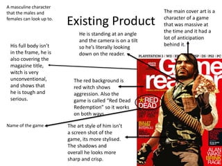
Existing Product
He is standing at an angle
and the camera is on a tilt
so he’s literally looking
down on the reader.
The red background is
red witch shows
aggression. Also the
game is called “Red Dead
Redemption” so it works
on both ways
The main cover art is a
character of a game
that was massive at
the time and it had a
lot of anticipation
behind it.
The art style of him isn’t
a screen shot of the
game, its more stylised.
The shadows and
overall he looks more
sharp and crisp.
His full body isn’t
in the frame, he is
also covering the
magazine title,
witch is very
unconventional,
and shows that
he is tough and
serious.
Name of the game
A masculine character
that the males and
females can look up to.
Existing Product
He is on a tilt and an
action shot has been
chosen to represent
the game even
though its more of a
stealth game. This is
because action shots
look better and are
more likely to attract
more readers.
All of the text a part from the
title is on a slant along with
the main character. Not only
does this look good but it
shows that in the game the
world kind of revolves around
him and you are able to make
your own choices.
The character is
slightly off centre
and is shown with
an angry serious
look on his face. It
doesn't look like a
screen shot from
the game, it looks
like digital art taken
from a cut scene.
The game doesn't
look too much
different from this
picture witch shows
off how good the
game looks
The background is red ad
black. This symbolises the
fact that as the player you
can chose to be violent(red)
or stealthy(black).
The PS Vita
would have been
new at the time
The background looks like its from the game. This makes him look less out of place.
Existing Product
Small picture that doesn't
take up the whole front
cover. The art style is the
same style that the games
cover art uses. It’s a simple
art style that looks good on a
magazine because it leaves
room for other games to be
featured on the front covers.
Background is
plane and white.
It makes the
shadow of the
two people stand
out
The title is bold and not
covered by anything.
This image shows masculinity and
violence. Themes that are very
strong in the game.
The red on the logo
symbolises violence,
passion, leadership,
anger and love.
Themes that are all in
the game.
Even though there are two
people on the cover, it
doesn’t look too cluttered.
This is mainly because of the
white background
Research Analysis
• What common features do the researched products
have?
I have realised that all of the magazine covers have digital art styled characters on the front, not a screenshot
from the game. This is because it looks better and this way you are able to show people the game in the best
light possible.
An other thing that they have in common is simplicity. There is usually one character on the front posing in an
action shot. And around him are headlines of what's featured inside.
The background usually complements the main character on the front, weather it’s a background from the
game to make the character seem more in place, or just a colour to represent the games themes. The
background is a big part of what makes the whole cover come together.
• What aspects of the research will you include within
your on work?
In my work I will take aspects of all of the magazines I have seen. For example, just having one person on the
cover. This makes it look less cluttered and leaves more space to put headlines to show people what's inside.
I like the idea of having a slightly weird camera angle. I feel like it’s a good way to show off a games main
character. Its quite unconventional, but it works because depending on the character, it suits them.
Having the character cover up the magazines title tells the audience that it’s a good brand and it has loyal
customers that will buy no matter what. So I may take this idea and apply it to my own work.
Audience
Audience Profile
Category Demographic Content to appeal to this audience
Age Range
10-29 I feel like older children (10-13) are likely to be
interested in my magazine, because there are a lot of
games targeted at them.
I also feel like younger teens (13-15) and older teens
(15-18) also have many games target towards them.
The same is true with younger adults (18-29). I feel
that there aren’t too many games targeted towards
anybody older than that.
The magazine wont feature any explicit content or
anything a young child/ parents would find offensive.
The magazine will feature more mature games, but
only in the form of a review, etc..
Gender
Male and female I think targeting a mostly male demographic is a good
choice.
However, females are a large part of the audience
too.
I will appeal to both audiences by having a relatable
yet popular videogame character featured on the

2. research (aa)

  • 1.
  • 2.
    Existing Product He isstanding at an angle and the camera is on a tilt so he’s literally looking down on the reader. The red background is red witch shows aggression. Also the game is called “Red Dead Redemption” so it works on both ways The main cover art is a character of a game that was massive at the time and it had a lot of anticipation behind it. The art style of him isn’t a screen shot of the game, its more stylised. The shadows and overall he looks more sharp and crisp. His full body isn’t in the frame, he is also covering the magazine title, witch is very unconventional, and shows that he is tough and serious. Name of the game A masculine character that the males and females can look up to.
  • 3.
    Existing Product He ison a tilt and an action shot has been chosen to represent the game even though its more of a stealth game. This is because action shots look better and are more likely to attract more readers. All of the text a part from the title is on a slant along with the main character. Not only does this look good but it shows that in the game the world kind of revolves around him and you are able to make your own choices. The character is slightly off centre and is shown with an angry serious look on his face. It doesn't look like a screen shot from the game, it looks like digital art taken from a cut scene. The game doesn't look too much different from this picture witch shows off how good the game looks The background is red ad black. This symbolises the fact that as the player you can chose to be violent(red) or stealthy(black). The PS Vita would have been new at the time The background looks like its from the game. This makes him look less out of place.
  • 4.
    Existing Product Small picturethat doesn't take up the whole front cover. The art style is the same style that the games cover art uses. It’s a simple art style that looks good on a magazine because it leaves room for other games to be featured on the front covers. Background is plane and white. It makes the shadow of the two people stand out The title is bold and not covered by anything. This image shows masculinity and violence. Themes that are very strong in the game. The red on the logo symbolises violence, passion, leadership, anger and love. Themes that are all in the game. Even though there are two people on the cover, it doesn’t look too cluttered. This is mainly because of the white background
  • 5.
    Research Analysis • Whatcommon features do the researched products have? I have realised that all of the magazine covers have digital art styled characters on the front, not a screenshot from the game. This is because it looks better and this way you are able to show people the game in the best light possible. An other thing that they have in common is simplicity. There is usually one character on the front posing in an action shot. And around him are headlines of what's featured inside. The background usually complements the main character on the front, weather it’s a background from the game to make the character seem more in place, or just a colour to represent the games themes. The background is a big part of what makes the whole cover come together. • What aspects of the research will you include within your on work? In my work I will take aspects of all of the magazines I have seen. For example, just having one person on the cover. This makes it look less cluttered and leaves more space to put headlines to show people what's inside. I like the idea of having a slightly weird camera angle. I feel like it’s a good way to show off a games main character. Its quite unconventional, but it works because depending on the character, it suits them. Having the character cover up the magazines title tells the audience that it’s a good brand and it has loyal customers that will buy no matter what. So I may take this idea and apply it to my own work.
  • 6.
  • 7.
    Audience Profile Category DemographicContent to appeal to this audience Age Range 10-29 I feel like older children (10-13) are likely to be interested in my magazine, because there are a lot of games targeted at them. I also feel like younger teens (13-15) and older teens (15-18) also have many games target towards them. The same is true with younger adults (18-29). I feel that there aren’t too many games targeted towards anybody older than that. The magazine wont feature any explicit content or anything a young child/ parents would find offensive. The magazine will feature more mature games, but only in the form of a review, etc.. Gender Male and female I think targeting a mostly male demographic is a good choice. However, females are a large part of the audience too. I will appeal to both audiences by having a relatable yet popular videogame character featured on the

Editor's Notes

  • #3 Choose a recent product similar to your own and annotate it Type of image- studio/location, angle, effects, post-production Use of lighting/composition/mise en scene/costume/props/location/colours/fonts etc. Audience appeal- how does it make its audience want to buy/watch/play it?
  • #4 Choose a recent product similar to your own and annotate it Type of image- studio/location, angle, effects, post-production Use of lighting/composition/mise en scene/costume/props/location/colours/fonts etc. Audience appeal- how does it make its audience want to buy/watch/play it?
  • #5 Choose a recent product similar to your own and annotate it Type of image- studio/location, angle, effects, post-production Use of lighting/composition/mise en scene/costume/props/location/colours/fonts etc. Audience appeal- how does it make its audience want to buy/watch/play it?