•Raw   3                   •Final   3


•Hereis why I did not change the
photograph
•Idid not change these picture because they look
fine as they are. As well as the images do not need
to be cropped as they show exactly what is needed
to relate to the cover lines.
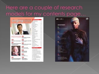
•Contents   Page   •These    are key features…
                   •The  masthead- Unconventional
                   playful presentation of the headline
                   which has been done to attract the
                   audience.
                   •Cover lines- Shows a variety of how
                   the cover lines can be structured to
                   help the readers navigate the
                   pages. Also the illustration looks
                   playful but sophisticated to match
                   the interest of my target audience.
                   •Pictures- They match the cover
                   lines as the image directs exactly
                   what the cover line is informing the
                   reader. Also all the pictures are all of
                   Youth showing different types that
                   they see the Gospel which will
                   attract my audience on how they
                   can relate.
•The Background continues to use the colour scheme of purple
whilst the font for the writing is black.
•The cover lines that were used in the front cover I also used
some of them and adapted them to go into the contents
page.
•How have you made the reader want to read on?
• The structure of the contents page has shown the
variety between using pictures and text and the
format of them. The cover lines are short and
snappy and easy to remember and attractive just
as the pictures are.
•What are the links between images and words?
•Through the use of the short cover lines and the
pictures. The pictures gives an insight into part of
story whilst the text compliments the picture.
•What determines the dominant stories?
• The dominate stories are presented in boxes with
the pictures next to them.
•How have you gone about ordering the
information on the page?
•The order of the information has displayed with the
Editor note being shown at the top of the page.
Then the main cover lines have been presented in
boxes with images. Whist a features section shows
more cover lines. The page look simple and easy
as the use of boxes and borders and headings has
helped navigate the information.
•The  contents page flags up the double page spread implicitly. The
cover lines that have been used continue show how the Gospel is
increasing with the youth and how they are progressing as they win
competitions, go to concerts and learn how to play more
instruments.
•The use of the cover lines continues to show progression which is
the key words that is used in the headline for the double page
spread and the main cover .
The headline- gives the reader an     The by-line is the author            The main image is demonstrated
insight into the context of the       ‘krissie dawn’ implicating           across the whole page which an
magazine. Also the style of the       who has written the                  element of lighting to centralise the
headline has been displayed to        magazine and it also has             girl with headphones contrasting the
reflect the colour scheme and also    been represented in a                element of her sitting down near the
the style of the word ‘Riot’          colloquial simplistic to             space where it has the flammable
corresponds to the text.              endorse how the                      safety warning could suggest that
                                      magazine is aimed at a               music as well as other subjects can
                                      younger target audience              cause anarchy.


The layout of this
double page
spread as been
shown with the
body copy of a
diagonal tinted
box with 3
vertical tinted
columns to
highlight the text
and overshadow
the picture but
also reflect the
central image.


The sub image shown                                  Theses pull out quotes show the
towards to the centre left                           important parts which have
                             The end dot shows
of the page and with a                               been taken from the
                             the reader is at the
image margin to create                               interviewee; they give they give
                             end of the story.
space for the picture                                the reader a little teaser into the
and keep the layout in                               type of the story. Furthermore all
•Thisdouble page spread is simple but attractive
• The main image takes precedence across both pages.
Which creates the main focus to be on the model and the
basis of what the story is about.
• Also the use of the transparency within the use of the main
body of the interview highlights the text and makes the text
look more appealing as the reader can see the text.
•Because the main text is an interview it makes it easier to read
and it does not bore audience.
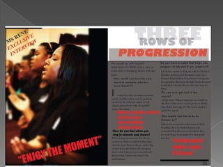
•The  Headline: has been directed in three parts to look not only stylish
but challenge appeal to the audience on the importance of the
headline and the story. Also the headline only makes the standpoint
that it is based on progression but gives the audience a sense of
wonder and mystery into what type of progression.
•The main image: was illustrated to break conventions of an artist
posing or looking directly at the audience. So instead I showed the
artist as she was when she first started. Which could bring a sense of
belonging to the audience of how she began her journey and how
she interprets the Gospel.
•The story/ Text: The story has been displayed through the masthead
but in the main text which has been showed through the format of an
interview and only with 5 Q&A’s. The use of the interview allows the
reader to see the inside story of the artist interpretation of how she
has used 3 rows of progression and what they are in her life; whilst
depicting her music and gospel career within 5 questions. It is small
because it does not fully give an insight into the artist so that the
audience will want more as they have been sucked into the details
•Images:   In all the pictures used in all three stages of production I have
made sure all the images show a message that illustrates how some youth
in the Gospel interpret to allow the audience to feel a sense of appeal
and relation to those images.
•Headlines/ Masthead: All the headlines that have used look appealing
and unconventional and playful but still have the element of looking
stylish but attractive which will interest my target audience.
•The colour scheme: from the beginning the colour scheme has been
purple, white and black and through all 3 stages I used the element of
those colours except in the double page spread I wanted it to look
different from having the same old colours. Purple was the initial colour
because in the Gospel purple is a very significant colour to use. And the
use of white black was to highlight and compliment the purple because
they are simple but effective colours.
•Main cover line: In the font cover the main cover line has been used in
the double page spread to follow conventions; because it various
magazines the main cover line has been shown in a double page
spread .

Presentations slides part 2

  • 1.
    •Raw 3 •Final 3 •Hereis why I did not change the photograph •Idid not change these picture because they look fine as they are. As well as the images do not need to be cropped as they show exactly what is needed to relate to the cover lines.
  • 3.
    •Contents Page •These are key features… •The masthead- Unconventional playful presentation of the headline which has been done to attract the audience. •Cover lines- Shows a variety of how the cover lines can be structured to help the readers navigate the pages. Also the illustration looks playful but sophisticated to match the interest of my target audience. •Pictures- They match the cover lines as the image directs exactly what the cover line is informing the reader. Also all the pictures are all of Youth showing different types that they see the Gospel which will attract my audience on how they can relate.
  • 4.
    •The Background continuesto use the colour scheme of purple whilst the font for the writing is black. •The cover lines that were used in the front cover I also used some of them and adapted them to go into the contents page.
  • 5.
    •How have youmade the reader want to read on? • The structure of the contents page has shown the variety between using pictures and text and the format of them. The cover lines are short and snappy and easy to remember and attractive just as the pictures are. •What are the links between images and words? •Through the use of the short cover lines and the pictures. The pictures gives an insight into part of story whilst the text compliments the picture. •What determines the dominant stories? • The dominate stories are presented in boxes with the pictures next to them. •How have you gone about ordering the information on the page? •The order of the information has displayed with the Editor note being shown at the top of the page. Then the main cover lines have been presented in boxes with images. Whist a features section shows more cover lines. The page look simple and easy as the use of boxes and borders and headings has helped navigate the information.
  • 6.
    •The contentspage flags up the double page spread implicitly. The cover lines that have been used continue show how the Gospel is increasing with the youth and how they are progressing as they win competitions, go to concerts and learn how to play more instruments. •The use of the cover lines continues to show progression which is the key words that is used in the headline for the double page spread and the main cover .
  • 7.
    The headline- givesthe reader an The by-line is the author The main image is demonstrated insight into the context of the ‘krissie dawn’ implicating across the whole page which an magazine. Also the style of the who has written the element of lighting to centralise the headline has been displayed to magazine and it also has girl with headphones contrasting the reflect the colour scheme and also been represented in a element of her sitting down near the the style of the word ‘Riot’ colloquial simplistic to space where it has the flammable corresponds to the text. endorse how the safety warning could suggest that magazine is aimed at a music as well as other subjects can younger target audience cause anarchy. The layout of this double page spread as been shown with the body copy of a diagonal tinted box with 3 vertical tinted columns to highlight the text and overshadow the picture but also reflect the central image. The sub image shown Theses pull out quotes show the towards to the centre left important parts which have The end dot shows of the page and with a been taken from the the reader is at the image margin to create interviewee; they give they give end of the story. space for the picture the reader a little teaser into the and keep the layout in type of the story. Furthermore all
  • 8.
    •Thisdouble page spreadis simple but attractive • The main image takes precedence across both pages. Which creates the main focus to be on the model and the basis of what the story is about. • Also the use of the transparency within the use of the main body of the interview highlights the text and makes the text look more appealing as the reader can see the text. •Because the main text is an interview it makes it easier to read and it does not bore audience.
  • 9.
    •The Headline:has been directed in three parts to look not only stylish but challenge appeal to the audience on the importance of the headline and the story. Also the headline only makes the standpoint that it is based on progression but gives the audience a sense of wonder and mystery into what type of progression. •The main image: was illustrated to break conventions of an artist posing or looking directly at the audience. So instead I showed the artist as she was when she first started. Which could bring a sense of belonging to the audience of how she began her journey and how she interprets the Gospel. •The story/ Text: The story has been displayed through the masthead but in the main text which has been showed through the format of an interview and only with 5 Q&A’s. The use of the interview allows the reader to see the inside story of the artist interpretation of how she has used 3 rows of progression and what they are in her life; whilst depicting her music and gospel career within 5 questions. It is small because it does not fully give an insight into the artist so that the audience will want more as they have been sucked into the details
  • 10.
    •Images: In all the pictures used in all three stages of production I have made sure all the images show a message that illustrates how some youth in the Gospel interpret to allow the audience to feel a sense of appeal and relation to those images. •Headlines/ Masthead: All the headlines that have used look appealing and unconventional and playful but still have the element of looking stylish but attractive which will interest my target audience. •The colour scheme: from the beginning the colour scheme has been purple, white and black and through all 3 stages I used the element of those colours except in the double page spread I wanted it to look different from having the same old colours. Purple was the initial colour because in the Gospel purple is a very significant colour to use. And the use of white black was to highlight and compliment the purple because they are simple but effective colours. •Main cover line: In the font cover the main cover line has been used in the double page spread to follow conventions; because it various magazines the main cover line has been shown in a double page spread .