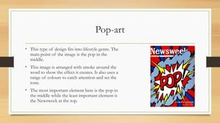
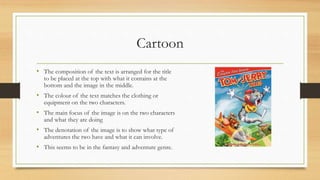
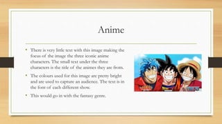
Unit 13 Task 1B Re-
draft
Pop-art
• This type of design fits into lifestyle genre. The
main point of the image is the pop in the
middle.
• This image is arranged with smoke around the
word to show the effect it creates. It also uses a
range of colours to catch attention and set the
tone.
• The most important element here is the pop in
the middle while the least important element is
the Newsweek at the top.
Cartoon
• The composition of the text is arranged for the title
to be placed at the top with what it contains at the
bottom and the image in the middle.
• The colour of the text matches the clothing or
equipment on the two characters.
• The main focus of the image is on the two characters
and what they are doing
• The denotation of the image is to show what type of
adventures the two have and what it can involve.
• This seems to be in the fantasy and adventure genre.
Anime
• There is very little text with this image making the
focus of the image the three iconic anime
characters. The small text under the three
characters is the title of the animes they are from.
• The colours used for this image are pretty bright
and are used to capture an audience. The text is in
the font of each different show.
• This would go in with the fantasy genre.
Comparison
• Compared to the cartoon and the pop-art examples I have chosen the anime example
seems to be the more brighter example in terms of colour. Pop-art seems like a style
that is used more for comic books and old cartoons compared to the others.
• All three of these examples are tying top persuade the audience to either read or watch
something. The cartoon and anime examples rely on the visual representation of the
characters while the pop-art relies on the representation of the word and what it
connotes.
• Compared to cartoon and pop-art the anime example seems to be the one of the 3 that
uses more brighter and compressed colours to show complexion on what it is showing.
This could be characters, location, objects and more.

Unit 13 task 1 b re draft

  • 1.
    Unit 13 Task1B Re- draft
  • 2.
    Pop-art • This typeof design fits into lifestyle genre. The main point of the image is the pop in the middle. • This image is arranged with smoke around the word to show the effect it creates. It also uses a range of colours to catch attention and set the tone. • The most important element here is the pop in the middle while the least important element is the Newsweek at the top.
  • 3.
    Cartoon • The compositionof the text is arranged for the title to be placed at the top with what it contains at the bottom and the image in the middle. • The colour of the text matches the clothing or equipment on the two characters. • The main focus of the image is on the two characters and what they are doing • The denotation of the image is to show what type of adventures the two have and what it can involve. • This seems to be in the fantasy and adventure genre.
  • 4.
    Anime • There isvery little text with this image making the focus of the image the three iconic anime characters. The small text under the three characters is the title of the animes they are from. • The colours used for this image are pretty bright and are used to capture an audience. The text is in the font of each different show. • This would go in with the fantasy genre.
  • 5.
    Comparison • Compared tothe cartoon and the pop-art examples I have chosen the anime example seems to be the more brighter example in terms of colour. Pop-art seems like a style that is used more for comic books and old cartoons compared to the others. • All three of these examples are tying top persuade the audience to either read or watch something. The cartoon and anime examples rely on the visual representation of the characters while the pop-art relies on the representation of the word and what it connotes. • Compared to cartoon and pop-art the anime example seems to be the one of the 3 that uses more brighter and compressed colours to show complexion on what it is showing. This could be characters, location, objects and more.