Graphic Narrative
Evaluation
Does your final product reflect your
original intentions?
My original intentions were a lot more basic than the final outcome. The
background is a lot more detailed. My flat plans showed a basic drawing with
a coloured background, the storyboard was the same. The final image was
more detailed with a lot more shading to add more depth to the image.
Although realism was not my intention for the characters, the shading does
add a nice effect. I did however originally plan for the dragon to be a different
colour. I had planned to make it a black dragon but I feared it would resemble
the dragon from DreamWorks’ “How to Train Your Dragon”. So I changed the
colour, wing shape and body shape. Also in my original ideas the main
character “James” had blonde hair. I decided to change this because the
colours I had planned for the background would contrast better with a darker
colour. I do think that my final outcome is a lot better than the flat plans and
storyboard. This is because of the vast amount of detail and colour that has
been added. I also did not like how on my flat plans and on my storyboards
the lines were very sketchy. I have changed this on the final product so that
there is one singular lines. This makes it look neater and more professional.
How well have you constructed your
images?
All of my images are hand drawn, they were scanned in via a scanner and they were
uploaded to Photoshop. I created a new layer and drew over the outline with a small
black brush. Once the outline was completed, I used the magic wand tool to select an
area of the image. I would then colourise the image by selecting the appropriate
colour and filling in the selected area. Once the image is coloured I would remove the
scanned image layer so that the only thing left is the coloured image I had just made. I
would then hide the layer with the character and then create a background for the
character to be placed on top of. I would create the background using the polygonal
lasso tool to create a shape, I would then right click on the shape and click “Layer via
copy” This creates another layer of the shape. I then colourised the shape by double
clicking on the layer tab. I clicked on “colour overlay” and selected a colour. I repeated
this process until I had created a scene I was happy with. I then clicked the eye icon to
reveal the character I had previously drawn. I placed the character in an appropriate
place. I then added text to the image. This was to keep the storyline flowing. The text
is white, this is because most of the backgrounds are dark colours.
How well have you used text to anchor
your images
I coloured the text white so that you can still read it even
when there is contrasting colours behind it. The text has no
box or bubble to go in. This is because I wanted the text to be
big so that it is understandable for children this means that if I
were to add in a box or bubble for the text to be placed inside
of, it would take up too much space. This would be a problem
because I want the children who are reading the book to also
be able to see the images. The images help to convey the
storyline in a way that is understandable just in case that the
child is not as skilled in reading as other children. This is very
important as it still allows for good storytelling even for
children who aren’t as good at reading as everyone else. The
text is placed on dark backgrounds. This is so that the text
stands out and it is still readable.
Is your product suitable for your
audience?
My product is completely suitable for my target audience for multiple
reasons: The text is large, clear and easy to read. The images are also
clear and you are able to easily decipher them if the reader is not very
skilled in reading. Also the book is short and incredibly easy to follow.
My target audience is children from ages 3-8. This is because most
children learn to read at the age of three. This means that the book
can be uses as a learning device as well as just a casual book. The book
is completely suitable for the target audience. The original storyline,
Jack and the beanstalk, is a story that is told to children as bedtime
stories. The end of Jack and the beanstalk ends with the death of a
character. My book does not feature anything like that. This means
that it is suitable for the same age group (3-8). The images are also
suitable for book’s demographic. This is because they do not feature
any violence or any other inappropriate content. All of the content
featured in the book is completely appropriate for the demographic.
What do you like/dislike about the
techniques you have used?
I like the fact that my images are hand drawn and edited digitally.
However this does sometimes look messy but an easy solution is to go
over the lines with a black brush in Photoshop. This will tidy up the
image and won’t make it look as messy. I frequently used the
Polygonal lasso tool to create most of the backgrounds. This is because
it is easy, simple to use and you can make almost any shape out of it.
This will give the background a lineless and cartoon like feel. However,
despite all of the good techniques, I was not fond of the “Layer Via
Copy” technique, the method was effective as it allowed me to create
very effective backgrounds however the method is very time
consuming and you have to create a new layer for each piece of the
background. This can add up to 30+ layers which can get very
confusing if there is a subtle details that need to be changed. It can be
very tedious trying to sift through the layers to find certain objects.
What do you like/dislike about how
your final product looks?
I really love the illustration in the books, it has a child like quality to it that I feel the
children can relate to it. I also like the amount of detail that is in the background.
There are small details such as: House decorations, slightly shaded walls to give the
house a more isometric feel. I feel like these features give more depth to the
backgrounds and make them feel more realistic. I do not like how the background and
the characters are two different styles. This means that it does not fit in as well. If I
were to do this again I would create the backgrounds using a hand drawn method. I
did not create the background in that way, I used a rotoscoping method to create the
backgrounds. However despite the background and the characters not blending
perfectly I still do like the outcome of the product. I think that, although the drawings
well drawn and detailed, there is a lot of room for improvement. Unfortunately, I do
not have the physical ability to draw any better. I think that, however, with a lot more
practice I could, if I were to do this project again, do it with a lot more drawing
experience in order to create a much more detailed and all round much better image.
Why did you include the content you
used?
I used Ariel as my font, this is because it is extremely
basic and very easy to read. This is so that the reader has
no problem understanding the book I did experiment
with different fonts and most of them either did not fit in
well with the book or they were unclear. I needed the
font to be as clear as possible. I experimented with
multiple font colours when creating the text. I found that
colours such as: Red or Black were too dark and you could
not understand the text. White text turned out perfect
because all of the backgrounds are dark colours such as:
Brown and Green. The white text contrasted these
colours perfectly and allowed the text to be completely
understandable and clear.
What signs, symbols or codes have
your used in your work?
All of the locations I used are in the fantasy genre. I chose this setting because
it is a setting that children like. This is because of the heavy amount of
imagination that is required in order to fully experience the story. The
character’s clothing is always dirty and tatted, this is to show that they are
very poor. However this is mentioned at the start of the book and is a key
element in the storyline but the reader needs to be constantly reminded that
the main character’s are poor. The tone of the book starts out quite sad, two
people living alone, with no money or food. The book soon changes to a
lighter mood when James meets his dragon and they find a way to get some
money. I started the book of with a sad tone to make the readers feel
sympathetic towards the main characters. My style is hand drawn, this is so
that it feels more like a children’s book. I prefer the drawing to be slightly
messy rather than professionally drawn. The colours I have chosen are
dependent on the context of a page. For example: All of the colours on the
pages where the tone is sad. The book’s colours get brighter as the tone gets
lighter. This is a small detail but it is very effective.
Audience Responses
Cultural competence:
Media texts require us to have a certain level of cultural understanding to
be able to interpret them.
At a basic level, this could mean being able to read the language that a
magazine is written in.
At a deeper level, it means being able to interpret signs and symbols that
we use a visual shorthand to communicate ideas.
We recognise these signs in our own culture but find it harder to
understand when looking at others.
We create and attach meaning to signs and symbols in many different
forms.
10Creative Media Production 2012
Audience Responses
Cultural competence:
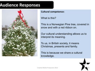
What is this?
This is a Norwegian Pine tree, covered in
snow and with a red ribbon on.
Our cultural understanding allows us to
interpret its meaning.
To us, in British society, it means
Christmas, presents and family.
This is because we share a cultural
knowledge.
11Creative Media Production 2012
Audience Responses
Cultural competence:
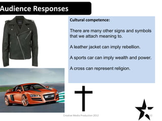
There are many other signs and symbols
that we attach meaning to.
A leather jacket can imply rebellion.
A sports car can imply wealth and power.
A cross can represent religion.
12Creative Media Production 2012
Audience Responses
Cultural competence:
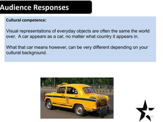
Visual representations of everyday objects are often the same the world
over. A car appears as a car, no matter what country it appears in.
What that car means however, can be very different depending on your
cultural background.
13Creative Media Production 2012
What representations can be found in
your work?
My book does lack people of different races and religions. All of the
characters are white, this is unintentional, when I decided on
appearance for the characters, I did not think about adding in anyone
of a different race. The only female character is James’ mother who is
represented as a strong woman who is struggling to survive. I am
worried people will take the representation the wrong way and
assume that the mother is incapable of providing for the family, this is
not the case. There are no social or religious groups shown in the
book, this is because I didn’t think it was necessary and it would not
progress the storyline in any way. I do think that the book lacks variety.
This means that the book only shows one type of character rather than
a variety of people of different races, social or religious groups. I think
that adding more variety would be a lot better as more people could
relate to the book if the characters were part of the same race or
religious group as them.
What style have you employed in your
products?
My inspired art style is taken from children’s books such as “Cheeky
Charlie” and “the storm whale”. They both have a messy style like my
book. This style is quite popular in children’s book because it looks like
it has been drawn by another child, this usually means that the style
extremely simplistic. My work has a hand drawn visual style. I chose
this because I am a lot more comfortable drawing images by hand
rather can creating them digitally. This is because I can rough sketch an
idea multiple times on paper before drawing a final image. This is
much more effective than creating a character on Photoshop and then
finding multiple faults with it then spend a very long time changing
everything. With hand drawn images I can rough sketch it and then
only have to create it digitally once using the rough sketches as a
guide. I would only scan the rough sketches in once I was completely
happy with the final image. I can then colour the image and move on
rather than spending time making sure it looks perfect.
What were the strengths and weaknesses
of the pre-production and planning
I believe that I had a slight advantage during pre production, this is
because I was using a hand drawn method. This was more efficient
than creating images digitally. This is because I could spend as long as I
needed creating drafts and rough sketches to ensure that the final
product was as good as it can be. This was better than spending a long
time drawing and creating an image digitally which is significantly
more difficult than hand drawing it. The weakness to this was that I
had to spend a lot more time doing rough sketches to make sure they
were perfect. This was unavoidable however. Planning was very simple
for me because I had a lot of ideas in mind for the storyline. This
meant I could easy put my ideas on to paper. The only problem with
the planning phase was the page restrictions. We were only allowed 12
pages. This was a small problem because I struggled to break down the
whole story into only 12 pages without having a ridiculous amount of
text on one page.
Historical and cultural context
My start of my work compares to a story called “Oodle Thunks”. That
children’s book uses Dinosaurs whilst my work uses Dragons. The main
premise is based off of “Jack and the beanstalk”. The similarities include: The
family selling their animal because they have no food and they’re poor, they
are offered a magical item instead of money and it causes the mother to get
very annoyed. The differences include the change of animal from Cow to a
dog. The magical item was changed from magic beans to a dragon’s egg. The
rest of the story is different to the original. Currently there are no books that
feature the exact same storyline. However there is a book written in 1997
called “The Dragon Rider” which features a child with a dragon egg. This book
was a large inspiration for creating the dragon and the basic idea. However I
did not want to directly copy the book so I ensured that I had changed the
dragon’s appearance and behaviour. The dragon from “The Dragon Rider” has
angry mannerisms whilst the dragon from my book is a lot more friendly. This
is so that the readers do not get scared or upset reading the book and can
level and begin to like the dragon.
Peer Feedback
• Summarise peer feedback and discuss
– Responses you agree with
– Responses you disagree with
Digital graphics evaluation pro forma

Digital graphics evaluation pro forma

  • 1.
  • 2.
    Does your finalproduct reflect your original intentions? My original intentions were a lot more basic than the final outcome. The background is a lot more detailed. My flat plans showed a basic drawing with a coloured background, the storyboard was the same. The final image was more detailed with a lot more shading to add more depth to the image. Although realism was not my intention for the characters, the shading does add a nice effect. I did however originally plan for the dragon to be a different colour. I had planned to make it a black dragon but I feared it would resemble the dragon from DreamWorks’ “How to Train Your Dragon”. So I changed the colour, wing shape and body shape. Also in my original ideas the main character “James” had blonde hair. I decided to change this because the colours I had planned for the background would contrast better with a darker colour. I do think that my final outcome is a lot better than the flat plans and storyboard. This is because of the vast amount of detail and colour that has been added. I also did not like how on my flat plans and on my storyboards the lines were very sketchy. I have changed this on the final product so that there is one singular lines. This makes it look neater and more professional.
  • 3.
    How well haveyou constructed your images? All of my images are hand drawn, they were scanned in via a scanner and they were uploaded to Photoshop. I created a new layer and drew over the outline with a small black brush. Once the outline was completed, I used the magic wand tool to select an area of the image. I would then colourise the image by selecting the appropriate colour and filling in the selected area. Once the image is coloured I would remove the scanned image layer so that the only thing left is the coloured image I had just made. I would then hide the layer with the character and then create a background for the character to be placed on top of. I would create the background using the polygonal lasso tool to create a shape, I would then right click on the shape and click “Layer via copy” This creates another layer of the shape. I then colourised the shape by double clicking on the layer tab. I clicked on “colour overlay” and selected a colour. I repeated this process until I had created a scene I was happy with. I then clicked the eye icon to reveal the character I had previously drawn. I placed the character in an appropriate place. I then added text to the image. This was to keep the storyline flowing. The text is white, this is because most of the backgrounds are dark colours.
  • 4.
    How well haveyou used text to anchor your images I coloured the text white so that you can still read it even when there is contrasting colours behind it. The text has no box or bubble to go in. This is because I wanted the text to be big so that it is understandable for children this means that if I were to add in a box or bubble for the text to be placed inside of, it would take up too much space. This would be a problem because I want the children who are reading the book to also be able to see the images. The images help to convey the storyline in a way that is understandable just in case that the child is not as skilled in reading as other children. This is very important as it still allows for good storytelling even for children who aren’t as good at reading as everyone else. The text is placed on dark backgrounds. This is so that the text stands out and it is still readable.
  • 5.
    Is your productsuitable for your audience? My product is completely suitable for my target audience for multiple reasons: The text is large, clear and easy to read. The images are also clear and you are able to easily decipher them if the reader is not very skilled in reading. Also the book is short and incredibly easy to follow. My target audience is children from ages 3-8. This is because most children learn to read at the age of three. This means that the book can be uses as a learning device as well as just a casual book. The book is completely suitable for the target audience. The original storyline, Jack and the beanstalk, is a story that is told to children as bedtime stories. The end of Jack and the beanstalk ends with the death of a character. My book does not feature anything like that. This means that it is suitable for the same age group (3-8). The images are also suitable for book’s demographic. This is because they do not feature any violence or any other inappropriate content. All of the content featured in the book is completely appropriate for the demographic.
  • 6.
    What do youlike/dislike about the techniques you have used? I like the fact that my images are hand drawn and edited digitally. However this does sometimes look messy but an easy solution is to go over the lines with a black brush in Photoshop. This will tidy up the image and won’t make it look as messy. I frequently used the Polygonal lasso tool to create most of the backgrounds. This is because it is easy, simple to use and you can make almost any shape out of it. This will give the background a lineless and cartoon like feel. However, despite all of the good techniques, I was not fond of the “Layer Via Copy” technique, the method was effective as it allowed me to create very effective backgrounds however the method is very time consuming and you have to create a new layer for each piece of the background. This can add up to 30+ layers which can get very confusing if there is a subtle details that need to be changed. It can be very tedious trying to sift through the layers to find certain objects.
  • 7.
    What do youlike/dislike about how your final product looks? I really love the illustration in the books, it has a child like quality to it that I feel the children can relate to it. I also like the amount of detail that is in the background. There are small details such as: House decorations, slightly shaded walls to give the house a more isometric feel. I feel like these features give more depth to the backgrounds and make them feel more realistic. I do not like how the background and the characters are two different styles. This means that it does not fit in as well. If I were to do this again I would create the backgrounds using a hand drawn method. I did not create the background in that way, I used a rotoscoping method to create the backgrounds. However despite the background and the characters not blending perfectly I still do like the outcome of the product. I think that, although the drawings well drawn and detailed, there is a lot of room for improvement. Unfortunately, I do not have the physical ability to draw any better. I think that, however, with a lot more practice I could, if I were to do this project again, do it with a lot more drawing experience in order to create a much more detailed and all round much better image.
  • 8.
    Why did youinclude the content you used? I used Ariel as my font, this is because it is extremely basic and very easy to read. This is so that the reader has no problem understanding the book I did experiment with different fonts and most of them either did not fit in well with the book or they were unclear. I needed the font to be as clear as possible. I experimented with multiple font colours when creating the text. I found that colours such as: Red or Black were too dark and you could not understand the text. White text turned out perfect because all of the backgrounds are dark colours such as: Brown and Green. The white text contrasted these colours perfectly and allowed the text to be completely understandable and clear.
  • 9.
    What signs, symbolsor codes have your used in your work? All of the locations I used are in the fantasy genre. I chose this setting because it is a setting that children like. This is because of the heavy amount of imagination that is required in order to fully experience the story. The character’s clothing is always dirty and tatted, this is to show that they are very poor. However this is mentioned at the start of the book and is a key element in the storyline but the reader needs to be constantly reminded that the main character’s are poor. The tone of the book starts out quite sad, two people living alone, with no money or food. The book soon changes to a lighter mood when James meets his dragon and they find a way to get some money. I started the book of with a sad tone to make the readers feel sympathetic towards the main characters. My style is hand drawn, this is so that it feels more like a children’s book. I prefer the drawing to be slightly messy rather than professionally drawn. The colours I have chosen are dependent on the context of a page. For example: All of the colours on the pages where the tone is sad. The book’s colours get brighter as the tone gets lighter. This is a small detail but it is very effective.
  • 10.
    Audience Responses Cultural competence: Mediatexts require us to have a certain level of cultural understanding to be able to interpret them. At a basic level, this could mean being able to read the language that a magazine is written in. At a deeper level, it means being able to interpret signs and symbols that we use a visual shorthand to communicate ideas. We recognise these signs in our own culture but find it harder to understand when looking at others. We create and attach meaning to signs and symbols in many different forms. 10Creative Media Production 2012
  • 11.
    Audience Responses Cultural competence: Whatis this? This is a Norwegian Pine tree, covered in snow and with a red ribbon on. Our cultural understanding allows us to interpret its meaning. To us, in British society, it means Christmas, presents and family. This is because we share a cultural knowledge. 11Creative Media Production 2012
  • 12.
    Audience Responses Cultural competence: Thereare many other signs and symbols that we attach meaning to. A leather jacket can imply rebellion. A sports car can imply wealth and power. A cross can represent religion. 12Creative Media Production 2012
  • 13.
    Audience Responses Cultural competence: Visualrepresentations of everyday objects are often the same the world over. A car appears as a car, no matter what country it appears in. What that car means however, can be very different depending on your cultural background. 13Creative Media Production 2012
  • 14.
    What representations canbe found in your work? My book does lack people of different races and religions. All of the characters are white, this is unintentional, when I decided on appearance for the characters, I did not think about adding in anyone of a different race. The only female character is James’ mother who is represented as a strong woman who is struggling to survive. I am worried people will take the representation the wrong way and assume that the mother is incapable of providing for the family, this is not the case. There are no social or religious groups shown in the book, this is because I didn’t think it was necessary and it would not progress the storyline in any way. I do think that the book lacks variety. This means that the book only shows one type of character rather than a variety of people of different races, social or religious groups. I think that adding more variety would be a lot better as more people could relate to the book if the characters were part of the same race or religious group as them.
  • 15.
    What style haveyou employed in your products? My inspired art style is taken from children’s books such as “Cheeky Charlie” and “the storm whale”. They both have a messy style like my book. This style is quite popular in children’s book because it looks like it has been drawn by another child, this usually means that the style extremely simplistic. My work has a hand drawn visual style. I chose this because I am a lot more comfortable drawing images by hand rather can creating them digitally. This is because I can rough sketch an idea multiple times on paper before drawing a final image. This is much more effective than creating a character on Photoshop and then finding multiple faults with it then spend a very long time changing everything. With hand drawn images I can rough sketch it and then only have to create it digitally once using the rough sketches as a guide. I would only scan the rough sketches in once I was completely happy with the final image. I can then colour the image and move on rather than spending time making sure it looks perfect.
  • 16.
    What were thestrengths and weaknesses of the pre-production and planning I believe that I had a slight advantage during pre production, this is because I was using a hand drawn method. This was more efficient than creating images digitally. This is because I could spend as long as I needed creating drafts and rough sketches to ensure that the final product was as good as it can be. This was better than spending a long time drawing and creating an image digitally which is significantly more difficult than hand drawing it. The weakness to this was that I had to spend a lot more time doing rough sketches to make sure they were perfect. This was unavoidable however. Planning was very simple for me because I had a lot of ideas in mind for the storyline. This meant I could easy put my ideas on to paper. The only problem with the planning phase was the page restrictions. We were only allowed 12 pages. This was a small problem because I struggled to break down the whole story into only 12 pages without having a ridiculous amount of text on one page.
  • 17.
    Historical and culturalcontext My start of my work compares to a story called “Oodle Thunks”. That children’s book uses Dinosaurs whilst my work uses Dragons. The main premise is based off of “Jack and the beanstalk”. The similarities include: The family selling their animal because they have no food and they’re poor, they are offered a magical item instead of money and it causes the mother to get very annoyed. The differences include the change of animal from Cow to a dog. The magical item was changed from magic beans to a dragon’s egg. The rest of the story is different to the original. Currently there are no books that feature the exact same storyline. However there is a book written in 1997 called “The Dragon Rider” which features a child with a dragon egg. This book was a large inspiration for creating the dragon and the basic idea. However I did not want to directly copy the book so I ensured that I had changed the dragon’s appearance and behaviour. The dragon from “The Dragon Rider” has angry mannerisms whilst the dragon from my book is a lot more friendly. This is so that the readers do not get scared or upset reading the book and can level and begin to like the dragon.
  • 18.
    Peer Feedback • Summarisepeer feedback and discuss – Responses you agree with – Responses you disagree with