Downloaded 11 times


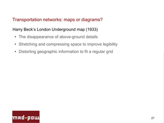


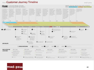


This presentation discusses how maps, diagrams, and timelines can provide inspiration for interactive design. It provides several examples from history: - Maps like the Peutinger Table and Erhard Etzlaub's Romweg map that visualize networks through link-node diagrams. - Harry Beck's 1933 London Underground map that distorted space to improve legibility and fit a regular grid. - Joseph Priestley's invention of the timeline in 1765 to align cultures, categories, and chronology in history and biography. - Fritz Kahn's "Man as an Industrial Palace" diagram from the 1920s explaining biological processes through mechanical metaphor. - Modern examples like the Olympics race data visualization using a pool as a data grid