Sex object
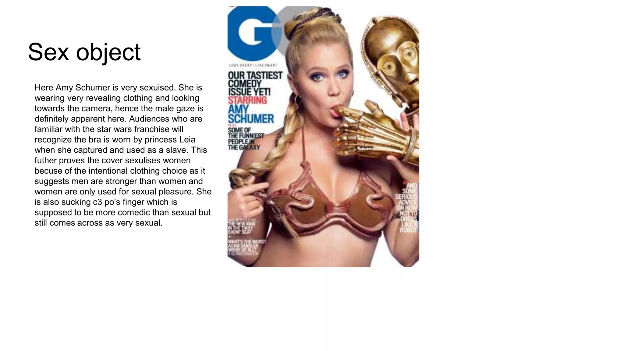
Here Amy Schumer is very sexuised. She is
wearing very revealing clothing and looking
towards the camera, hence the male gaze is
definitely apparent here. Audiences who are
familiar with the star wars franchise will
recognize the bra is worn by princess Leia
when she captured and used as a slave. This
futher proves the cover sexulises women
becuse of the intentional clothing choice as it
suggests men are stronger than women and
women are only used for sexual pleasure. She
is also sucking c3 po’s finger which is
supposed to be more comedic than sexual but
still comes across as very sexual.
Defeminised women
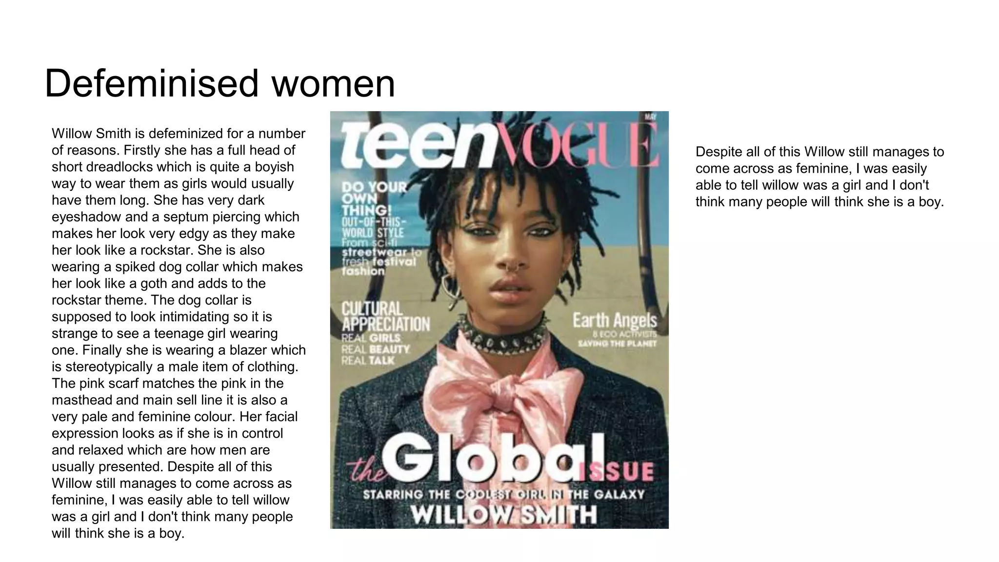
Willow Smith is defeminized for a number
of reasons. Firstly she has a full head of
short dreadlocks which is quite a boyish
way to wear them as girls would usually
have them long. She has very dark
eyeshadow and a septum piercing which
makes her look very edgy as they make
her look like a rockstar. She is also
wearing a spiked dog collar which makes
her look like a goth and adds to the
rockstar theme. The dog collar is
supposed to look intimidating so it is
strange to see a teenage girl wearing
one. Finally she is wearing a blazer which
is stereotypically a male item of clothing.
The pink scarf matches the pink in the
masthead and main sell line it is also a
very pale and feminine colour. Her facial
expression looks as if she is in control
and relaxed which are how men are
usually presented. Despite all of this
Willow still manages to come across as
feminine, I was easily able to tell willow
was a girl and I don't think many people
will think she is a boy.
Despite all of this Willow still manages to
come across as feminine, I was easily
able to tell willow was a girl and I don't
think many people will think she is a boy.
Strong and powerful
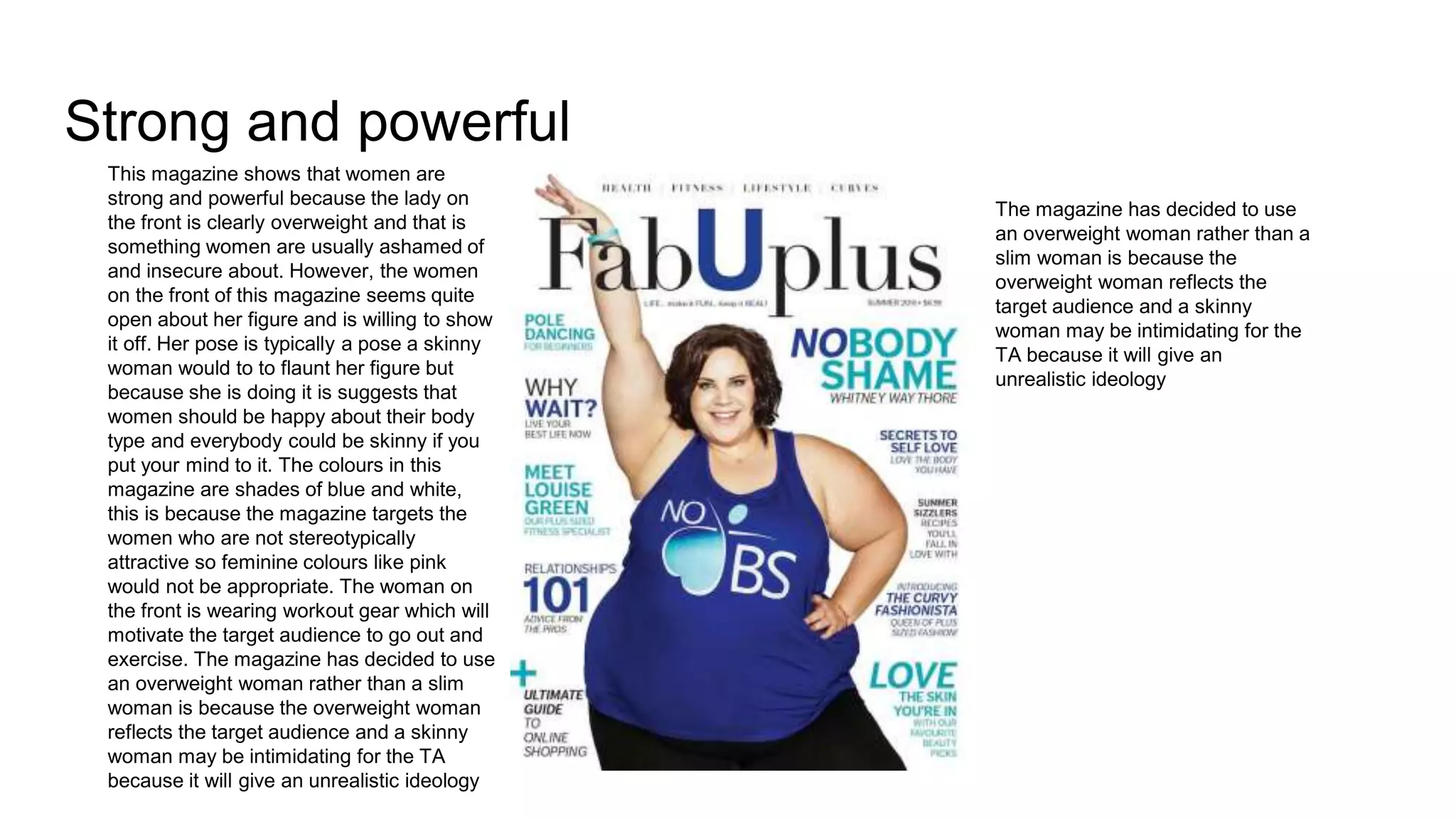
This magazine shows that women are
strong and powerful because the lady on
the front is clearly overweight and that is
something women are usually ashamed of
and insecure about. However, the women
on the front of this magazine seems quite
open about her figure and is willing to show
it off. Her pose is typically a pose a skinny
woman would to to flaunt her figure but
because she is doing it is suggests that
women should be happy about their body
type and everybody could be skinny if you
put your mind to it. The colours in this
magazine are shades of blue and white,
this is because the magazine targets the
women who are not stereotypically
attractive so feminine colours like pink
would not be appropriate. The woman on
the front is wearing workout gear which will
motivate the target audience to go out and
exercise. The magazine has decided to use
an overweight woman rather than a slim
woman is because the overweight woman
reflects the target audience and a skinny
woman may be intimidating for the TA
because it will give an unrealistic ideology
The magazine has decided to use
an overweight woman rather than a
slim woman is because the
overweight woman reflects the
target audience and a skinny
woman may be intimidating for the
TA because it will give an
unrealistic ideology
The girly stereotype
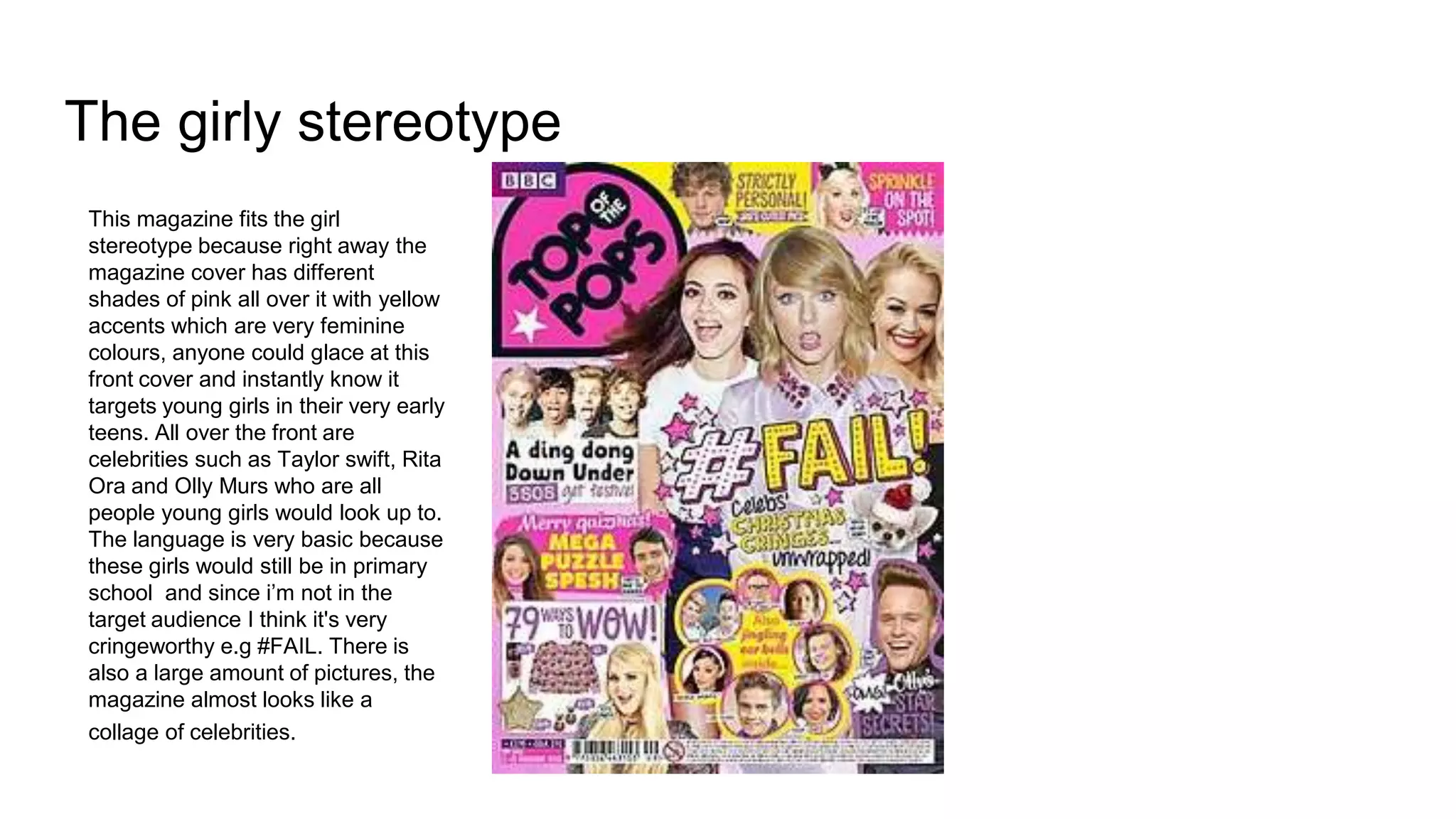
This magazine fits the girl
stereotype because right away the
magazine cover has different
shades of pink all over it with yellow
accents which are very feminine
colours, anyone could glace at this
front cover and instantly know it
targets young girls in their very early
teens. All over the front are
celebrities such as Taylor swift, Rita
Ora and Olly Murs who are all
people young girls would look up to.
The language is very basic because
these girls would still be in primary
school and since i’m not in the
target audience I think it's very
cringeworthy e.g #FAIL. There is
also a large amount of pictures, the
magazine almost looks like a
collage of celebrities.

Magazine tings

  • 1.
    Sex object Here AmySchumer is very sexuised. She is wearing very revealing clothing and looking towards the camera, hence the male gaze is definitely apparent here. Audiences who are familiar with the star wars franchise will recognize the bra is worn by princess Leia when she captured and used as a slave. This futher proves the cover sexulises women becuse of the intentional clothing choice as it suggests men are stronger than women and women are only used for sexual pleasure. She is also sucking c3 po’s finger which is supposed to be more comedic than sexual but still comes across as very sexual.
  • 2.
    Defeminised women Willow Smithis defeminized for a number of reasons. Firstly she has a full head of short dreadlocks which is quite a boyish way to wear them as girls would usually have them long. She has very dark eyeshadow and a septum piercing which makes her look very edgy as they make her look like a rockstar. She is also wearing a spiked dog collar which makes her look like a goth and adds to the rockstar theme. The dog collar is supposed to look intimidating so it is strange to see a teenage girl wearing one. Finally she is wearing a blazer which is stereotypically a male item of clothing. The pink scarf matches the pink in the masthead and main sell line it is also a very pale and feminine colour. Her facial expression looks as if she is in control and relaxed which are how men are usually presented. Despite all of this Willow still manages to come across as feminine, I was easily able to tell willow was a girl and I don't think many people will think she is a boy. Despite all of this Willow still manages to come across as feminine, I was easily able to tell willow was a girl and I don't think many people will think she is a boy.
  • 3.
    Strong and powerful Thismagazine shows that women are strong and powerful because the lady on the front is clearly overweight and that is something women are usually ashamed of and insecure about. However, the women on the front of this magazine seems quite open about her figure and is willing to show it off. Her pose is typically a pose a skinny woman would to to flaunt her figure but because she is doing it is suggests that women should be happy about their body type and everybody could be skinny if you put your mind to it. The colours in this magazine are shades of blue and white, this is because the magazine targets the women who are not stereotypically attractive so feminine colours like pink would not be appropriate. The woman on the front is wearing workout gear which will motivate the target audience to go out and exercise. The magazine has decided to use an overweight woman rather than a slim woman is because the overweight woman reflects the target audience and a skinny woman may be intimidating for the TA because it will give an unrealistic ideology The magazine has decided to use an overweight woman rather than a slim woman is because the overweight woman reflects the target audience and a skinny woman may be intimidating for the TA because it will give an unrealistic ideology
  • 4.
    The girly stereotype Thismagazine fits the girl stereotype because right away the magazine cover has different shades of pink all over it with yellow accents which are very feminine colours, anyone could glace at this front cover and instantly know it targets young girls in their very early teens. All over the front are celebrities such as Taylor swift, Rita Ora and Olly Murs who are all people young girls would look up to. The language is very basic because these girls would still be in primary school and since i’m not in the target audience I think it's very cringeworthy e.g #FAIL. There is also a large amount of pictures, the magazine almost looks like a collage of celebrities.